<|>
NPG Brand guidelines
Brand toolkit
Using the brand toolkit
Combining design
pri
Bnc
r iples
an and br
d g a
u nd
idelines
toolkit
Logo
Colour
MORE
Typography
Word and PowerPoint
THAN MEETS
THE EYE
11/2023
2 <|>
NPG Brand guidelines
Brand toolkit
Brand toolkit
Master logo
Master logo – landscape
Using the brand toolkit
Our brand toolkit is a set of unique
elements, which when combined
Combining design
creates the visual identity.
principles and brand
toolkit
Logo
Colour
Typography
Colour
Word and PowerPoint
Typography
SHARP SANS CAPS FOR HEADLINES
AND HIGHLIGHT COPY
Supported by Sharp Sans sentence case
Inter should support Sharp Sans on the website and digital applications
Calibri for PowerPoint and Word
Guest typefaces can be used for exhibitions
3 <|>
NPG Brand guidelines
Brand toolkit
Using the brand toolkit
Using the brand toolkit
We use the brand toolkit in different ways
across our activities.
Combining design
principles and brand
toolkit
Logo
Branded experiences
Branded activities
Exhibitions
Colour
What we do:
What we do:
What we do:
Typography
⁼ use the primary palette
⁼ use additional colours that ‘draw’
⁼ colour choice is open
from the artworks when needed
Word and PowerPoint
⁼ try to use a touch of red where
⁼ use guest typefaces if needed
possible
⁼ try to include a touch of red
where possible

4 <|>
NPG Brand guidelines
Brand toolkit
Combining design principles
Using the brand toolkit
and brand toolkit
Combining design
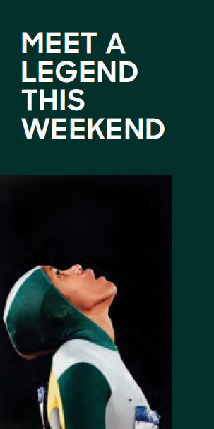
Example ad for National Portrait Gallery
principles and brand
toolkit
Logo
Colour
Typography
Word and PowerPoint
EXAMPLE AD
A touch of red is included
The background colour is
drawn from the artwork
Typography interacts, overlays
and creates a powerful link to
the image
The headline tone is warm and
human
The body copy is concise and
the CTA clear
The artwork is cropped to
create a strong point of focus

5 <|>
NPG Brand guidelines
Brand toolkit
Combining design principles
Using the brand toolkit
and brand toolkit
Combining design
Example ad for Circle of Friends
principles and brand
toolkit
Logo
Colour
Typography
Word and PowerPoint
EXAMPLE AD
A touch of red is included
The background colour is
drawn from the artwork
Typography interacts, overlays
and creates a powerful link to
the image
The headline tone is warm and
human
The body copy is concise and
the CTA clear
The artwork is cropped to
create a strong point of focus

6 <|>
NPG Brand guidelines
Brand toolkit
Combining design principles
Using the brand toolkit
and brand toolkit
Combining design
Example ad for Access and Learning
principles and brand
toolkit
Logo
Colour
Typography
Word and PowerPoint
EXAMPLE AD
A touch of red is included
The background colour is
drawn from the artwork
Typography interacts, overlays
and creates a powerful link to
the image
The headline tone is warm and
human
The body copy is concise and
the CTA clear
The artwork is cropped to
create a strong point of focus


7 <|>
NPG Brand guidelines
Brand toolkit
Combining design principles
Using the brand toolkit
and brand toolkit
Combining design
ONE TICKET.
principles and brand
TWO EXTRAORDINARY
toolkit
EXHIBITIONS.
Logo
PO RT RA IT
Colour
PR IZ E
Typography
NATIONAL
Word and PowerPoint
PHOTOGRAPHIC
PORTRAIT
PRIZE
Blurb
Blurb
6 March —
10 May
In Canberra
Experience the very best new
portrait paintings and photographs
from across Australia.
Book now at portrait.gov.au
Program identifers should
include a touch of red.
Annual Report
2022–23
8 <|>
NPG Brand Guidelines
Brand toolkit
Logo
Master logo
Clear space
Using the brand toolkit
Combining design
Clear space
principles and brand
To calculate the amount of clear
toolkit
space around the logo, use the height
of our frame symbol.
Logo
The minimum space is only a guide,
Colour
always give the logo room to breathe.
Typography
Minimum sizes
Word and PowerPoint
The minimum size specifications are a
guide only. Always make sure our logo
is clear and legible.
Master logo – landscape
Print – 12mm width
Clear space
Digital – 20px standard screen
– 40px retina screen
9 <|>
NPG Brand Guidelines
Brand toolkit
Logo
Successful colour combinations
Using the brand toolkit
Combining design
Colour variations
principles and brand
The frame symbol can appear in any
toolkit
colour. When choosing a colour it
should be clearly legible.
Logo
Although a different colour frame is
Colour
used in the above right examples, it
hasn’t affected the legibility of the
logo type.
Typography
On the examples shown bottom right
Word and PowerPoint
the colour of the frame is either too
light or dark so that word ‘PORTRAIT’
isn’t clear.
Unsuccessful colour combinations
X
X
X
X


10 <|>
NPG Brand Guidelines
Brand toolkit
Logo
Using the brand toolkit
ONE TICKET.
TWO EXTRAORDINARY
Combining design
Position
EXHIBITIONS.
principles and brand
The logo should be placed with
toolkit
clear space in a corner at a size that
PO RT RA IT
is clearly legible.
PR IZ E
Logo
Colour
NATIONAL
PHOTOGRAPHIC
Typography
EXAMPLE AD
PORTRAIT
PRIZE
Word and PowerPoint
6 March —
10 May
In Canberra
Experience the very best new
portrait paintings and photographs
from across Australia.
Book now at portrait.gov.au
11 <|>
NPG Brand Guidelines
Brand toolkit
Colour
Using the brand toolkit
Combining design
Primary palette
NPG Red
Black
White
principles and brand
Our primary colour palette consists
C0 M100 Y85 K0
C0 M0 Y0 K100
C0 M0 Y0 K0
toolkit
of nine colours (including black and
R230 G0 B44
R0 G0 B0
R255 G255 B255
white).
HEX #E6002C
HEX #000000
HEX #FFFFFF
Logo
PMS 185C
The colour palette can be
Colour
supplemented/ replaced with other
colours when appearing with an
artwork.
NPG Stone
NPG Sand
NPG Bark
NPG Sand
Typography
Background
Neutrals work well when multiple
C32 M38 Y41 K0
C15 M11 Y12 K0
C4 M7 Y9 K7
Word and PowerPoint
artworks are shown together. This
R214 G214 B214
R266 G218 B211
R174 G151 B140
C5 M4 Y5 K0
helps avoid colour ‘clashes’.
HEX #D6D6D6
HEX #E2DAD3
HEX #AE978C
R241 G239 B236
HEX #F1EFEC
Collection colours
We can use colours ‘drawn’ from
NPG Eucalyptus
NPG Desert
NPG Sky
an artwork and use them as a
background or for highlight copy.
C43 M29 Y41 K5
C20 M30 Y53 K0
C25 M3 Y0 K0
R145 G153 B140
R204 G173 B130
R184 G222 B245
HEX #91998C
HEX #CCAD82
HEX #B8DEF5


12 <|>
NPG Brand Guidelines
Brand toolkit
Colour
Using the brand toolkit
E
Combining design
X
principles and brand
AM
toolkit
PLE
Logo
Colour
Typography
Word and PowerPoint
EXAMPLE AD
The background uses a colour
from the primary palette.
The background uses colours
‘drawn’ from the artwork.
13 <|>
NPG Brand Guidelines
Brand toolkit
Colour
Using the brand toolkit
Combining design
Use of the NPG Red
principles and brand
Where possible NPG Red should be
toolkit
used through our branded activities
THE AMAZING
and experiences. It’s most successful
Logo
when used in small ‘touches’.
Colour
FACE
DARLINGS
Typography
Word and PowerPoint
Book a ticket
14 <|>
NPG Brand Guidelines
Brand toolkit
Typography
Using the brand toolkit
SHARP SANS CAPS
Combining design
FOR HEADLINES
Sharp Sans is our primary typeface. As
principles and brand
a general guide headlines should be
toolkit
Sharp Sans Bold uppercase.
AND HIGHLIGHT COPY
In digital applications Inter should
Logo
be used to support Sharp Sans. Inter
works well at small sizes and for text.
Colour
Supported by Sharp Sans
Calibri should be used for Microsoft
Typography
applications such as Word or
PowerPoint.
sentence case
Word and PowerPoint
Inter should support Sharp Sans in digital applications
Calibri for PowerPoint and Word
Guest typefaces can be used for exhibitions


15 <|>
NPG Brand Guidelines
Brand toolkit
Typography
Design
solution
Using the brand toolkit
when an
unlicensed
Combining design
Branded activities and experiences
artwork
principles and brand
cannot be
⁼ When licensing permits headlines
toolkit
layered with
can be used over images
type
Logo
⁼ Left-aligned headlines are general y
preferred
Colour
EXAMPLE AD
⁼ Full stops are used for headlines
that include punctuation
Typography
Word and PowerPoint
Exhibitions
⁼ Guest typefaces can be used
Sharp Sans uppercase heading
Guest typeface in use
for an exhibition poster
16 <|>
NPG Brand Guidelines
Brand toolkit
Word
Heading 1, Calibri Bold, 20pt
Using the brand toolkit
Heading 2, Calibri Regular, 16pt
Combining design
In Office 365, there are NPG branded templates
principles and brand
to use, which are crucial for maintaining
toolkit
consistency and professionalism in internal
Heading 3, Calibri Regular, 14pt
documents.
Logo
The Word templates have been created using
Heading 4, Calibri Italic, 11pt
styles. Styles are a set of formatting options that
Colour
you apply to text. They help you to quickly and
Normal/Body text, Calibri Regular, 11pt
easily format your document.
Typography
When opening Word, choose ‘File > open from
• List Paragraph/Bul eted text, Calibri Regular, 11pt, Bul et symbol,
Word and PowerPoint
template > open XXX’
Left indent .3cm, Indent .7cm
To use the styles within the document:
1. List Paragraph/Numbered list, Calibri Regular, 11pt, Outlined numbered,
⁼ select the text you want to format
Left indent .3cm, Hanging indent .6cm
⁼ click the ‘styles pane’ (Home tab > styles
pane), select ‘list: Styles in use’
⁼ click the style you want to apply.
17 <|>
NPG Brand Guidelines
Brand toolkit
PowerPoint
Using the brand toolkit
Combining design
In Office 365, there are NPG branded templates
principles and brand
to use, which are crucial for maintaining
toolkit
consistency and professionalism in internal
WELCOME
WELCOME
documents.
Logo
The PowerPoint template has a set number of
THE HOME OF PORTRAITURE
THE HOME OF PORTRAITURE
slides to choose from:
Colour
⁼ Intro – available in NPG Red and NPG Black
Intro slide options
Typography
⁼ Outro – available in NPG Red and NPG Black
Word and PowerPoint
⁼ Acknowledgement of Country – available in
NPG Eucalyptus and NPG Desert
THANKS
THANKS
visit
PORTRAIT.GOV.AU
visit
PORTRAIT.GOV.AU
⁼ Blank slide with NPG logo
follow
@PORTRAITAU
follow
@PORTRAITAU
⁼ A slide with the recommended heading and
THE HOME OF PORTRAITURE
THE HOME OF PORTRAITURE
text sizes
Outro slide options
⁼ A slide with recommendations for PPT
content
The National Portrait Gallery acknowledges the
The National Portrait Gallery acknowledges the
When opening PowerPoint, choose ‘Theme –
traditional custodians of Country throughout Australia
traditional custodians of Country throughout Australia
and recognises the continuing connection to lands,
and recognises the continuing connection to lands,
XXX’
waters and communities.
waters and communities.
We pay our respect to Aboriginal and
We pay our respect to Aboriginal and
Torres Strait Islander cultures and to elders
Torres Strait Islander cultures and to elders
both past and present.
both past and present.
THE HOME OF PORTRAITURE
THE HOME OF PORTRAITURE
Acknowledgement of Country slide options
HEADING 1 (Calibri, XXpt)
RECOMMENDATIONS
Sub heading (Calibri, XXpt)
• Aim for no more than 7 lines of text per slide, with no more than
7 words per line.
Body text (Calibri, XXpt)
• Divide complex concepts into smaller, more manageable chunks
of informati on spread across multi ple slides.
• Bullet points (Calibri, XXpt)
• Visuals can eff ecti vely convey informati on in a more engaging and
memorable way.
• Leave ample white space on your slides to create a sense of balance
and avoid clutt er.
• Limit the main points on each slide to three or less.
• Remember, the goal of PowerPoint slides is to provide visual cues
and key points to guide the audience through your presentati on.
Blank slide
Recommended text
Recommendations for
sizes slide
PPT content
