

 BRAND
GUIDELINES
VERSION 1.0
www.asa.gov.au
link to page 3 link to page 4 link to page 5 link to page 7 link to page 8 link to page 10 link to page 11 link to page 12 link to page 13 link to page 13 link to page 14 link to page 15 link to page 15 link to page 16 link to page 17 link to page 18 link to page 19 link to page 20 link to page 21
 CONTENTS
Brandmarks ................................................................3
The Coat Of Arms ............................................................. 4
The Letter Mark ................................................................ 5
Clear Space & Minimum Size ....................................7
Prominence & Placement .......................................... 8
Branding Document Structure .............................10
Letter Mark Misuse ..........................................................11
Colours .......................................................................12
Primary Colours ................................................................13
Accessibility .........................................................................13
The brand guidelines have been developed to inform
Typography ...............................................................14
staff how the ASA logo can be used correctly and provide
Primary Font ........................................................................15
examples of the brand in application as a range of
products. All products contained in this document are
Alternate Font ....................................................................15
prototypes to demonstrate how the colour scheme looks
Graphic Elements ....................................................16
with the logo and possible images.
Seabed Topography Texture ...................................17
It is essential these guidelines are read and understood
Delimiter Device ............................................................. 18
prior to utilising the ASA logo on any external material
such as presentations, reports or documents.
Imagery ......................................................................19
Image Usage ......................................................................20
For more information, a copy of the ASA logo or graphic
design support please contact
xxx.xxxxx@xxxxxxx.xxx.xx.
Brand In Application ..............................................21
 BRANDMARKS
THE COAT OF ARMS
The Commonwealth Coat of Arms is used by
Australian Government departments and agencies,
statutory and non-statutory authorities, the
Parliament, and Commonwealth courts and
tribunals.
The Commonwealth Coat of Arms is incorporated
into the Coat of Arms of Australian government
departments and agencies subject to the Australian
Government’s branding policy unless an exemption
has been granted to an agency by the minister
responsible for the branding policy of that agency.
The ASA Coat of Arms must be used in its entirety.
Elements of the Coat of Arms should not be used
in isolation, and the minimum size and positioning
requirements are to be consistent with government
guidelines — the width of the Coat of Arms is to be
no less than 20mm wide when produced.
It must only be used for the specific purposes for
which permission is given. Usage must comply with
this usage guide unless otherwise agreed with ASA.
Please note: It is preferred that the ASA Coat of
Arms is used wherever possible on all external-
facing material, and where appropriate on internal
materials.
Australian Submarine Agency Brand Guidelines / 4
THE LETTER MARK
The ASA Letter Mark is formed from the ASA
initialism.
The Letter Mark must be used in its entirety.
Elements of the mark should not be used in
isolation, and the minimum size and positioning
requirements specified in this guide must be met.
MASTER LETTER MARK
The ASA Letter Mark is available in three versions.
The master version is the preferred version (see
following page for alternative versions).
ASA Master Letter Mark
ASA Master Letter Mark Reversed
Australian Submarine Agency Brand Guidelines / 5
LETTER MARK VERSIONS
The alternative versions of the ASA Letter Mark are
shown here. They are comprised of the ASA Letter
Mark and agency’s name.
In all versions the Letter Mark must be used in its
entirety. Elements of the Letter Mark should not
be used in isolation, and the minimum size and
positioning requirements specified in this guide
must be met.
INLINE VERSION
The ASA Inline version is to be used when the
agency’s name is required. In these instances the
inline version is preferred over the stacked version.
Stacked version
Inline version
STACKED VERSION
The ASA Stacked version is to be used when the
agency’s name is required, and the inline version
is not appropriate due to design limitations
or constraints surrounding the minimum size
requirements.
Stacked version
Inline version
Australian Submarine Agency Brand Guidelines / 6
CLEAR SPACE &
MINIMUM SIZE
X
X
CLEAR SPACE
X
X
Maintaining an appropriate amount of clear space
X
X
around the ASA Letter Mark creates a positive
impression and impact. Therefore, a minimum
amount of clear space must always surround the
ASA Letter Mark, in order to separate it from other
elements such as headlines, text, or imagery.
X
X
X
Clear space is proportional to the size of the logo
X
being used. The same clear space rule applies to all
X
X
logo versions.
MINIMUM SIZE
Careful consideration should be given when
X
X
determining the size of the ASA Logo. If it is too
X
small, it will be ineffective. As a general rule, the
minimum sizes shown here should be observed.
X
X
X
Clear space
8mm high
8mm high
16mm high
Minimum sizes
Australian Submarine Agency Brand Guidelines / 7
PROMINENCE &
PLACEMENT
20mm min
It is preferred that the ASA Coat of Arms is used
width for crest
wherever possible on all external facing material,
and where appropriate on internal materials. In
these instances, the prominence and placement of
the ASA Coat of Arms in relation to the ASA Letter
X
Mark must be considered.
PROMINENCE
To maintain the prominence of the ASA Coat of
Arms, a size limitation is applied to the ASA Letter
Mark. The maximum size of the logo is three times
X
the height of ‘X’, which is determined by the space
in between the baseline of the first line of text and
the ascender of the second line of text.
PLACEMENT
X
PREFERRED PLACEMENT
The preferred placement for the ASA Coat of Arms
is the top left corner of the page or screen. The
preferred placement of the ASA Letter Mark is in
parallel with the Coat of Arms on the top right-hand
corner of the page or screen.
X
Proportions
Australian Submarine Agency Brand Guidelines / 8
PROMINENCE &
PLACEMENT (Cont.)
PLACEMENT VARIATIONS
In some instances, the ASA Coat of Arms and Letter
Mark cannot be positioned in parallel due to design
limitations or constraints surrounding the minimum
size requirements. In these instances, the ASA Coat
of Arms must be of higher prominence. Refer to
examples of placement shown here.
Australian Submarine Agency Brand Guidelines / 9

 BRANDING DOCUMENT
STRUCTURE
X
X
X
X
The following illustrates the application of the
mandatory elements of the ASA Identity. Where
X
X
possible these elements should always appear
in this format using the spacing guide to keep
Y
uniformity across branded collateral. The main
elements are the ASA crest, the Letter Mark and the
footer.
FOOTER GRAPHIC.
This should be placed at the bottom of all
communication products according to spacing and
size guidelines. It contains the ASA website and
helps provide balance and anchor the brand.
Document
The footer can be used over the top of graphics
Title
but must ALWAYS be legible and adhere to WCAG
2.0 AA compliance regarding colour contrast. It is
preferred that the footer appear over either white or
the Subs Grey colour from the ASA palette.
The footer must span one third of the width of the
document.
Footer width is one third
the width of the document
X
Y
www.asa.gov.au X
X
X
Structure
Australian Submarine Agency Brand Guidelines / 10

 LETTER MARK MISUSE
To maintain the integrity and clarity of the
brand, do not modify the ASA logo in any way
or associate it with conflicting elements. Shown
here are some examples of executions that are
prohibited.
Do not rotate
Do not scale disproportionately.
Do not recolour.
Do not outline.
Do not add grapphic effects.
Do not use on a complex
background.
Executive Division
Do not use on a background
Do not alter the composition
Do not attach internal
with poor contrast.
of the logo.
department names to the logo.
Australian Submarine Agency Brand Guidelines / 11
 COLOURS
PRIMARY COLOURS
PRIMARY COLOURS
The way colour is used is important. GREY, is the
Should be used as the main colours of the document
primary colour in the ASA brand with two BLUES
and GREENS used throughout to accent.
ASA Sub Grey
CMYK: 80 / 70 / 48 / 41
RGB: 52 / 59 / 76
WCAG 2.0 compliance
ACCESSIBILITY
#333b4c
AA Large Text | Normal Text
If material is required to be accessible, all colour
ASA Blue Green
combinations must conform to AA WCAG 2.0
accessibility standards.
CMYK: 85 / 57 / 28 / 7
RGB: 52 / 102 / 138
WCAG 2.0 compliance
#34658a
AA Large Text | Normal Text
Note:
Large text = 18pt and above
Normal text = 17pt and below
ACCENT COLOURS
Should be used sparingly to add impact
ASA Sea Green
CMYK: 77 / 29 / 77 / 13
RGB: 63 / 128 / 89
WCAG 2.0 compliance
#3f8058
AA Large Text | Normal Text
ASA Seafoam
CMYK: 49 / 4 / 47 / 0
RGB: 134 / 195 / 158
WCAG 2.0 compliance
#86c39e
AA Large Text | Normal Text
ASA Light Ice
CMYK: 36 / 11 / 9 / 0
RGB: 161 / 198 / 217
WCAG 2.0 compliance
#a0c6d8
AA Large Text | Normal Text
Australian Submarine Agency Brand Guidelines / 13
 TYPOGRAPHY
PRIMARY FONT
The primary font for the ASA is Brother 1816.
This font has a wide range of weight options that
PRIMARY FONT
can be explored. Medium up to black weighted
options should be considered when dealing
BROTHER 1816
with headings hierarchies while book or regular
options should be used when dealing with large
amounts of body text.
ABCDEFGHIJKLMNOPQRSTUVWXYZ
abcdefghijklmnopqrstuvwxyz
ALTERNATE FONT
1234567890!@#$%^&*()
If Brother 1816 is not available, please use Arial as
Book
Medium
Extra bold
the alternate. Arial black or bold should be used
Book italic
Medium italic
Extra bold italic
for headings and subheadings, while Arial regular
Regular
Bold
Black
should be used for body copy.
Regular italic
Bold italic
Black italic
ALTERNATE FONT
ARIAL
ABCDEFGHIJKLMNOPQRSTUVWXYZ
abcdefghijklmnopqrstuvwxyz
1234567890!@#$%^&*()
Regular
Bold
Black
Italic
Bold italic
Australian Submarine Agency Brand Guidelines / 15
 GRAPHIC
ELEMENTS

 SEABED TOPOGRAPHY
TEXTURE
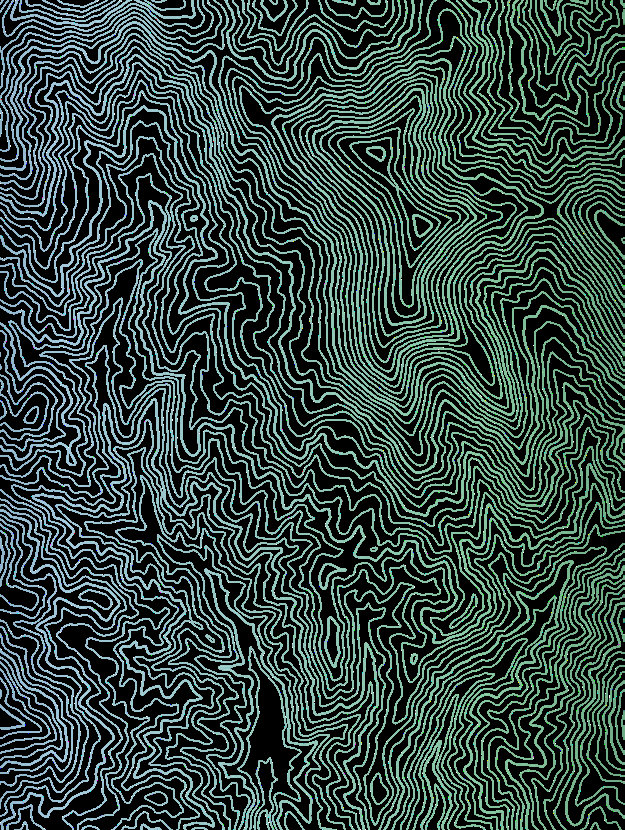
The primary graphic element within the ASA
brand is the topographic map of the sea bed.
This can be used in either white or the gradient
version incorporating the brand colours. It
can be used on it’s own or in conjunction with
photography.
Australian Submarine Agency Brand Guidelines / 17
DELIMITER DEVICE
The Delimiter Device within the ASA brand
refers to the angle that can be used to separate
different graphic elements within the brand. The
angle follows the ‘A’ in the ASA Letter Mark. It can
be used to divide the page or separate text from
imagery or other elements. It can be used as a
shape container to hold text, texture or imagery.
To create the Delimiter Device in InDesign or
Illustrator, use the path below.
Shear angle: Object – Transform – Shear (+/- 25.5)
115.5°
115.5°
If you are using as a line then use a rotation
of +/- 64.5°
Examples of different applications can be found
in the BRAND IN APPLICATION section of the
Brand Guidelines.
64.5°
64.5°
25.5
-25.5
Australian Submarine Agency Brand Guidelines / 18
 IMAGERY


 IMAGE USAGE
Images are an important part of the ASA brand as
they are the primary way of promoting what we do.
Images can be used in either colour or greyscale.
If the job is being professionally designed
it is preferred imagery be blended into the
background using software blend modes and
transparency. This softens the imagery and
helps it sink into the background a little. The
use of ‘Gradient feather’ is also a useful tool for
achieving the dissolving effect which offers a nod
to a radar sweep.
The brand is most effective when primary image
is used. Multiple images can be used but it is
preferrred to stick with a single image.
Imagery can be used either separately or in
conjunction with the ASA topographic seabed
texture.
Some examples of image use appear opposite.
When selecting images for any product, you must
ensure you know the origins of the image and have
the appropriate approvals to use it in your product.
PERSONNEL IDENTITY
PROTECTION
All names should be removed from personnel
badges via Photoshop or whatever image
manipulation tool is in use to protect the identity
of personnel appearing on collateral.
Australian Submarine Agency Brand Guidelines / 20
 BRAND IN
APPLICATION

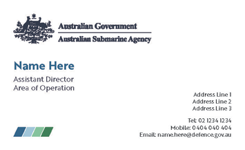
 BUSINESS CARD
Australian Submarine Agency Brand Guidelines / 22

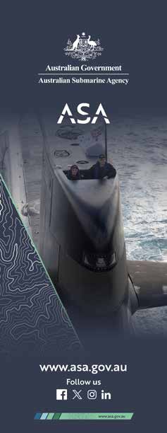
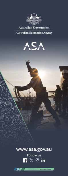
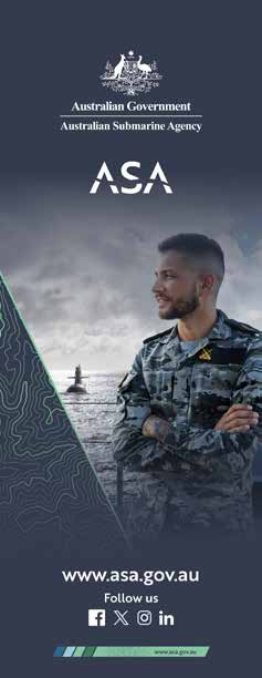
 PULL-UP BANNERS
Australian Submarine Agency Brand Guidelines / 23


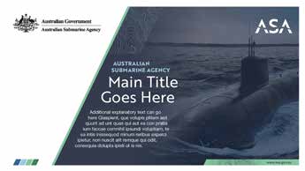
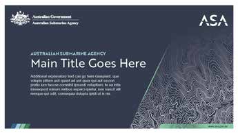
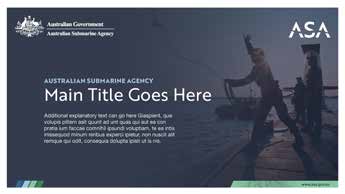
 POWERPOINT TEMPLATE
Australian Submarine Agency Brand Guidelines / 24
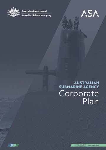
 DOCUMENT COVER
Australian Submarine Agency Brand Guidelines / 25

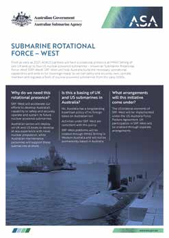
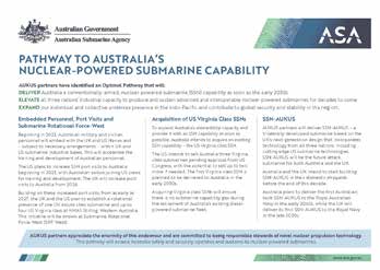
 FACT SHEET
Australian Submarine Agency Brand Guidelines / 26


 EMAIL HEADERS
AND FOOTER
Australian Submarine Agency Brand Guidelines / 27
 MEDIA WALL
Australian Submarine Agency Brand Guidelines / 28


Australian Submarine Agency Brand Guidelines / 29


www.asa.gov.au
Document Outline
