Brand Toolkit
March 2023
Housing Australia
Logo
March 2023
1
Language and Tone
Our purpose
Our persona
Our tone
Our purpose is to
Our corporate persona is one of ambition, collaboration,
Our overall tone of voice is professional.
expertise, and accountability.
improve housing
When in doubt, choose language and tone that is:
Our persona reflects the outlook and posture for
• clear and direct
outcomes for all
communications. It is not the same as our tone of voice, or
• neutral (i.e. relies on facts, not opinion-based, balanced)
our values.
• respectful (use inclusive language, don’t speak
down to people)
Australians.
We are ambitious
• appropriate (not overly formal nor informal)
We strive for excellence. We are led by our purpose, and we
work towards big picture goals.
All content should educate, guide, speak the truth, be
bipartisan, and treat readers with respect.
We are joiners
We facilitate collaboration across our stakeholders, to
Acronyms are an unfortunate necessity. When using
explore new and innovative solutions and ways of working.
acronyms, consider how to make your content clear, useful,
appropriate and respectful to all readers.
We are experts
We are experts in what we do: providing finance, support
For more information, refer to the Style guide.
and research to enable more social, market and affordable
housing in Australia.
We are doers
We are driven by outcomes, and we get things done. We
embrace change and opportunities to grow.
Housing Australia
Language and tone
March 2023
2
A significant component of
our transition from NHFIC to
Housing Australia is the
introduction of a new logo.
Apart from the new words and a
simplified rendition of our ‘dual
homes’ icon, most aspects of our
identity remain the same.
In order to minimise any disruption
associated with the change of
our brand, our new logo shares
the same sizing attributes and
proportions of the existing NHFIC
logo, making its replacement on
digital and print communications
as seamless as possible.
Housing Australia
Logo
March 2023
3
The new Housing Australia logo
Primary logo
Navy
Mono
Reversed
Secondary horizontal
Navy
Mono
Reversed
Housing Australia
Logo
March 2023
4
Our lockup
Primary lockup
Colour
Mono
Secondary lockup
Colour
Mono
Housing Australia
Lockup
March 2023
5
Clearspace + minimum size
How to use our logo
Clearspace
Minimum size
Do not:
Be mindful of minimum sizing.
• Recolour the logo
On A4 printed materials, the minimum height
• Stretch or modify the
for the Housing Australia Master logo is
proportions of the logo
20mm. It is 15mm for the Housing Australia
• Use the logo icon as a graphic element
Logo with acronym.
• Place the logo against busy backgrounds,
Smaller logo sizes (whether visual or
or too close to other objects or logos
contextual) may not be accessibility compliant.
20mm
15mm
The clearspace around the logo is dictated
by the distance between the ‘H’ of ‘Housing’
and the wall of the house icon.
Housing Australia
Clearspace
March 2023
6
Our colours
The Housing Australia colour palette represents Australia,
its landscapes, our origins, and our future focus on
housing solutions.
Navy blue is used as our primary brand colour , referencing
Housing Australia’s ties to the Australian Government as a
corporate Commonwealth entity and its first colour palette.
The remaining colours are intended to evoke:
• Residential housing
• Urban, coastal and inland scenery
• Construction and building materials
Housing Australia
Colours
March 2023
7
Primary colours
The Housing Australia colour palette has been divided into
primary, secondary and accent colours.
The primary palette develops the hero colour of
Navy, which contrasts with the warm tone of Sun,
and introduces the bright Aqua shade.
The colour palette also permits tints and shades
of the core colours. This is useful when creating
PMS 072
illustrations, charts or infographics
C100 M90 Y0 K7
R16 G6 B159
NAVY
NA
HEX #10069F
80%
60%
40%
20%
PMS 130
C0 M32 Y100 K0
R242 G169 B0
SUN
HEX #F2A900
80%
60%
40%
20%
PMS 2227
C60 M0 Y16 K0
R89 G190 B201
AQUA
HEX #59BEC9
80%
60%
40%
20%
Housing Australia
Colours
March 2023
8
Secondary and accent colours
How to use our colours
Secondary colours
• Less is more. For most contexts, you should only use
primary colours, with black and white.
• When using more than the primary colours, primary
colours should comprise the majority of visual space.
• This means elements in primary colours should
C0 M0 Y0 K70
outnumber or take up more space than elements in
R77 G77 B77
secondary or accent colours (excepting black
CONCRETE
HEX #4D4D4D
80%
80%
40%
20%
and white).
• Accent colours should be used sparingly. They are
most useful to provide contrast.
• The colour palette also permits tints and shades of
the secondary and accent colours. This can be useful
when creating illustrations, charts or infographics.
PMS 291
• Be mindful of accessibility, particularly when using
C38 M4 Y0 K0
Aqua, Sun and Sky for typography on lighter coloured
R155 G203 B235
backgrounds.
SKY
HEX #9BCBEB
80%
60%
40%
20%
PMS 327
C100 M0 Y59 K13
R0 G134 B117
GRASS
HEX #008675
80%
60%
40%
20%
Accent colours
PMS 2238
C98 M6 Y30 K41
R0 G105 B117
OCEAN
80%
60%
40%
20%
HEX #006975
PMS 7622
C0 M98 Y77 K37
R147 G40 B44
BRICK
HEX #93282C
80%
60%
40%
20%
Housing Australia
Colours
March 2023
9
Typography
Our primary typeface is Proxima Nova.
This typeface conveys modernity, efficiency and a
down-to-earth nature, reinforcing our identity and persona.
Typography
The Proxima Nova type family was chosen for its versatility
The Proxima Nova type family was chosen for its versatility,
,
legibility, ease of use
legibility, ease of use , and contemporary feel.
, and contemporary feel.
Guidance on the different fonts:
Proxima Nova Regular
• Main headlines, body copy, quotes, intro paragraphs.
Aa
Guidance on the different fonts
Bb
Aa
Bb
• Pro
Pro xima Nova Regular: main headlines, body copy
xima Nova Semi Bold/Bold/Extrabold
,
Proxima Nova Regular
Proxima Nova Condensed Regular
• quotes, intro paragraphs.
Heading levels, secondary body copy to highlight
abcdefghijklmnopqrstuvwxyz
information.
abcdefghijklmnopqrstuvwxyz
• Proxima Nova Semi Bold/Bold/Extrabold: heading
ABCDEFGHIJKLMNOPQRSTUVWXYZ
ABCDEFGHIJKLMNOPQRSTUVWXYZ
Proxima Nova Condensed Regular/Bold
• levels, secondary body copy to highlight information.
1234567890!@#$%^&*()_+=’”.,;:
Infographics, tables, figures, mid or low level headings,
1234567890!@#$%^&*()_+=’”.,;:
• Proxima Nova Condensed R
information.
egular/Bold
secondary body copy to highlight small paragraphs of
: infographics,
Proxima Nova Bold
tables, figures, mid or low level headings, secondary
Proxima Nova Condensed Bold
body copy to highlight small
Other variations including Pro
paragraphs of information.
xima Nova Light and Italic
abcdefghijklmnopqrstuvwxyz
abcdefghijklmnopqrstuvwxyz
versions should be used sparingly, as appropriate.
ABCDEFGHIJKLMNOPQRSTUVWXYZ
ABCDEFGHIJKLMNOPQRSTUVWXYZ
Other variations including Proxima Nova Light and Italic
Fallback fonts:
1234567890!@#$%^&*()_+=’”.,;:
1234567890!@#$%^&*()_+=’”.,;:
versions should be used sparingly
In cases where you can’t use Pro
, as appropriate
xima Nova,
.
try commonly available fonts in this order:
Fallback fonts
In cases where you can
• Helvetica Neue
’t use Proxima Nova,
Proxima Nova Light
Proxima Nova Condensed Regular
• Helvetica
try commonly available fonts in this order:
• Arial
Proxima Nova Light Italic
Proxima Nova Condensed Regular Italic
• Helvetica Neue
Proxima Nova Regular
Proxima Nova Condensed Semi Bold
If you are working on a digital platform, you can also select
the default san-serif for that platform.
Proxima Nova Italic
• Helvetica
Proxima Nova Condensed Semi Bold
Proxima Nova Semi Bold
• Arial
Proxima Nova Condensed Bold
Proxima Nova Semi Bold Italic
Proxima Nova Condensed Bold Italic
If you are working on a digital platform, you can also select
Proxima Nova Bold
Proxima Nova Condensed Extrabold
the default san-serif for that platform.
Proxima Nova Bold Italic
Proxima Nova Condensed Extrabold Italic
Proxima Nova Extrabold
Proxima Nova Extrabold Italic
Housing Australia
Typography
March 2023
10
NHFIC
Typography
April 2022
8
Sample typography
Typography
Sample typography
This is a sample of heading levels in use for printed
This is a sample of heading levels in use for printed
documents, using the brand type and colours.
documents, using the brand type and colours.
Head 1:
Templates and layouts will vary based on the
Templates and layouts will vary based on the
audience and purpose of the content, as well as its
audience and purpose of the content, as well as its
primary channel.
Proxima Nova Regular
primary channel.
Please be mindful of minimum sizes for accessibility
Please be mindful of minimum sizes for accessibility.
.
Intro paragraph or subhead:
Quote text: Proxima Nova Extrabold
Proxima Nova Regular
“Cras faucibus, dui eget blandit bibendum,
mauris mauris lobortis odio, a congue ligula
Quote text: Proxima Nova Extrabold
nunc quis ligula. Sed ac nisl suscipit, pharetra
Head 2: Proxima Nova Bold
felis non, fermentum elit. In libero lectus,
porttitor sit amet arcu vel, efficitur eros.”
“Cras faucibus, dui eget blandit bibendum,
Body text: Proxima Nova Regular
mauris mauris lobortis odio
Quote credit: Pro
, a congue ligula
xima Nova Condensed Semibold
Lorem ipsum dolor sit amet, consectetur adipiscing elit. Proin efficitur sapien
nunc quis ligula. Sed ac nisl suscipit, pharetra
ac leo maximus, aliquam maximus orci vulputate. Pellentesque interdum
felis non, fermentum elit. In libero lectus,
Fusce feugiat sagittis diam et sodales.
porttitor sit amet arcu vel, efficitur eros.”
Head 3: Proxima Nova Bold
Quote credit: Proxima Nova Condensed Semibold
Head 4: Proxima Nova Bold
Table/Figure head: Proxima Nova Bold Condensed.
Table text: Proxima Nova Regular/Bold
Header
Header
Subhead
Subhead
Subhead
Subhead
Table text
0
0
0
0
Table text
0
0
0
0
Table text
0
0
0
0
Housing A
NHFIC
ustralia
Typography
Typography
March 2023
April 2022
9
11

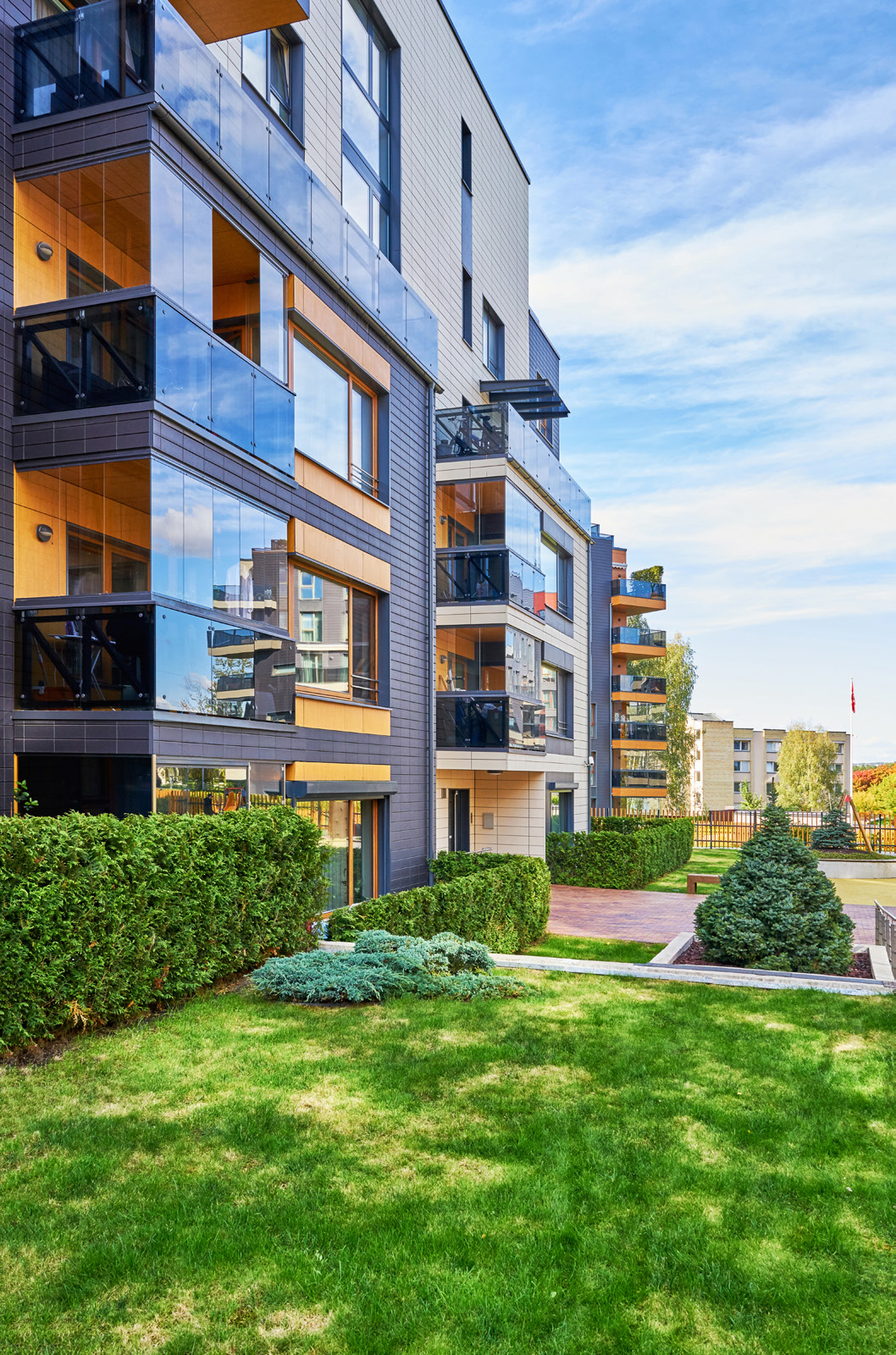
 Imagery plays an important role in maintaining a
Images
Imagery plays an important role in maintaining a
Images
Images should also convey and reinforce NHFIC
consistent look and feel, so that materials reflects the
themes and strategic aspirations, such as:
overall brand.
• Home ownership for the average Australian
• Families and communities
• Infrastructure, nation building, housing
development, urban planning
Images
• Responsible investment, sustainability, social
impact
A good image should:
Imagery plays an important role in maintaining a
consistent look and feel, so that materials reflects
Be simple and tell a story
theoverall brand.
The message should be clear, unambiguous, and relatable
Images should also convey and reinforce Housing
to a variety of audiences.
Australia
themes and strategic aspirations, such as:
Be versatile
• Home ownership for the average Australian
• Families and communities
High resolution is better
• Infrastructure
. It is preferred for the subject to be
, nation building, housing development,
in the centre, as it mak
urban planning
es it easier to crop the image and use
it in different formats and channels.
• Responsible investment, sustainability, social impact
A good image should:
Be unique, or reference another brand element
Avoid generic stock images. If you are using simple or
Be simple and tell a story
The message should be clear, unambiguous, and
common stock images, consider doing an image reverse
relatableto a variety of audiences.
search, and adding other brand elements.
Be versatile
High resolution is better. It is preferred for the subject to
be in the centre, as it makes it easier to crop the image
Do not use:
and use it in different formats and channels.
• Images we don’t have permissions or rights to use
Be unique, or reference another brand element
• Images that could be seen as political materials
Avoid generic stock images. If you are using simple or
common stock images, consider doing an image reverse
• Images of people who are (or appear) unhappy or
search, and adding other brand elements.
or uncomfortable
Do not use:
• •Images tak
en from extreme camera angles or
Images we don’t have permissions or rights to use
•perspectives, or with strange/unnatural environments
Images that could be seen as political materials
• Images of people who are (or appear) unhappy
• Images with very dark or overexposed lighting
or uncomfortable
• Images taken from extreme camera angles or
• Images with elements not associated with Australia.
perspectives, or with strange/unnatural environments
•Please check whether safety clothing, construction
Images with very dark or overexposed lighting
•equipment, skylines or natural landscapes are
Images with elements not associated with Australia.
identifiable to other countries.
Please check whether safety clothing, construction
equipment, skylines or natural landscapes are
identifiable to other countries.
Housing A
NHFIC
ustralia
Images
Images
March 2023
April 2022
10
12


 Graphics
Graphics help images and content emphasise our
message and brand story.
We use simple and solid geometric shapes to
represent housing. The squares, rectangles, frames
and triangles are intended to evoke bricks, walls,
architecture, windows and roofing.
future tagline goes here
State of the
Corporate
Nation’s Housing
Plan
Graphics should always:
• Focus the reader’s attention
• Create movement and visual interest
• Support the key message of the content
While there are exceptions, as a general rule, do not:
• Recreate, use, or extend the logo icon as a graphic
element or shape
• Point triangle shapes in many different directions. The
triangle/roof shape should always be pointing towards
the main piece or pieces of content.
• Use shading and gradients arbitrarily
Name
• Place graphic elements on main subjects, or on
Position
people’s faces
xxxx@xxxxxxxxxxxxxxxx.xxx.xx
22–
Mobile contact
Export House, 22 Pitt Street
Sydney NSW 2000
22–
housingaustralia.gov.au
23
1800 549 767
23
Housing Australia
Graphics
March 2023
13


 Graphics
Graphics help images and content emphasise our
message and brand story.
We use simple and solid geometric shapes to
represent housing. The squares, rectangles, frames
and triangles are intended to evoke bricks, walls,
architecture, windows and roofing.
Graphics should always:
State of the
Corporate
• Focus the reader’s attention
• Create movement and visual interest
Nation’s Housing
Plan
• Support the key message of the content
While there are exceptions, as a general rule, do not:
• Recreate, use, or extend the logo icon as a graphic
element or shape
• Point triangle shapes in many different directions. The
triangle/roof shape should always be pointing towards
the main piece or pieces of content.
• Use shading and gradients arbitrarily
• Place graphic elements on main subjects, or on
people’s faces
22–
22–
23
23
Housing Australia
Graphics
March 2023
14
Sample icons and infographics
Icons and infographics
Icons and infographics
Tips for icons
• Ensure the icons help tell a story.
• Less is more. Icons should be simple and recognisable.
Be mindful of cultural norms.
• Icons can feature backgrounds, though recommend a
maximum of two colours.
• Do not use emojis instead of icons.
Tips for icons
• Use mono versions of branded icons where possible
(e.g. logos of social media companies)
Ensure the icons help tell a story.
1.7m
• For accessibility, consider if detail is lost or distracting in
Am I
Rental affordability:
L different conte
ess is more xts and channels.
. Icons should be simple and
net new
households
eligible?
NSW, Qld and Vic
Tips for infographics and statistics
recognisable. Be mindful of cultural norms.
• Brevity matters. Be concise. Start with the lead.
• Write interesting titles.
Icons can feature backgrounds, though
• Cut out words that don’t help an average reader
recommend a maximum of two colours.
COMMUNITY
FAMILY HOME GUARANTEE
RESEARCH
understand the point of the message.
• Use facts and data to back up your claims.
Do not use emojis instead of icons.
• Edit for overall user experience. Ensure there is enough
negative space. Too much content can be overwhelming
Use mono versions of branded icons where
and counterproductive.
possible (e.g. logos of social media companies)
For accessibility, consider if detail is lost or
distracting in different contexts and channels.
Tips for infographics and statistics
up 5.5%
$460k
4,900
Brevity matters. Be concise. Start with the lead.
social housing
The average first
new dwellings
Write interesting titles.
stock yoy
home buyer debt
supported
Cut out words that don’t help an average reader
understand the point of the message.
HOUSING SUPPLY
BOND OUTCOMES
FIRST HOME BUYERS
Use facts and data to back up your claims.
Edit for overall user experience. Ensure there is
enough negative space. Too much content can
Housing Australia
Application
March 2023
15
be overwhelming and counterproductive.
NHFIC
Icons and infographics
April 2022
12
Accessibility
Accessibility is a design principle, a good
corporate practice, and a mandatory standard
for many government agencies.
What is accessibility?
What good accessibility looks like
General tips for good accessibility
Accessibility is about removing barriers that people with
In writing
• Write clearly and simply
disabilities or restrictions might experience.
• Can someone without deep expertise understand what
• Avoid long sentences (20 to 25 words at most)
• this is, what it does/says, and who its intended for?
• Minimise acronyms, avoid jargon and slang
However, accessibility is not just about people with
• Are you using headings, subheadings and paragraphs?
• Provide informative, unique page titles
permanent disabilities. People can have permanent
• Are the sentences long? Are there many acronyms?
• Use headings and subheadings to convey hierarchy,
disabilities, temporary disabilities, situational
• Is it easy to find something, or to skim?
meaning and structure, and to guide levels
impairments, or socio-economic restrictions.
• Make linking text and call to actions meaningful and
In visual design
versatile (e.g. “on the right” is not good for responsive
For example, captioning on videos is helpful for all
• Do the elements – text, graphics, images, icons
digital formats)
people, whether you’re on a train without headphones
infographics etc – look cohesive and organised?
• Write meaningful alt text for images, and provide
or if you have a hearing impairment.
• Is it cluttered or busy? Is there enough negative space?
transcripts and captions for multimedia
• Is any element too dominant or distracting?
• Be mindful of how visual elements may clash or distract
Good accessibility is a proactive exercise in design and
• Do the colours provide good contrast?
• Avoid poor colour combinations – for example, white text
empathy. Accessibility should not be purely a checklist
on light blue background, or red and green graphs
or ‘tick box’ compliance activity.
In products, digital and physical
• Avoid font sizes smaller than 9pt for body copy, or 8pt for
• Does this cater to all users?
captions and footnotes
Under the
Disability Discrimination Act 1992,
• Can a person with limited or no training figure it out?
information and services must be provided in a
• For digital, can users have a consistently good
nondiscriminatory accessible manner.
experience, regardless of their device, internet speed or
technology literacy level?
Web content accessibility standards also exist,
developed under the Web Accessibility Initiative of the
World Wide Web Consortium (W3C).
Housing Australia
Accessibility
March 2023
16
Questions?
Contact Corporate Affairs Team
National Housing Finance and Investment Corporation
xxxxxxxxx@xxxxxxxxxxxxxxxx.xxx.xx
Housing Australia
Logo
March 2023
17