

 Style Guide
Guidance on writing and presentation of
documents
September 2023

 Quick Reference Guide
OIGAC’s font is Calibri for all documents (size 11) (except graphics and typeset documents)
All approved styles are built into the templates. Please use these when constructing a document.
All content for web publishing needs to be submitted to the Enquiries, Engagement, and
Communications Section for style review to ensure accessibility.
General Style
Titles:
Heading 1:
Heading 2:
Heading 3:
Body:
Reports and reviews will follow their respective template formats.
For document titles use title case (capital for all words except joining words [and, or, of, etc]).
Use sentence case (initial capital then lower case unless proper noun) for all other headings and text.
Use one space after a full stop.
Use Australian English spelling.
Use the oxford comma.
For any advice on writing, please see the APS Style Manu
al at stylemanual.gov.au.


 Visuals
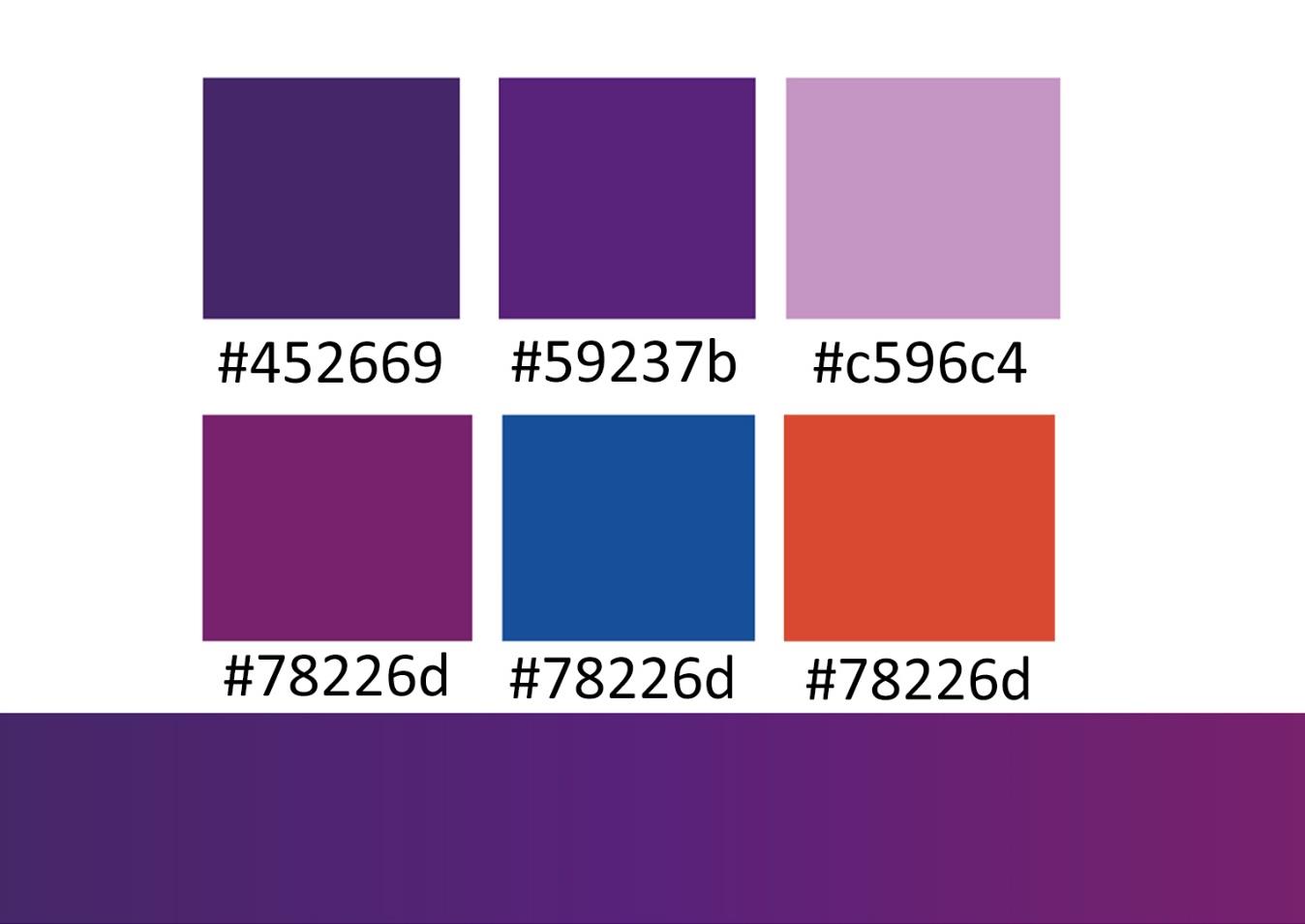
Presentation and Corporate Colours
Visuals
Presentation and Corporate Colours
Templates are available with inbuilt approved styles and the corporate colour palette, making it easy
for staff to create attractive, professional, consistent, and accessible documents.
These are available on Sharepoint in the Templates folder.
It is recommended that staff limit the use of colours to the corporate palette, but the order in which
they are used can be changed to suit the content or highlight information in the chart.
The approved Inspector-General of Aged Care logo should be used on all communications.
For guidance on how to apply the Australian Government logo, consult the Australian Government
Branding Guidelines on use of the Australian Government logo by Australian Government
Departments and Agencies.
The guidelines are available at:
https://www.pmc.gov.au/sites/default/files/publications/Australian_Government_Branding_Design
_ Guidelines.pdf
Corporate Colour Palate

 Using tables
Use a table only if there isn’t a simpler way to present your content, such as a list, paragraph of text
or diagram. Use tables for exact values and information that is too detailed for the text.
Tables can be difficult to understand for people using assistive technologies, both on web pages and
documents. Only use them to present tabular data, such as a table showing a breakdown of visitor
numbers to Parliament House, and not to control the way your information appears on a page.
Images
Include a short caption for all informative images, including diagrams. Users need images to have alt
text for different purposes. Decorative images do not require a caption.
• Screen readers read out alt text to tell a user what’s in it and why it’s there.
• Browsers and mobile devices display captions to tell a user with a slow internet connection or
limited data about an image that isn’t displayed.
Write captions that conveys the same important information as the image.
Don’t write something in the caption that a user can’t learn from seeing the image or reading the
caption or title.
Titles and captions don’t need to be a complete sentence. Other grammar and punctuation rules for
titles and captions are:
• Capitalise the first word and proper nouns only.
• Don’t use a full stop to end the title or caption, even if it is a complete sentence.
Don’t repeat the information provided by the image and alt text. This prevents users of screen
readers from hearing the same information twice.
If the caption or nearby text already explains the informational image, you might use a very brief
caption.
Video and audio
Provide transcripts and captions for all videos. Video footage and audio files should include a
transcript of what people are saying for hearing impaired viewers (for example, ‘Security guard says
to visitor, “Please display your pass at all times”’). They should also have captions of the action for
vision-impaired viewers (for example, ‘Woman fills in form; security guard hands over access pass
and opens barrier’). Captions and transcripts ensure all viewers are able to experience video and
audio files as the content can be read/read out.

 Text
Text
Accessibility
The main pillar of good writing is to consider your audience. When writing for a broad public
audience, you should keep in mind that some readers may have a low-level of literacy and find it
hard to read and understand large amounts of text.
Australia also has a culturally and linguistically diverse population. Many immigrants and Indigenous
Australians speak English as a second language, so it is important to write inclusively and in plain
language.
Headings
Headings should accurately and succinctly describe the content and sections on the page to help
readers find the information they want.
Headings must be strictly hierarchical (nested)—you cannot jump from heading 1 to heading 3. This
is to assist screen reading technology, which can jump between headings.
Yes:
Heading 1
Heading 2
Heading 3
Heading 2
No:
Heading 1
Heading 3
Heading 2
Avoid using unnecessary punctuation in headings.
Text formatting
Bold, italics, underline, and capital letters should be kept to a minimum. Italics are more difficult to
read onscreen and ALL CAPITALS IS LIKE SHOUTING, so be careful not to use them any more than
absolutely necessary.
• Bold should be used for headings and sparingly to emphasise important information like dates or
important instructions.
• Italics should only be used to denote formal titles of legislation or titles of publicly released
publications.


• Underlining should be used for hyperlinks only.
• Capitals should be kept to a minimum—use for acronyms/abbreviations and proper nouns only.
• Coloured text and a mix of different fonts can interfere with the readability of a page (particularly
for vision-impaired readers), and may not be presented the same way on different browsers. Don’t
use colour or different fonts as the sole way of differentiating text onscreen.