2024 Brand
Style Guide
Australian Institute of Aboriginal and Torres Strait Islander Studies
link to page 3 link to page 6 link to page 10 link to page 20 link to page 23 link to page 27 link to page 32
Contents
Our strategy
3
Brand management
6
Our logo
10
Our fonts
20
Our colours
23
Our elements
27
Our icons
32
2
Our strategy
3
Who we are
Our vision is a world in
We are the leading institute on the research and preservation of Aboriginal and Torres Strait Islander
which Aboriginal and
history and culture.
Torres Strait Islander
• Our collection represents the diversity of Aboriginal and Torres Strait Islander communities.
peoples’ knowledge and
• By being open and accessible, we promote better understanding and respect of Indigenous cultures
and heritage.
cultures are recognised,
• We hold high standards in ethics across our research, publishing and management
respected, celebrated
of Indigenous collections.
and valued.
• Working with us means working with responsive and professional people who are culturally competent.
4
Our mission is simple,
yet profound.
Tell the story of Aboriginal and
Torres Strait Islander Australia.
Tell
Create
C
opportunities
Shape our
Our mission
re
for people
national
a
ape
and what
to encounter,
t
narrative.
h
e
engage with and
S
we do
be transformed
by that story.
t r o p p u S
Support and facilitate
Aboriginal and Torres Strait
Islander cultural resurgence.
5
Brand
management
6
Our brand needs to reflect our purpose.
Our brand is important,
• We tell the story of Aboriginal and Torres Strait Islander Australia.
it is a reflection of who we
• We create opportunities for people to encounter, engage with and be transformed by that story.
are, where we want to be,
• We support and facilitate cultural resurgence.
and how people see us.
• We shape the national dialogue, for a nation that respects and values our oldest living cultures.
Ensuring the AIATSIS brand is used correctly is everyone’s responsibility.
We need to be consistent in our application of the brand, and embody it in everything we do. Just like
our commitment to operate cohesively as a single entity embodying the concept of Yindyamarra.*
* Yindyamarra is a Wiradjuri word meaning honour and respect. More broadly it implies thoughtfulness,
graciousness and kindness.
7
The CEP team is responsible for ensuring the correct and consistent application
The Communications,
of the AIATSIS brand for the organisation.
Events and Publishing
External facing outputs and activities include:
team manages the
• Online channels (websites, social media)
AIATSIS brand and
• Printed collateral
external facing outputs
• Publications
and activities that reflect
• Events and conferences
our organisation’s
• Media and public engagements
identity, values and
• Maraga (AIATSIS building) signage, foyer and public spaces
strategic direction.
• AIATSIS Central Australia facility
Please ensure any external facing outputs are cleared by the Communications,
Events and Publishing team prior to publication.
It is important to consider this whenever you are undertaking or producing work that engages with
anyone outside of the organisation. Incorrect and inconsistent application of the AIATSIS brand dilutes
and weakens our position as a trusted and valued organisation.
Please engage the Communications, Events and Publishing team at the start of projects rather than
at the end. This will ensure we work together, plan and co-ordinate with other organisational activities
and value add.
8
Here are a few key messages we heard from our users, audiences and communities
Community and user
during our concept testing process:
engagement
• ‘Cultural safety’ and ‘cultural protection and preservation’ were seen as paramount to what
the AIATSIS brand needs to communicate.
• Externally, there is a strong desire for AIATSIS to be seen as more open and accessible,
modern and vibrant.
‘AIATSIS is an important intermediary between non-government and government,
brokering linkages and contact.’
‘Although we don’t know the full story of the Shield, its story is there, it’s waiting
to be told.’
‘AIATSIS means to be coming together, educating people about us. We are all one
big community.’
9
Our logo
10
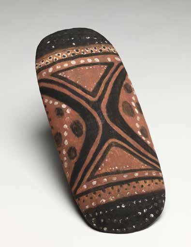
The history of our logo
George Wilson, Claude Ponto and John William Malcolm created the
Koko Bera-Kungen Shield that the AIATSIS logo is derived from and it
was adopted by the Institute’s first Council in 1963.
The brand consultations informed us the story of the Koko Bera-Kungen
Shield is inextricably linked to the history of AIATSIS and must be told.
The AIATSIS Council were unanimous in their decision to continue using
the shield as our logo.
AIATSIS has recently established a connection with the families of the
makers of the shield and they visited AIATSIS in December 2019.
Research is ongoing with the family and the Communications and
Curatorial teams are working together to develop the story of the shield.
The history of our logo
1960-80s
1990s
2000s
2015
11
The primary logo may be used on white or the light teal brand colour (see page 24 for colour breakdown).
Our primary logo
Reversed logos to be used on solid black only.
Primary logo
Reversed primary logo
Horizontal logo
Reversed horizontal logo
12
Our mono logo
The mono logo may be used on white, dark teal, light teal or the light orange brand colours
(see page 24 for colour breakdowns). Reversed logos to be used on solid brand colours only.
Mono logo
Reversed mono logo
Horizontal mono logo
Reversed horizontal mono logo
13
Only to be used with permission from the Communications, Events and Publishing team. This logo is not our
Our logo – official
primary logo and should only be used when the full acronym is an absolute requirement.
government use
Primary logo
Mono logo
Reversed logos
Horizontal logo
Horizontal mono logo
14
Minimum size primary logo
Minimum size government use logo
Logo use – minimum size
and clear space
25mm
45mm
26mm
45mm
• The logo must be displayed with a clear area around it which is free from other graphic elements.
• The clear space is shown below in red and is to be maintained as the logo scales.
• The clear space has no specific measurement as the value will change as the logo scales.
• The clear space applies to the entire suite of logos. Always measure from the furthest edge of the logo.
15


Logo use – what not to do
Don’t change colour
Don’t change proportion
Don’t use on images that compromise legibility
Don’t add effects
Don’t use incorrect background colour
Don’t change composition
Don’t rotate
Don’t use shield on its own
Don’t add brand elements
16
Partner logo
Occasionally there may be a need to show our logo next to a partner. Here is a guideline as to how our
logo may sit with a third party logo.
• Make sure the minimum clear space shown below in red is used.
• Consider the partner logos clear space requirements.
• Ensure the logos have the same visual weight.
Primary logo partner use
Horizontal logo partner use
PARTNER
PARTNER
LOGO ZONE
LOGO ZONE
17
Aboriginal Studies Press
The primary ASP logo may be used on white or the light teal brand colour (see page 24 for colour breakdown).
Reversed logos to be used on solid black only.
(ASP) logo
Primary logo
Acronym logo for book spines
Reversed primary logo
Reversed acronym logo
Horizontal logo
Reversed horizontal logo
18
Aboriginal Studies Press
The mono ASP logo may be used on white, dark teal, light teal or the light orange brand colours
(see page 24 for colour breakdowns).
(ASP) mono logo
Mono logo
Acronym logo for book spines
Reversed mono logo
Reversed acronym logo
Horizontal mono logo
Reversed horizontal mono logo
19
Our fonts
20
Primary font – Mulish Regular
Secondary font – Mulish Extra Bold
Our fonts
Used for body copy and headlines
Used for body copy and headlines where emphasis
is needed
Mulish Regular
Mulish Extra Bold
ABCDEFGHJKLMN ABCDEFGHJKLMN
OPQRSTUVWXYZ
OPQRSTUVWXYZ
abcdefghjklmn
abcdefghjklmn
opqrstuvwxyz
opqrstuvwxyz
1234567890
1234567890
Mulish is a free google font that can be used across all applications and has been installed on your system
by Digital Services. Mulish is available for free from
Google Fonts if it is unavailable on your computer.
Mulish should be used in all instances where possible. If unavailable please use Arial Regular, Bold and
Black for general business use.
Arial Regular /
Arial Bold / Arial Black
21
Our feature font
Westfalia V.2
Is available to the Design and Production team for use in headlines and featured text where emphasis
is needed. It should be used sparingly and consistently in a design.
The font should be used in upper case only.
WESTFALIA V.2
Regular
ABCDEFGHJKLMN
OPQRSTUVWXYZ
1234567890
22
Our colours
23
Our brand colours have been defined in templates to ensure consistent colour usage. Please use the below
Brand colours
swatches and colour breakdowns for the relevant application when using our brand colours.
C 0 M 71 Y 82 K 0
C 0 M 28 Y33 K0
C 71 M 0 Y 31 K 0
C 28 M 0 Y 12 K 0
R 243 G 107 B 60
R 251 G 194 B 164
R 31 G 188 B 188
R 181 G 225 B 225
HEX #F36B3C
HEX #FBC2A4
HEX #1FBCBC
HEX #B5E1E1
C 0 M 0 Y 0 K 0
C 0 M 0 Y 0 K 100
R 255 G 255 B 255
R 0 G 0 B 0
HEX #FFFFFF
HEX #000000
24
Additional colours for
Used for
Used for
‘hover state’
‘hover state’
functional website use
R 200 G 75 B 39
R 0 G 131 B 131
HEX #C84B27
HEX #008383
R 238 G 238 B 238
R 112 G 112 B 112
BLACK GRADIENT
HEX #EEEEEE
HEX #707070
TRANSPARENT
OVERLAY
0% TO 15%
25
Accessibility – background
12pt
12pt
12pt
12pt
12pt
and text colour
AA compliant
AA and AAA compliant
AA and AAA compliant
AA and AAA compliant
AA and AAA compliant
18pt
18pt
18pt
18pt
18pt
AA and AAA
AA and AAA
AA and AAA
AA and AAA
AA and AAA
compliant
compliant
compliant
compliant
compliant
18pt
18pt
AA
AA
compliant
compliant
only
only
12pt
12pt
12pt
12pt
12pt
AA compliant
AA and AAA compliant
AA and AAA compliant
AA and AAA compliant
AA and AAA compliant
18pt
18pt
18pt
18pt
18pt
AA and AAA
AA and AAA
AA and AAA
AA and AAA
AA and AAA
compliant
compliant
compliant
compliant
compliant
When designing content for our brand it should always meet AA and AAA accessibility standards.
The chart above displays the different combinations to ensure the colour contrast of background
and font colours comply with the Web Content Accessibility Guidelines (WCAG).
As tested at
contrastchecker.com on 7 February 2023
26
Our elements
27
Our patterns
Pattern usage is implemented and overseen by the Communications, Events and Publishing team.
The primary and secondary patterns are applied across various collateral alongside brand colours
and should be displayed in a consistent manner. Only one pattern per output should be used within
a design. The patterns must not be displayed in full and shall be enlarged and cropped according
to the design requirements.
Primary pattern
Secondary patterns
28

Pattern usage
Below are example mock-ups of how our patterns may look when applied to various collateral items.
Only one pattern per output should be used within a design. The patterns must not be displayed in full
and shall be enlarged and cropped according to the design requirements.
Pull up banner
A5 booklet cover
Bookmark front
Lanyard
Education Strategy
2021–25
Tell
the story of Aboriginal and
Torres Strait Islander Australia.
Create
opportunities for people to
encounter, engage with and
be transformed by that story.
Support
and facilitate
Aboriginal and Torres Strait
Islander cultural resurgence.
21_098 Nomad Girl bookmark_74x210mm_D01.indd 1
28/10/2021 8:12:59 AM
Shape
Web banner
Social post
our national narrative.
aiatsis.gov.au
20_000_AIATSIS_Pull-up banner_850x2000mm_D02.indd 1
4/11/2020 11:03:42 AM
29
Our line and circle
Our line and icon are elements to help support our brand and show the AIATSIS personality. They should be
used sparingly and in a consistent way. Occasionally there may be a need to use a line to separate content.
The line is available in various lengths and should match the proportions of the content it is displayed with.
The circular icon can be used to enclose social media icons, call to action buttons, to contain images or as
a design feature to accompany other brand assets. Only 1-2 brand colours should be used together for the
icons at any one time.
30
Line and icon usage
Business card front
Email signature
Danny Grant Job Title
Danny Grant
Program area
Job title
May run over two
Program area
or three lines
P 02 6129 1234
P 02 6129 1234
M 0405 286 000
E xxxxx.xxxxx@xxxxxxx.xxx.xx
E xxxxx.xxxxx@xxxxxxx.xxx.xx
51 Lawson Crescent, Acton ACT 2601
aiatsis.gov.au
GPO Box 553, Canberra ACT 2601
51 Lawson Crescent, Acton ACT 2601
aiatsis.gov.au
GPO Box 553, Canberra ACT 2601
AIATSIS acknowledges the traditional owners of country throughout Australia and their continuing
connection to land, culture and community. We pay our respects to elders past and present.
Australian Institute of Aboriginal and Torres Strait Islander Studies
Business card back
Social media icons and call to action button
Connect with us
FIND OUT MORE
31
Our icons
32
Icon usage
Our illustrative branded icon suite was created by Waanyi and Kalkadoon woman Keisha Leon from
Leon Design. This unique suite of icons explore conceptual ideas of storytelling that cover a range of areas
at AIATSIS. The icons will be used by the design and production team to visually support our existing brand
in print and digital outputs to connect and communicate with our audiences. Below is a small selection from
the full suite of 44 icons.
Diverse Country
Books and
Learning
and languages
collection material
Collaboration
Country
Support
Advise
Our strategies
33
Contained icons
Below is a selection of the icons in contained format. The irregular circle shape is an extension of the brand
circle. The icons should be used in the brand colours of dark/light teal and black. The circular teal colour
should sit on a background with suitable contrast. The suite of icons will not be available on the intranet
for general use. Please get in touch with the design and production team if you would like to discuss using
them in your next project.
Diverse Country
Books and
Learning
and languages
collection material
Collaboration
Country
Support
Advise
Our strategies
34
All AIATSIS Word doc templates and logos are available
for staf
f via the intranet.
AIATSIS business cards can be ordered by staff as needed.
More information is av
ailable on the intranet.
If you have any questions or require assistance with
the application of the AIATSIS brand, please get in touch
with the Communications, Events and Publishing team
via the
CEP Jira Helpdesk or xxxxxxxxxx@xxxxxxx.xxx.xx
Document Outline