 Brand
Guidelines
December 2024 | INTERIM Version
Contents
Our brand
1
Typography
12
Brand essence, values
and personality
2
Graphic device
13
Tone of voice
Imagery
General principles
3
Useage 14
Copyright 14
Logo
Attribution 15
Variations 4
Cropping 15
Placement and size
5
First Australians imagery
16
Incorrect use
6
Promotion 16
Co-branding
Signage 16
7
Captioning images
17
Colour palette
8
Accessibility 9
Colour breakdowns
10
Charts and diagrams
11
 Our brand
We are the custodians of our nation’s stories,
preserving Australia’s physical and digital
heritage for people to explore today and for
generations to come. We collect, protect,
and share millions of items, making them
accessible to everyone—onsite or online,
wherever they may be.
These updated Brand Guidelines are designed to help us
connect meaningfully with our audiences by presenting a
consistent, trusted, and inspiring identity.
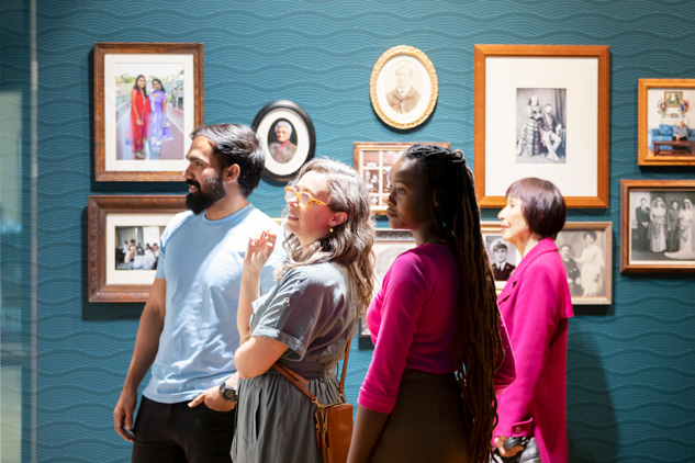
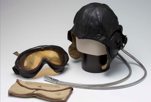
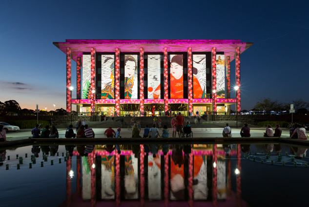
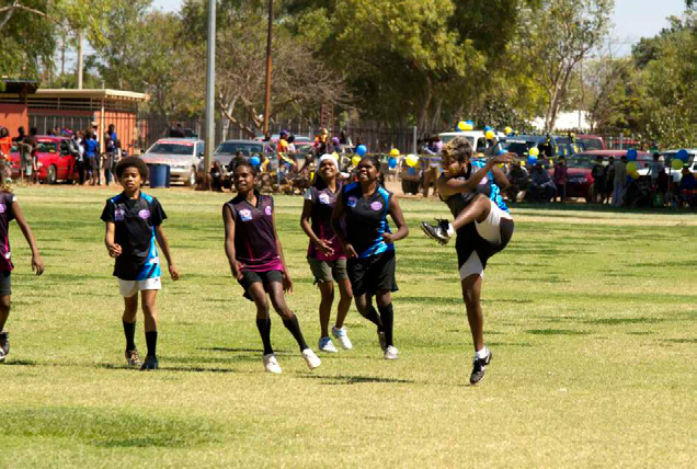
At the heart of our brand is storytelling. From our muted
yet welcoming colour palette, inspired by the building’s
mid-century heritage, to imagery that captures our
extensive collections and the people who engage with
them—every element reflects our purpose.
Whether showcasing behind-the-scenes moments,
vibrant community interactions, or the beauty of our
collections, our visual identity brings the Library’s story
to life.
These guidelines will help you create clear, engaging, and
impactful communications—whether it’s a PowerPoint
presentation, website content, a social media campaign
or wayfinding signage. Together, we can ensure the
National Library’s identity remains as relevant and vital as
the stories we preserve and share.
NATIONAL LIBRARY OF AUSTRALIA BRAND GUIDELINES
OUR BRAND
1
Brand essence
National Library
of Australia
VALUES
Past
Present
Future
Record
Discover
Create
Protect
Share
Understand
Digitise
Access
Sustain
PERSONALITY
Relevant
Welcoming
Vital
Reliable
Impartial
Indispensable
Resourceful
All-embracing
Stimulating
Trustworthy
Helpful
For you
NATIONAL LIBRARY OF AUSTRALIA BRAND GUIDELINES
BRAND ESSENCE: VALUES AND PERSONALITY
2
Tone of voice
GENERAL PRINCIPLES
We are open
We are reliable
We are
& approachable
& resourceful
surprising
We want all visitors to feel welcome at the
We are natural teachers. We are well informed
Every item has a story, and every collection
National Library. We use warm, friendly language
and authoritative without being academic. Our
is filled with countless threads that connect
to help people explore our services and
tone of voice reflects our knowledge, and we
them.
collection with ease.
have fun with language.
We love playing with words to uncover the
As a public institution, we’re here to provide
We depend on our collections and research
funny, surprising, and unexpected tales hidden
a safe space where people can find support,
skills to present accurate information in a
in our archives.
connect with others, and build a sense of
relatable way. We aim to encourage conversation
• Be fun on suitable channels.
community.
and learning.
• Share human-centered stories.
• Use shared pronouns (we, us, our).
• Use relevant and timely references.
• Use humour with purpose and meaning.
• Use positive language.
• Be informed and accurate but humble.
• Inspire curiosity and exploration.
• Ask neutral questions to encourage
• Be patient and encouraging.
• Share how you found something,
conversation.
• Explain clearly and simply.
solved a mystery.
• Use plain English and avoid using jargon.
• Be generous and gracious.
NATIONAL LIBRARY OF AUSTRALIA BRAND GUIDELINES
TONE OF VOICE: GENERAL PRINCIPLES
3
Logo
VARIATIONS
BLACK | PREFERRED
The National Library of Australia logo is the unique
combination of the Library building illustration, open book
symbol and logotype grouped together as shown.
The following pages outline the basic principles needed
to ensure that the logo is always applied both correctly
and consistently across all applications.
The logo only ever appears in
black or reversed
white.
The logo must appear on the cover of all printed material
and on all digital assets.
When the logo is placed over an image or solid colour,
it must be clearly legible.
Vertical
Horizontal
Consider accessibility requirements when placing the
logo on a coloured background—this will determine
whether the white or the black version of the logo is
most appropriate.
WHITE | ALTERNATIVE USE
Vertical
Horizontal
NATIONAL LIBRARY OF AUSTRALIA BRAND GUIDELINES
LOGO: VARIATIONS
4
Logo
PLACEMENT AND SIZE
EXCLUSION ZONE
PRINT
In general, the preferred placement is top left for the
horizontal logo and bottom right for the vertical logo,
however exceptions to this may apply depending on the
constraints of the design.
In all instances the exclusion zone must be applied
as a minimum. More space is preferred.
The recommended size for the logo on printed A4
materials is 30mm wide (vertical logo) and 43mm
wide (horizontal logo). While there is no maximum size
restriction on materials larger than A4, the minimum
The minimum exclusion zone is equal to the height of the ‘B’ in the National Library logo
size it can appear is 15mm wide (vertical logo) and
29mm wide (horizontal).
DIGITAL
RECOMMENDED SIZE (PRINT A4)
MINIMUM SIZE
To meet accessibilty standards please note that the
minimum size for the logo in digital applications
is 45 pixels wide (vertical logo) and 82 pixels wide
(horizontal logo).
Many applications will limit the size of logos in a header
bar. Where not possible to achieve the minimum size
of 45 pixels, please ensure the logo retains clarity of
the Library building, and of the text “National Library of
Australia”. In the event that the building or text become
30mm
15mm / 45 pixels
difficult to see, do not use the logo.
43mm
29mm / 82 pixels
NATIONAL LIBRARY OF AUSTRALIA BRAND GUIDELINES
LOGO: PLACEMENT AND SIZE
5

 Logo
Logo
INCORRECT USE
The logo must be clearly legible at all times and
maintain its integrity.
Do not colour or stretch the logo, or break it up into
individual elements. Do not introduce other wording
or graphic elements to the logo.
The logo may be placed over an image but it must be
clearly legible and should be done in consultation with
the Communications and Marketing team.
Avoid placing the logo over busy areas of an image
Do not separate elements of the logo
THINKERS
WANTED
Do not colour the logo
Do not stretch the logo
Do not add words or introduce
other elements to the logo
NATIONAL LIBRARY OF AUSTRALIA BRAND GUIDELINES
LOGO: INCORRECT USE
6
Co-branding
The National Library brand includes a subset of
co-brands and services as shown on this page.
More information on these brands and external
co-branding guidelines to follow soon.
NATIONAL LIBRARY OF AUSTRALIA BRAND GUIDELINES
CO-BRANDING
7
Colour palette
Our colour palette draws inspiration from mid-century
design, reflecting the building’s heritage. It’s muted yet
inviting, balancing sophistication with warmth.
• There is no primary or compulsory colour, use the
palette consistently to support brand awareness.
• Use sparingly for corporate documents, operational
signage, and the website.
• Add more colour for social media, advertising, and
marketing materials to enhance impact.
• Use colours intentionally and to compliment
chosen imagery.
• Use its versatility to enhance communications with
consideration.
NATIONAL LIBRARY OF AUSTRALIA BRAND GUIDELINES
COLOUR PALETTE
8
Colour palette
ACCESSIBILITY
Making our website accessible ensures that all users,
regardless of their abilities or disabilities, can easily
navigate and interact with the content. This includes
AA
AA
AAA
AA
AAA
AAA
features like alternative text for images, clear fonts and
AA
AA
colours, and clear formatting layouts. Accessibility is
important because it creates an inclusive experience,
helps us meet legal standards, and ensures our website
works well for everyone.
For PowerPoint presentations, use accessible
AA
AA
AAA
AAA
AAA
AAA
templates, readable text, and alt text for images to
AA
AA
ensure inclusivity.
WCAG (Web Content Accessibility Guidelines) sets the
standard for creating accessible digital content, ensuring
it’s usable for everyone. Making our website accessible
includes text size, colour combinations and contrast.
AA
AAA
AAA
AAA
Colour contrasts must meet WCAG 2.1 Level AA at
minimum, with Level AAA preferred. Refer to the colour
contrast chart for accessible combinations.
Denotes regular text.
Denotes large text (minimum 14pt bold or
AAA
AAA
AAA
AAA
18pt regular) and graphic objects (like icons).
NATIONAL LIBRARY OF AUSTRALIA BRAND GUIDELINES
COLOUR PALETTE: ACCESSIBILITY
9
Colour palette
COLOUR BREAKDOWNS
Dark Blue
Mid Blue
Light Blue
Lightest Blue
Pantone 7689C
Pantone 550C
Pantone 552C
Pantone 7457C
CMYK 95, 41, 10, 0
CMYK 42, 7, 8, 8
CMYK 24 ,3, 7, 2
CMYK 18, 0, 5, 0
RGB 46, 134, 171
RGB 150, 194, 215
RGB 201, 225, 234
RGB 217, 238, 244
Hex 2e86ab
Hex 96c2d7
Hex c9e1ea
Hex d9eef4
Dark Teal
Mid Teal
Light Teal
Lightest Teal
Pantone 2241
Pantone 563C
Pantone 565C
Pantone 621C
CMYK 73, 7, 51, 6
CMYK 54, 0, 29, 2
CMYK 30, 0, 18, 0
CMYK 25, 2, 19, 5
RGB 88, 162, 145
RGB 107, 187, 174
RGB 161, 214, 202
RGB 222, 240, 237
Hex 58a291
Hex 6bbbae
Hex a1d6ca
Hex def0ed
Dark Red
Muted Orange
Light Muted Orange
Lightest Orange
Pantone 484C
Pantone 7618C
Pantone 487C
Pantone 489C
CMYK 8, 92, 100, 33
CMYK 12, 63, 72, 0
CMYK 0, 43, 40, 0
CMYK 0, 20, 21, 0
RGB 154, 51, 36
RGB 220, 118, 76
RGB 245, 169, 146
RGB 252, 217, 201
Hex 9a3324
Hex dc764c
Hex f5a992
Hex fcd9c9
Black
White
Muted Yellow
Parchment
CMYK 0, 0, 0, 100
CMYK 0, 0, 0, 0
Pantone 616C
Pantone 7499C
RGB 0, 0, 0
RGB 255, 255, 255
CMYK 10, 5, 49, 6
CMYK 1, 2, 24, 0
Hex 000000
Hex FFFFFF
RGB 228, 220, 149
RGB 255, 247, 210
Hex e4dc95
Hex fff7d2
Warm Grey
Dark Grey
Pantone Warm Grey 10
Mid Grey
Light Grey
CMYK 0, 0, 0, 50
CMYK 24, 34, 35, 60
CMYK 0, 0, 0, 25
CMYK 0, 0, 0, 8
RGB 153, 153, 153
RGB 104, 94, 87
RGB 204, 204, 204
RGB 242, 242, 242
Hex 999999
Hex 685e57
Hex cccccc
Hex f2f2f2
NATIONAL LIBRARY OF AUSTRALIA BRAND GUIDELINES
COLOUR PALETTE: COLOUR BREAKDOWN
10
Colour palette
CHARTS AND DIAGRAMS
VISUAL EXAMPLES
The following colours have been carefully selected
to create charts and diagrams that are both
aesthetically pleasing and accessible to individuals
with colour blindness.
The colours are embedded in corporate word and
powerpoint templates and will automatically populate
in order 1–6.
1. Dark Blue
Hex 2e86ab
2. Light Teal
Hex a1d6ca
Sales
3. Muted Yellow
Hex e4dc95
4. Light Muted Orange
Hex f5a992
5. Dark Teal
Hex 58a291
6. Mid Blue
Hex 96c2d7
1st Qtr
2nd Qtr
3rd Qtr
4th Qtr
NATIONAL LIBRARY OF AUSTRALIA BRAND GUIDELINES
COLOUR PALETTE: CHARTS AND DIAGRAMS
11
Typography
Stix Two Text (bold)
BRAND TYPEFACES
ABCDEFGHIJKLMNOPQRSTUVQXYZ
Stix Two Text is a serif typeface that combines a classic,
timeless look with excellent readability, providing a set
abcdefghijklmnopqrstuvqxyz
of fonts that offer high legibility across both digital and
print applications.
1234567890!@#$%^&*()
Open Sans is an open and friendly typeface that has
been optimized for print, web, and mobile interfaces, and
Open Sans (regular)
also offers excellent legibility across all applications.
ABCDEFGHIJKLMNOPQRSTUVQXYZ
The combination of these two typefaces reflects both the
abcdefghijklmnopqrstuvqxyz
heritage aspect of the Library and today’s contemporary
focus, resulting in a vibrant, friendly yet sophisticated
1234567890!@#$%^&*()
aesthetic.
MICROSOFT REPLACEMENTS
Times New Roman (bold)
When Stix Two Text and Open Sans aren’t available,
Times New Roman (Bold) and Arial are used as
ABCDEFGHIJKLMNOPQRSTUVQXYZ
substitutes. These fonts are suitable for:
• Microsoft Office applications
abcdefghijklmnopqrstuvqxyz
• Internal corporate documents
1234567890!@#$%^&*()
• Digital platforms with font limitations
Corporate Word and PowerPoint templates available in
Microsoft Office have embedded type styles to ensure
Arial (regular)
consistency and ease of use.
ABCDEFGHIJKLMNOPQRSTUVQXYZ
abcdefghijklmnopqrstuvqxyz
1234567890!@#$%^&*()
NATIONAL LIBRARY OF AUSTRALIA BRAND GUIDELINES
TYPOGRAPHY
12
Graphic device
The graphic device is drawn from the bottom step of
the National Library logo and in its line state represents
an open book. It can also be used in a block format to
reference a speech bubble, or quote block.
It is to be used very intentionally and sparingly
and is for use on the website and in marketing or
promotional materials created by the Communications
and Marketing design team.
DO
• Use corporate templates in Microsoft 365 for internal
documents.
• Reach out to the Marketing or Design team for signage,
merchandise, promotional, or marketing materials.
Email: xxxxxxxxx@xxx.xxx.xx or
xxxxxxxxxxxxx@xxx.xxx.xx
DON’T
• Add into corporate templates or other internal material,
including signage.
• Use it as a line divider.
• Stretch or distort the device.
NATIONAL LIBRARY OF AUSTRALIA BRAND GUIDELINES
GRAPHIC DEVICE
13


 Imagery
USEAGE
Images boost user engagement and quickly convey
our message. They break up text, create emotional
connections, and reflect the depth of the National
Library’s collections and community.
• Include images of people using our spaces
and collections.
• Showcase behind-the-scenes moments to
captivate diverse audiences.
• Highlight the Library’s rich resources to align with
its brand.
1. Copyright
Not all images in the Library’s collection are automatically
available for use, even if they’ve been digitised.
To check copyright:
Refer to Sprightly via the image record in the NLA
catalogue for information on any copyright restrictions.
If copyright details are unclear or you need further
assistance, contact the Rights Management team at
xxxxxx@xxx.xxx.xx.
For publications, merchandise, flyers, or other print
materials, always consult the Rights Management team
for final approval.
Keep in mind:
Some images under copyright may only be cleared
for specific purposes. For example, an image could
be approved for print use but not for websites or
social media. When in doubt, double-check with
Rights Management to ensure compliance.
NATIONAL LIBRARY OF AUSTRALIA BRAND GUIDELINES
IMAGERY
14


 Imagery
2. Attribution
All collection images must be fully attributed, whether in
copyright or not. The catalogue record contains all
available information for attribution. See page 17 for
detailed information on captioning.
3. Cropping
Some image permissions may specify that cropping is not
allowed. If cropping is permitted:
• Ensure the crop suits the design and respects the
integrity of the original image.
• Never stretch or distort images.
• Check resolution before enlarging or cropping to avoid
pixelation, blurriness, or quality loss.
If an image is cropped, include “(detail)” in the caption.
Examples are provided on page 17.
4. First Australians imagery
When using imagery of First Australians Peoples or
cultures, consult with the Indigenous Engagement
team at xxxxxxxxxx.xxxxxxxxxx@xxx.xxx.xx
before proceeding.
NATIONAL LIBRARY OF AUSTRALIA BRAND GUIDELINES
IMAGERY
15


 Imagery
5. Promotion
All printed collateral promoting the National Library must
be designed and ordered through the Communications
& Marketing Section.
All digital and print signs that are displayed to the public
must be made using pre-existing templates or designed
by the Communications and Marketing Section.
Contact xxxxxxxxx@xxx.xxx.xx
When choosing or taking photographs for use in
marketing collateral think carefully about visual appeal,
framing, contrast, impact and image quality.
DO
• Focus on the intended audience.
• Use high-quality, well-lit images.
• Show diversity in age, gender, and cultural backgrounds
where possible and appropriate.
• Verify image permissions before use.
• Caption images and credit photographers
DON’T
• Use low resolution images.
• Crop or resize images in ways that compromise quality
or integrity.
5. Signage
Contact the design team at
xxxxxxxxxxxxx@xxx.xxx.xx for assistance.
NATIONAL LIBRARY OF AUSTRALIA BRAND GUIDELINES
IMAGERY
16

 Imagery
CAPTIONING
1. DIGITISED AND AVAILABLE ON TROVE
2. NOT DIGITISED
(Link to Trove)
(Link to the Library Catalogue)
For digitised items available on Trove, link directly
For items not digitised, link to the Library Catalogue
using the persistent identifier in the short URL format:
using the catalogue identifier in the format:
nla.gov.au/nla.obj-XXXXX. This format ensures the link
nla.cat-vnXXXXXX.
works even when printed.
Creator, Title in Italics with Initial Caps for All
Creator, Title in Italics with Initial Caps for All Words
Words except Conjunctions, Articles and
except Conjunctions, Articles and Prepositions, date,
Prepositions, date, hyperlinked catalogue
short URL with (nla.gov.au/nla.obj-XXXXXXXXX),
identifier (nla.cat-vnXXXXXX), credit [if image
credit [if image requires permission to use or is not
requires permission to use or is not from our
from our collection or otherwise requires permission].
collection or otherwise requires permission].
For example:
For example:
Peter Dombrovskis, Mount Hayes, Western
Peter Dombrovskis, Mount Hayes, Western
Arthur Range, Tasmania, 1996, 3 (detail),
Arthur Range, Tasmania, 1996, 3 (detail),
nla.gov.au/nla.obj-149548526, courtesy
nla.cat-vn4973646, courtesy Liz Dombrovskis
Liz Dombrovskis
Notes:
• If the date appears in the title, don’t repeat it.
• Use “(detail)” to specify if the image shown is part of
the work.
• If information is unknown, omit it (avoid
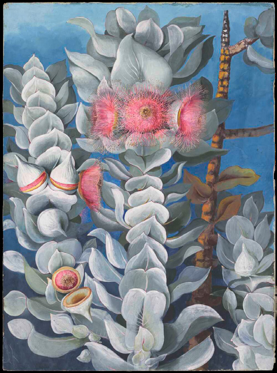
Ellis Rowan,
Eucalyptus Macrocarpa Hook., Family Myrtaceae,
placeholders like “anonymous” or “n.d.”).
Western Australia, 1880s, nla.gov.au/nla.obj-138826568
• For long titles, abbreviate logically by removing
unnecessary details.
Note: Images taken by Library staff, internal
photographers, or commissioned for marketing don’t
require captions. However, adding a simple descriptive
caption can be helpful if it provides useful context.
NATIONAL LIBRARY OF AUSTRALIA BRAND GUIDELINES
IMAGERY: CAPTIONING
17


