CONTENTS
A. Brand Story and Purpose
B. Brand Idea
C. The System
D. Colour
E. Typography
F. Photography
G. Example Usage
AFTRS – Style Guide
2

VISION 2021
To be the reference point for
innovation in screen, sound,
and story-making, globally.
AFTRS – Style Guide
4
PURPOSE
To find and empower Australian
talent to shape and share their
stories with the world by delivering
future-focused, industry-relevant
education, research and training.
AFTRS – Style Guide
5
VALUE PROPOSITION
FOR EVERY
STORYTELLER’S
NEXT ACT.
AFTRS – Style Guide
6
TONE OF VOICE
TONE OF VOICE
3. SPEAK WITH AUTHORITY
AFTRS is a unique character. We’re one of the
Write with authority, not arrogance. AFTRS is
world’s leading schools in the art of storytelling
thoughtful, collaborative and informed. Avoid bald
through screen and sound – how we shape
claims or sweeping statements. Substantiate your
and share our own story should be our greatest
point of view.
demonstration of this truth.
4. STAY RELEVANT
1. BE A STORYTELLER
AFTRS is a prestige brand, we don’t just trade
Fight the lure of ordinary. Instead of simply
off the successes of the past. Always strive to
communicating the facts about a new course or
connect what we’re doing, with what matters
initiative, create for impact.
most to people today.
2. BE INCLUSIVE
5. GO BOLD
AFTRS exists to empower all Australian storytellers. AFTRS invests in initiatives that change the face
Wherever they come from, whoever they are. Always of the industry, and the future of it. These are not
strive for accessibility. Favour ‘we’ over ‘me’.
meek ambitions. Use active language. Speak with
passion for the things we believe in and do. Keep
Strive to be understood by all. Use words to build
communications sharp, confident and clear. Have
bridges, not walls.
the courage to take risks and challenge category
convention.
AFTRS – Style Guide
7
B.
Brand Idea
AFTRS – Style Guide
8
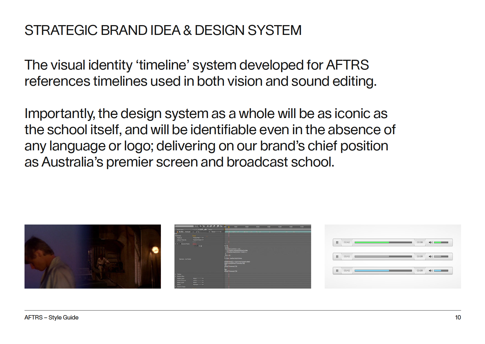
STRATEGIC BRAND IDEA & DESIGN SYSTEM
Whether in film, on television, radio or online, great stories
take us on a journey.
In the same way, AFTRS supports all Australians — irrespective
of background or circumstance — in their own career journeys.
The school is for every storyteller’s next act.
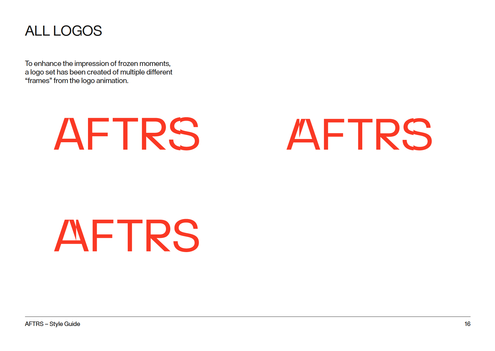
Our visual identity is built on this powerful idea (and marks a
point in time in AFTRS own ‘story’). It’s a screen first identity
which will be shown animated or for static applications as frozen
moments of a dynamic animation in progress, acknowledging
our core business of screen and sound storytelling.
AFTRS – Style Guide
9

C.
The System
AFTRS – Style Guide
11
THE SYSTEM
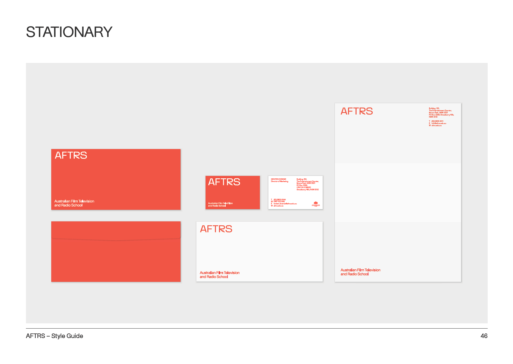
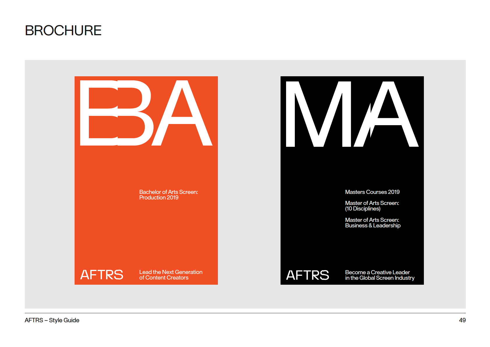
The new AFTRS identity creates a robust design
system that stretches beyond the logo to inform
all brand touch points, from core brand items,
printed communications, through to social
media, digital, signage and beyond.
AFTRS – Style Guide
12
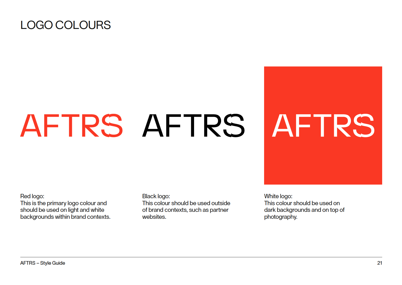
MASTER LOGO
AFTRS – Style Guide
13
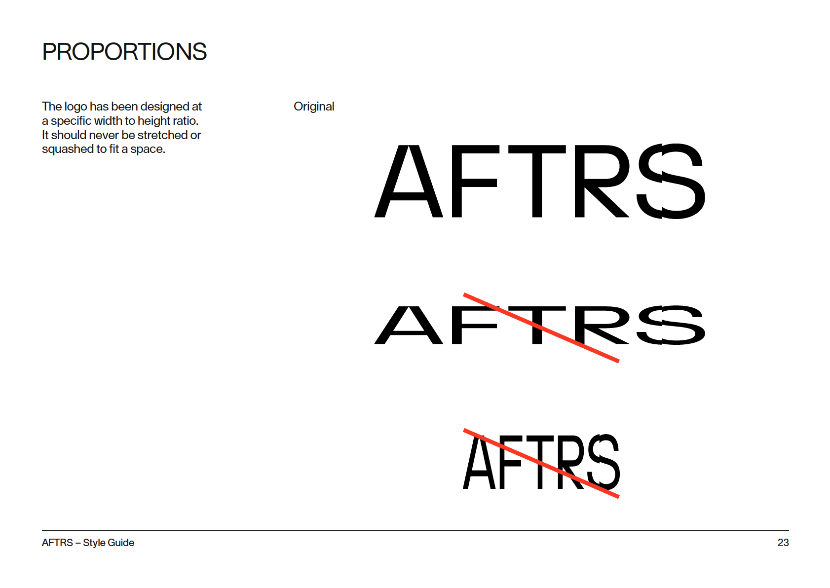
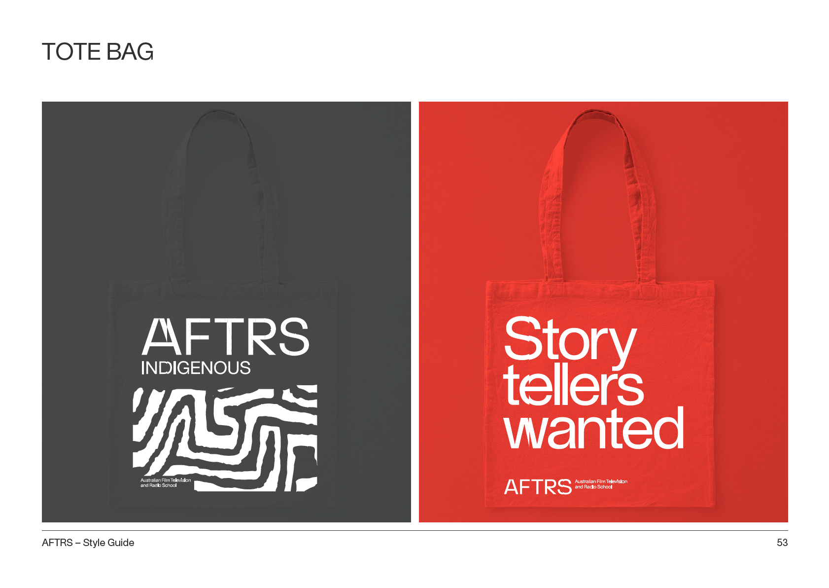
WORD MARK
The word mark has been designed to have a
unique and recognisable character. Both the A
and R letter forms have been custom made.
AFTRS – Style Guide
14


LOCK UP
AFTRS – Style Guide
17

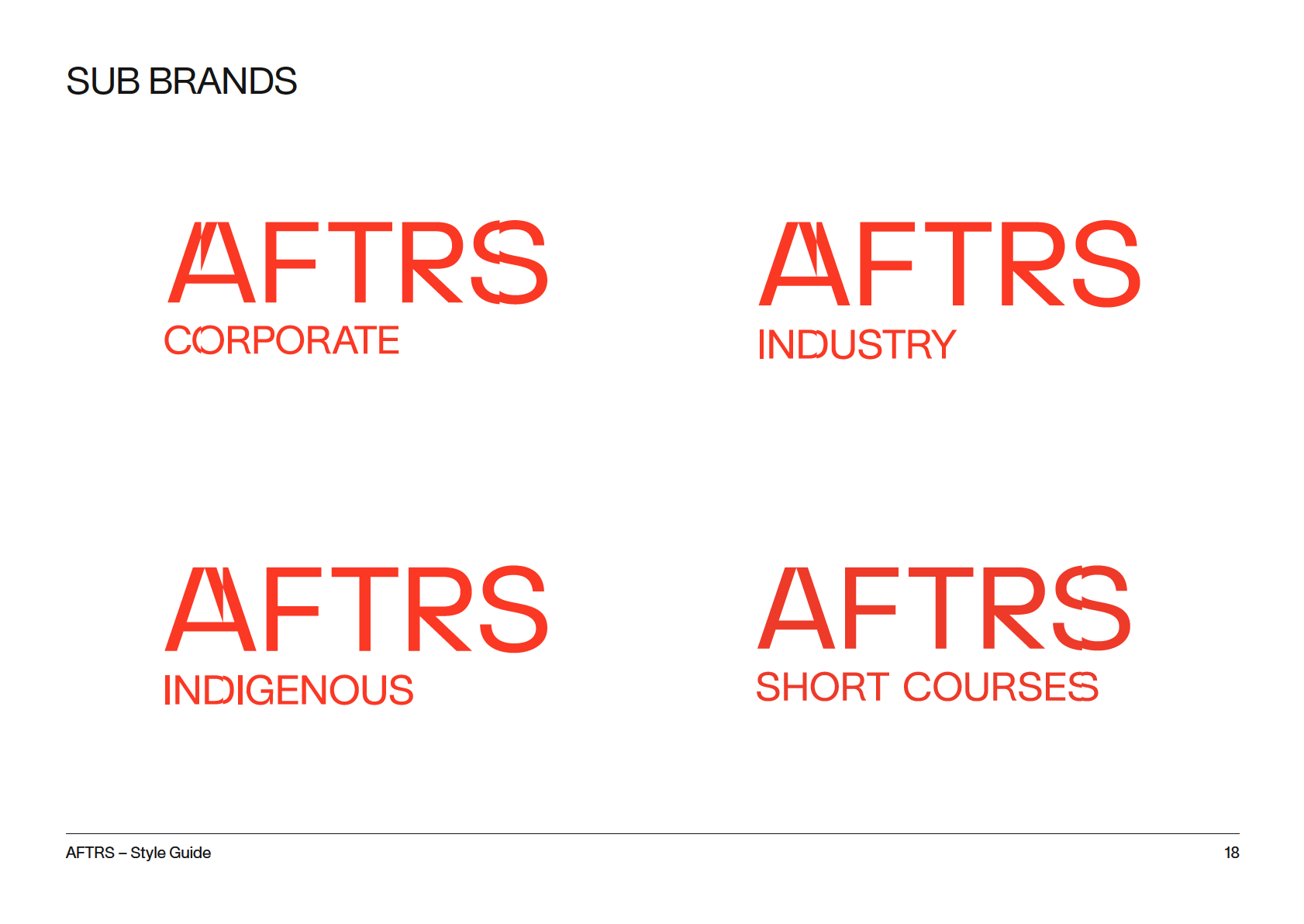
PROGRAM BRAND
AFTRS – Style Guide
19


CLEAR SPACE
The logos should always have a minimum
clear space all the way around to ensure
visibility and impact. The clear space is
taken from the width of the A.
AFTRS – Style Guide
22


D.
Colour
AFTRS – Style Guide
25
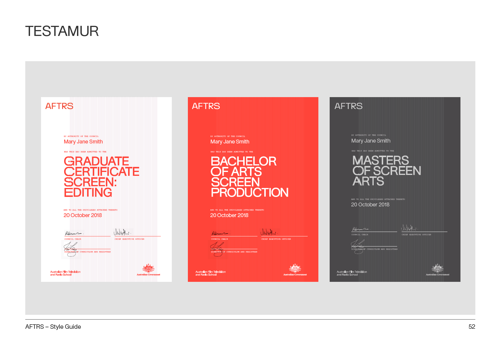
COLOUR PALETTE
Pantone Bright
Pantone 1505
Pantone Rubine
Pastel Pink 25%
Pantone Cool
Charcoal Grey
Pantone Black
Red
Red
Pantone Bright Red Gray 3
HEX: F93822
HEX: FF6900
HEX: CE0058
HEX: FFDCDC
HEX: C5C5C5
HEX: 1D252D
HEX: 27251F
R 250
R 255
R 230
R 255
R 197
R 77
R 20
G 55
G 105
G 0
G 220
G 197
G 77
G 20
B 35
B 0
B 88
B 220
B 197
B 79
B 20
C 0
C 0
C 0
C 0
C 0
C 0
C 0
M 85
M 55
M 100
M 20
M 0
M 0
M 0
Y 100
Y 90
Y 20
Y 10
Y 0
K 0
K 0
K 0
K 0
K 0
K 0
K 20
K 85
K 100
AFTRS – Style Guide
26
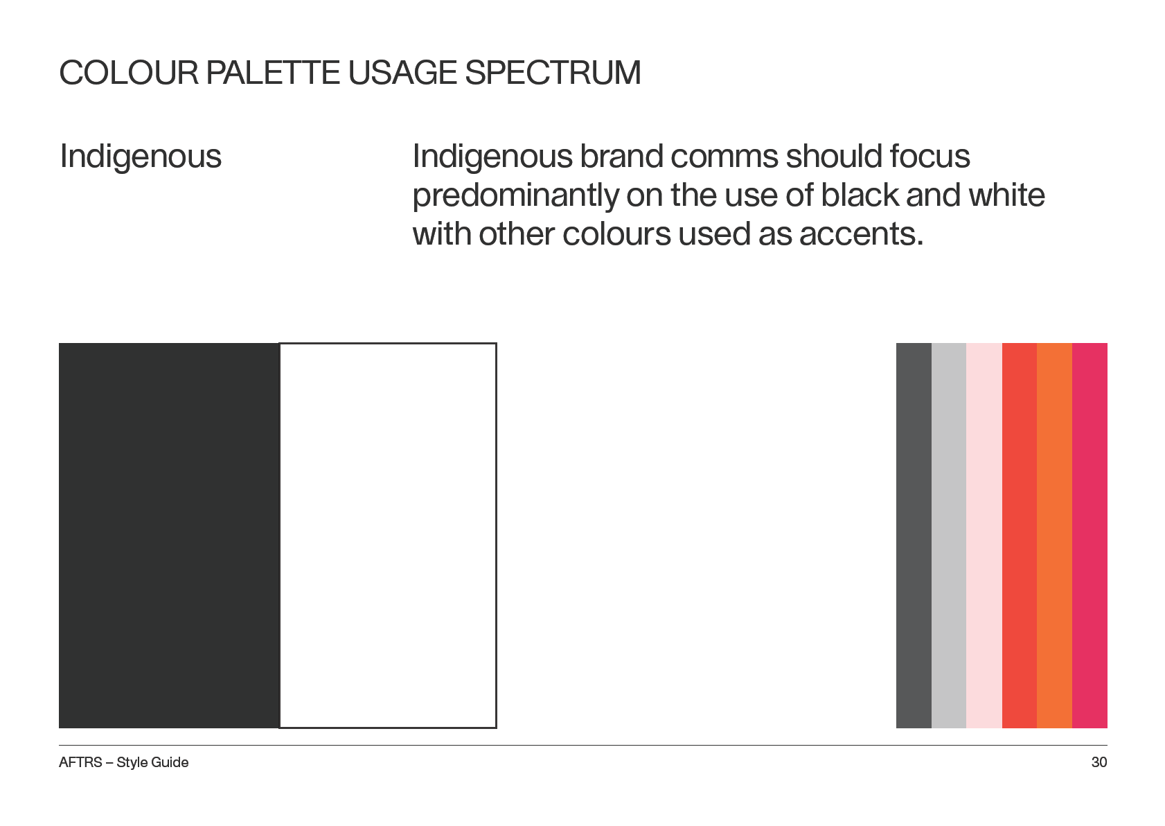
COLOUR PALETTE USAGE SPECTRUM
Youth
Youth comms should amplify the bright colours
in our palette. Heavier use of the orange, red
and magenta.
AFTRS – Style Guide
27
COLOUR PALETTE USAGE SPECTRUM
Core Brand
Core brand comms should focus predominantly
on the use of red and pastel pink with other
colours used as accents.
AFTRS – Style Guide
28
COLOUR PALETTE USAGE SPECTRUM
Masters
Masters comms are more subtle and
sophisticated so should use colour sparingly.
If AFTRS core brand is daytime, Masters should
feel “night time”.
AFTRS – Style Guide
29

E.
Typography
AFTRS – Style Guide
31
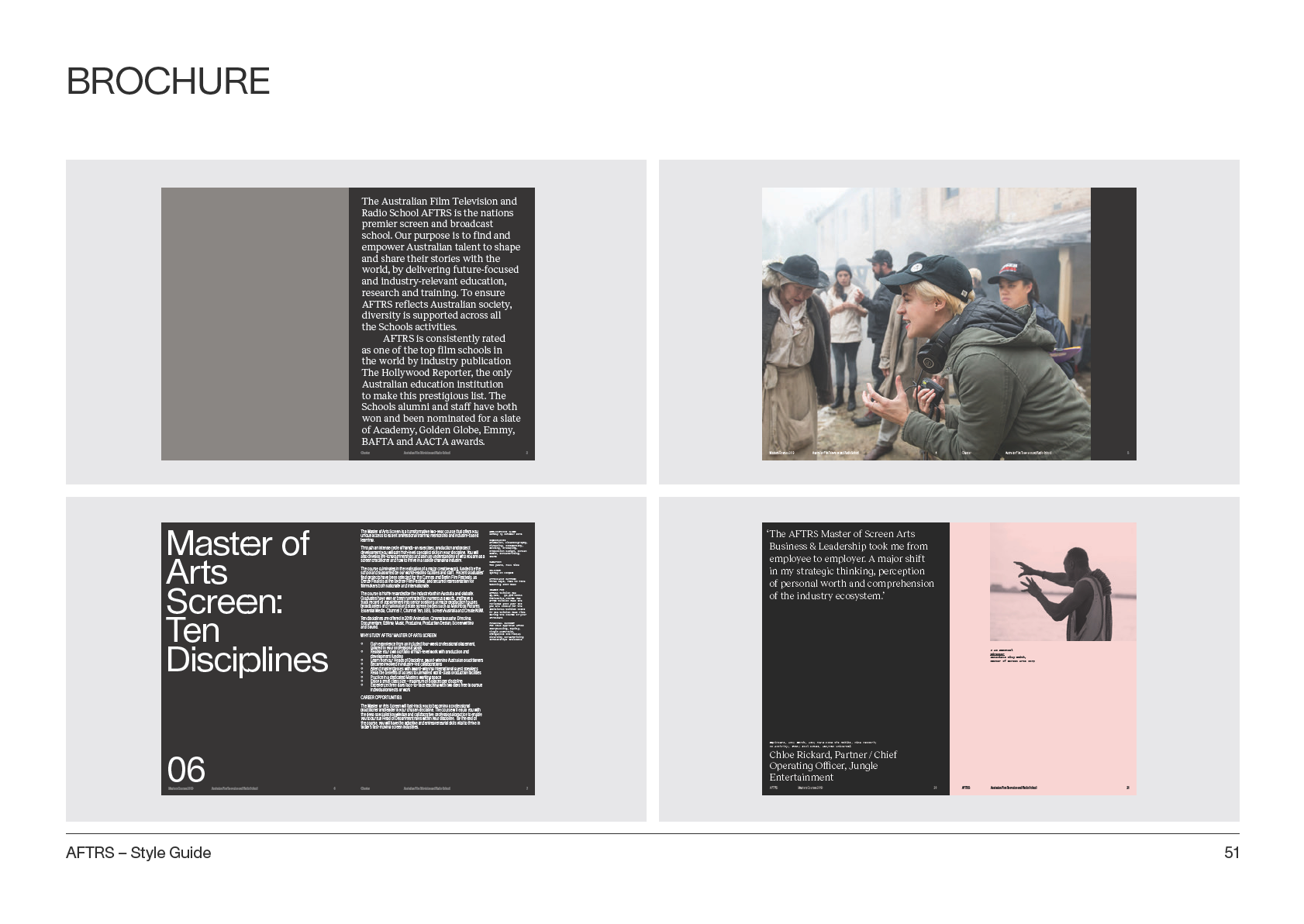
TYPOGRAPHY
Lausanne
Contemporary geometric letter forms
characterise this timeless neutral san
serif typeface. Font to be used predominately
for sub headlines and body copy for core brand
and sub headlines for Masters sub brand.
abcdefghijklmnopqrstuvwxyz
ABCDEFGHIJKLMNOPQRSTU
VWXYZ 01234567890
Purchase: nizarkazan.tictail.com/product/lausanne-regular
AFTRS – Style Guide
32
TYPOGRAPHY
Lausanne AFTRS
Custom version of Lausanne. Use for headlines
abcdefghijklmnopqrstuvwxyz
ABCDEFGHIJKLMNOPQRSTU
VWXYZ 01234567890
Supplied typeface
AFTRS – Style Guide
33
TYPOGRAPHY
Lausanne AFTRS
usage rules
Stack (evenly in all lines of text)
One letter per line only
THE
THE FUTURE OF
RISE
FASHION SHORT
OF
FILM PITCH
THE
COMPETITION
CREATIVE
AFTRS – Style Guide
34
TYPOGRAPHY
Reckless
Combines the sophistication of a serif typeface
with contemporary alternate letter forms that
give the font a unique, recognisable character.
To be used predominantly for Masters pull
quotes or introductory text.
abcdefgghijklmnopqrrstuvwxyyz
ABCDEFGHIJKLMNOPQRSTU-
VWXYZ 01234567890
Purchase: displaay.net/typeface/reckless/
AFTRS – Style Guide
35
TYPOGRAPHY
Pitch Sans
A modern re interpretation of the iconic
monospace font that is synonymous with the
typewriter and thus story writing, scripts and
creative writing. To be used mainly for captions,
information and factual text.
abcdefghijklmnopqrstuvwxyz
ABCDEFGHIJKLMNOPQRSTUVWXYZ
01234567890
Purchase: klim.co.nz/retail-fonts/pitch-sans/
AFTRS – Style Guide
36
TYPOGRAPHY
Default fonts
Default or desktop fonts are widely available fonts. For everyday use (rather than designed
collateral) to ensure documents can be read by external parties, e.g. external presentations
Helvetica / Calibri
abcdefghijklmnopqrstuvwxyz
substitutes Lausanne
ABCDEFGHIJKLMNOPQRSTUVWXYZ
01234567890
Times New Roman
abcdefghijklmnopqrstuvwxyz
substitutes Reckless
ABCDEFGHIJKLMNOPQRSTUVWXYZ
01234567890
Courier
abcdefghijklmnopqrstuvwxyz
substitutes Pitch Sans
ABCDEFGHIJKLMNOPQRSTUVWXYZ
01234567890
AFTRS – Style Guide
37
F.
Photography
AFTRS – Style Guide
38
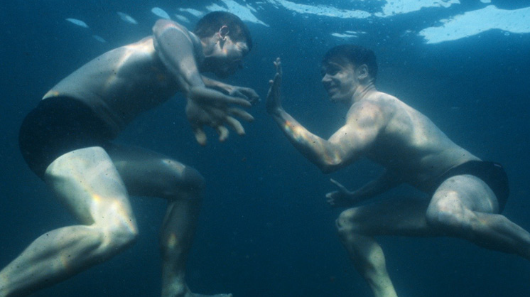
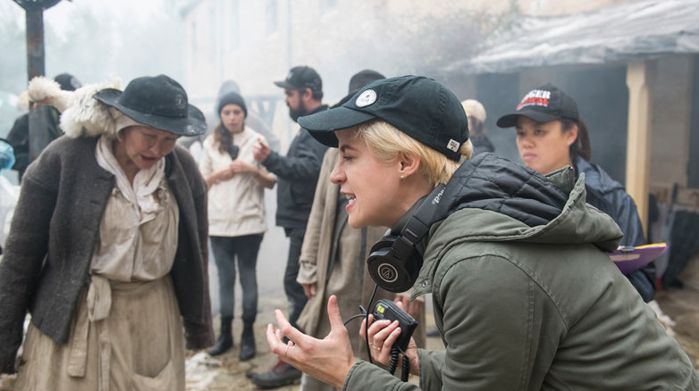
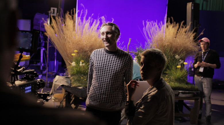
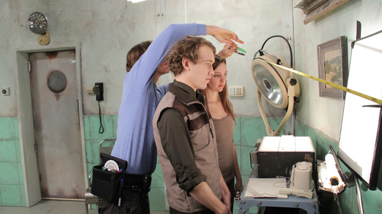
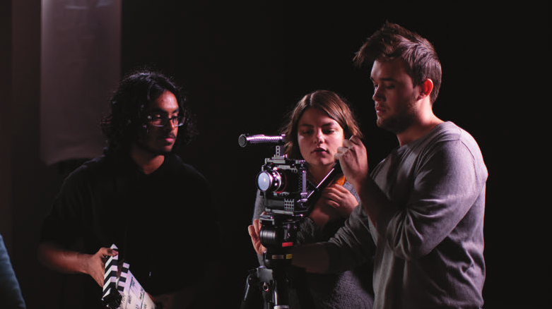
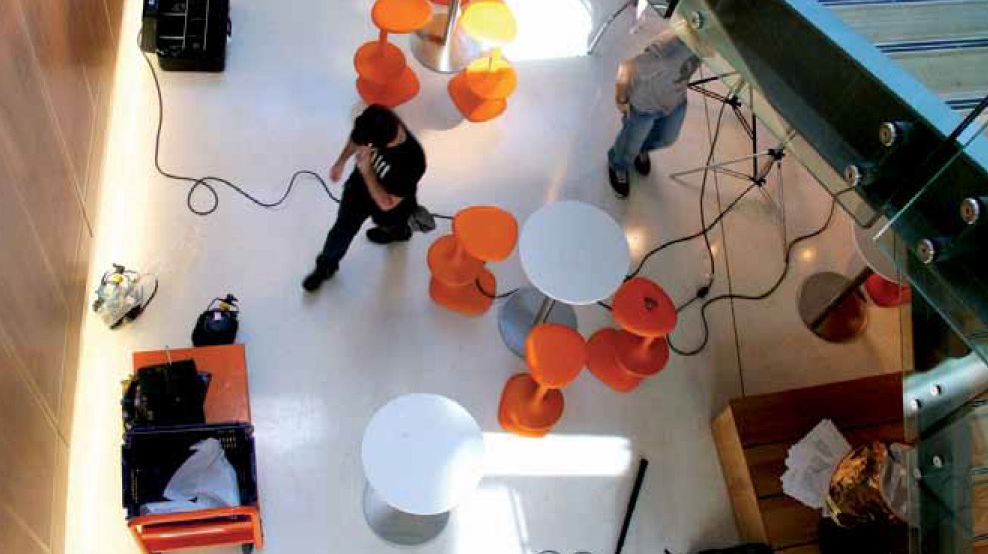
BRAND PHOTOGRAPHY
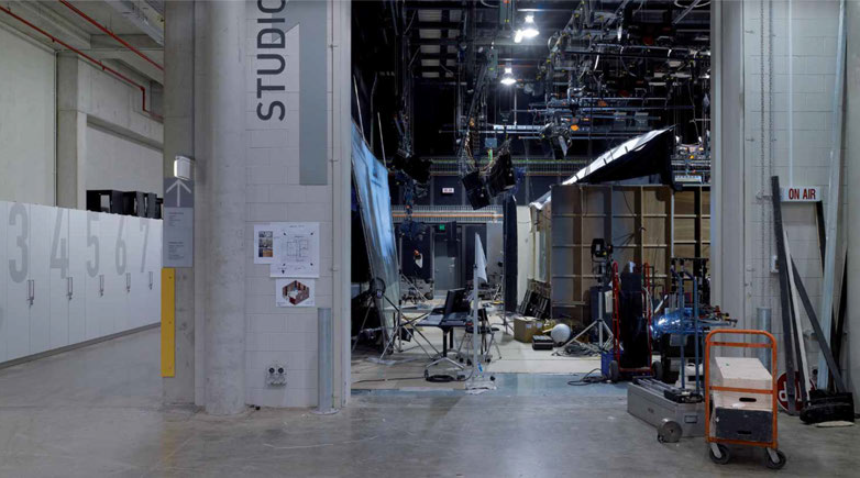
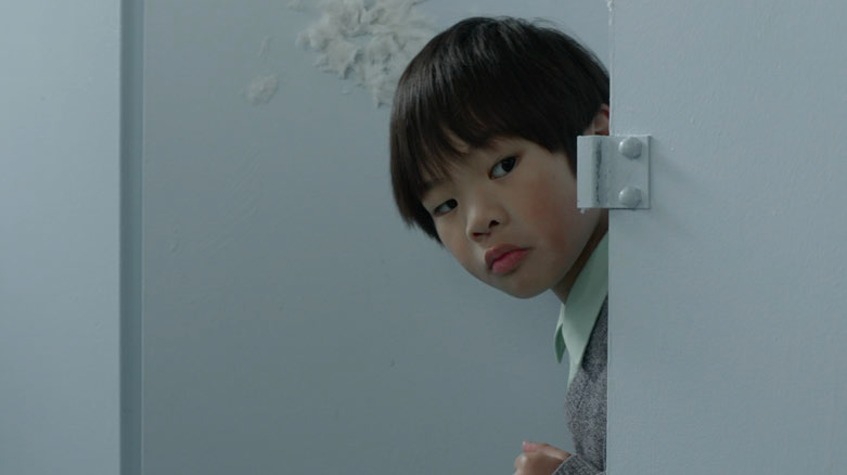
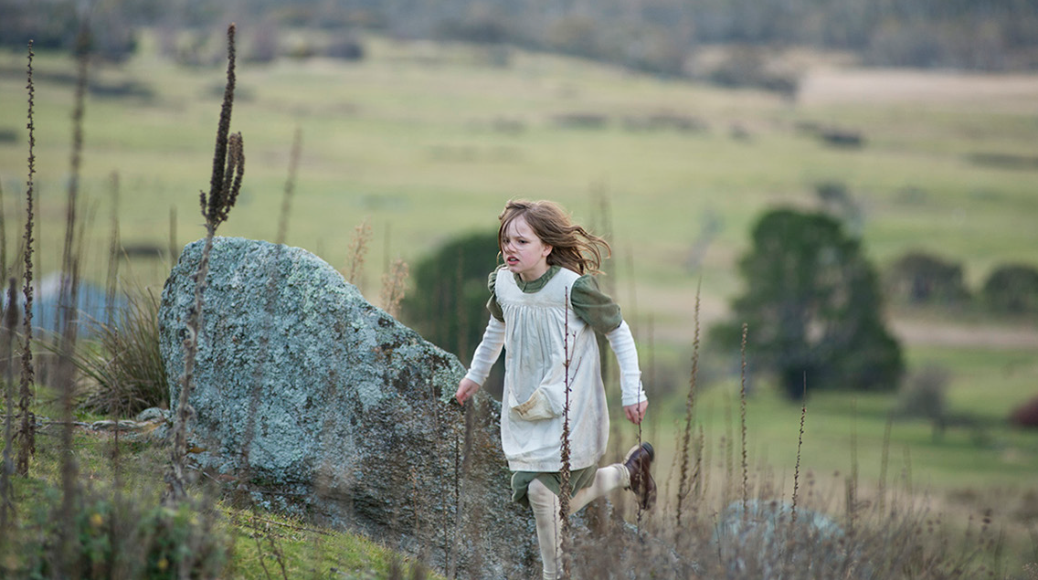
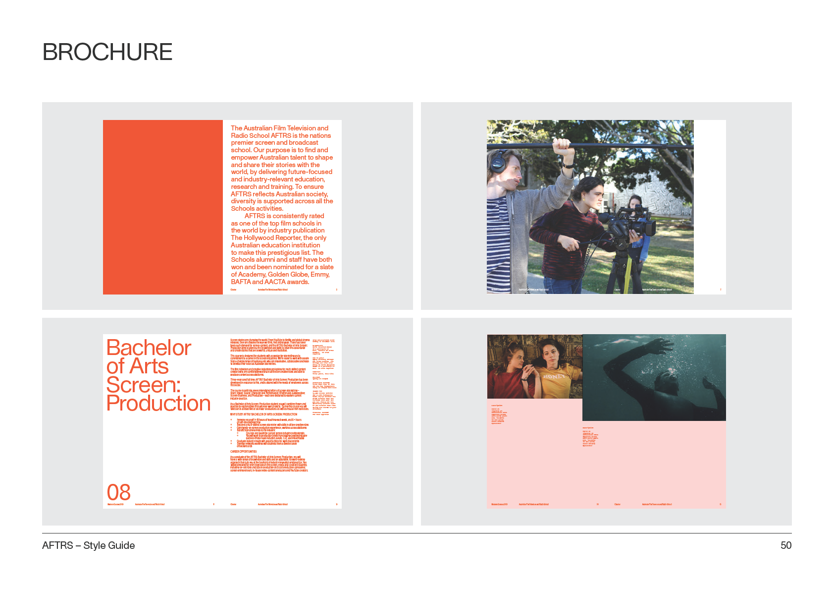
As part of our brand system we have
implemented a four part approach to imagery.
Overall the imagery is intended to fit within the
reportage (documentary) style of photography.
The shots should feel natural and candid, and
not at all like stock photos. The photographs
should feature natural lighting where possible.
AFTRS – Style Guide
39


PHOTOGRAPHIC STYLES
The Work: Past and Present
People working toge her
Screen captures
Reportage
Architecture and
Portraits
Facilities
Students & Staff
AFTRS – Style Guide
40


THE WORK: PAST AND PRESENT SCREEN CAPTURES
AFTRS – Style Guide
41


PEOPLE WORKING TOGETHER REPORTAGE
AFTRS – Style Guide
42


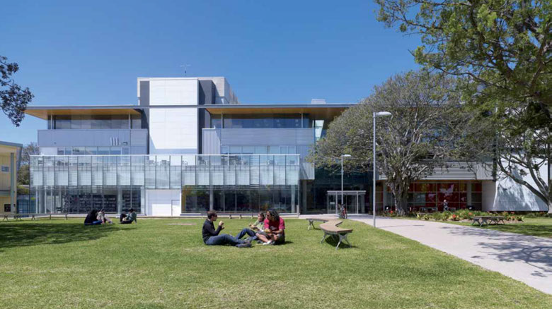
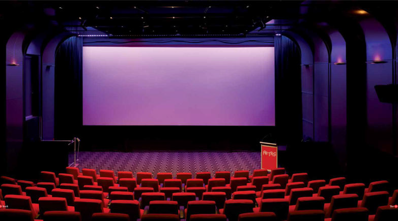
ARCHITECTURE AND FACILITIES
AFTRS – Style Guide
43


PORTRAITS
AFTRS – Style Guide
44
G.
Example Usage
AFTRS – Style Guide
45


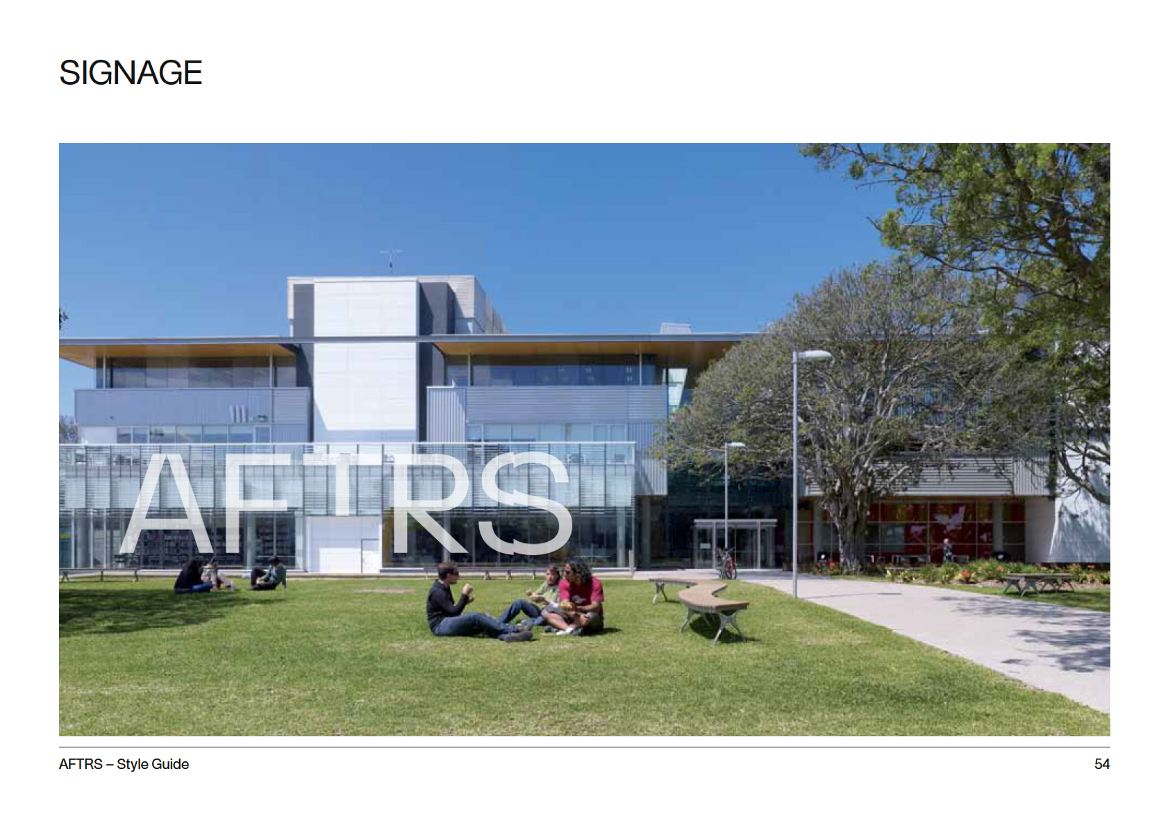
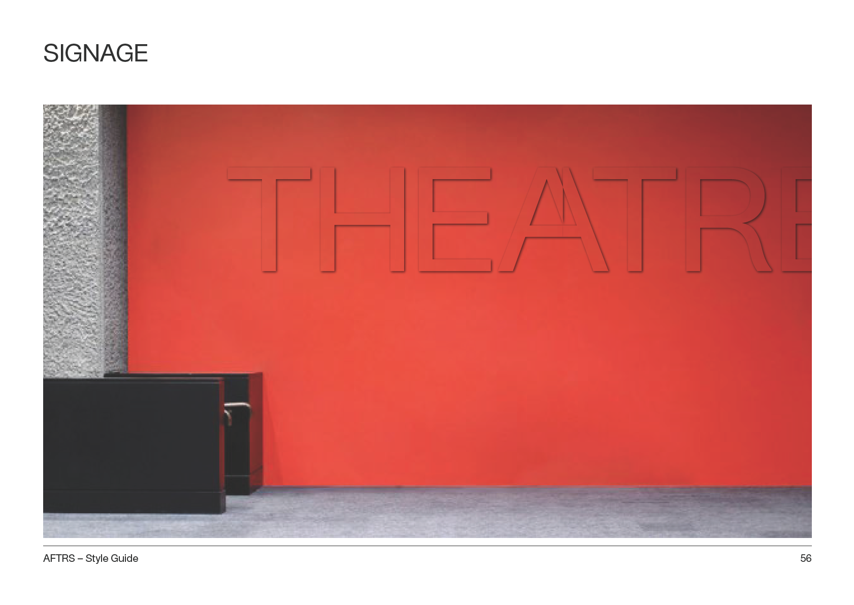
SIGNAGE
RO
R
OOM 25
←
AFTRS – Style Guide
55

Thank you
AFTRS brand visual identity developed by M35
www.m35.com.au
AFTRS – Style Guide
57

