Contents
1.0 Introduction
02
1.1 Cancer Australia
02
1.2 Our Toolkit
03
2.0 The logo
04
2.1 Logo formats
04
2.2 Logo colour
04
2.3 Isolation zone
05
2.4 Minimum size
05
2.5 Misuse
07
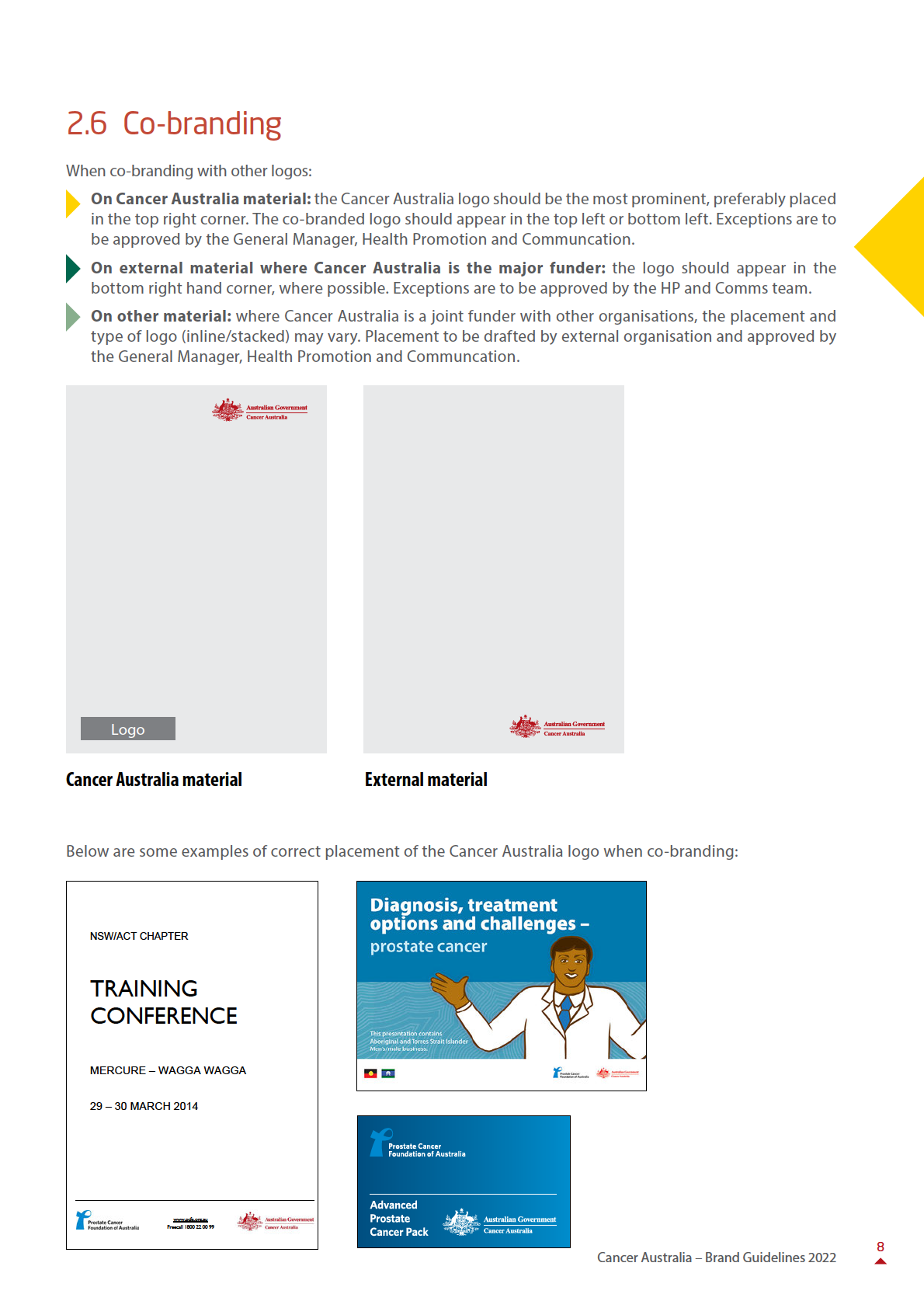
2.6 Co-branding
08
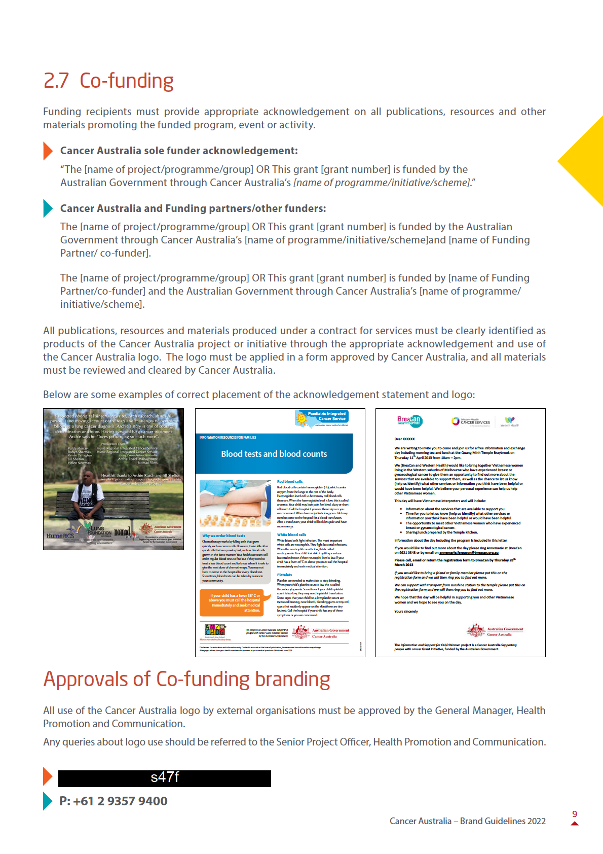
2.7 Co-funding
09
Approvals
09
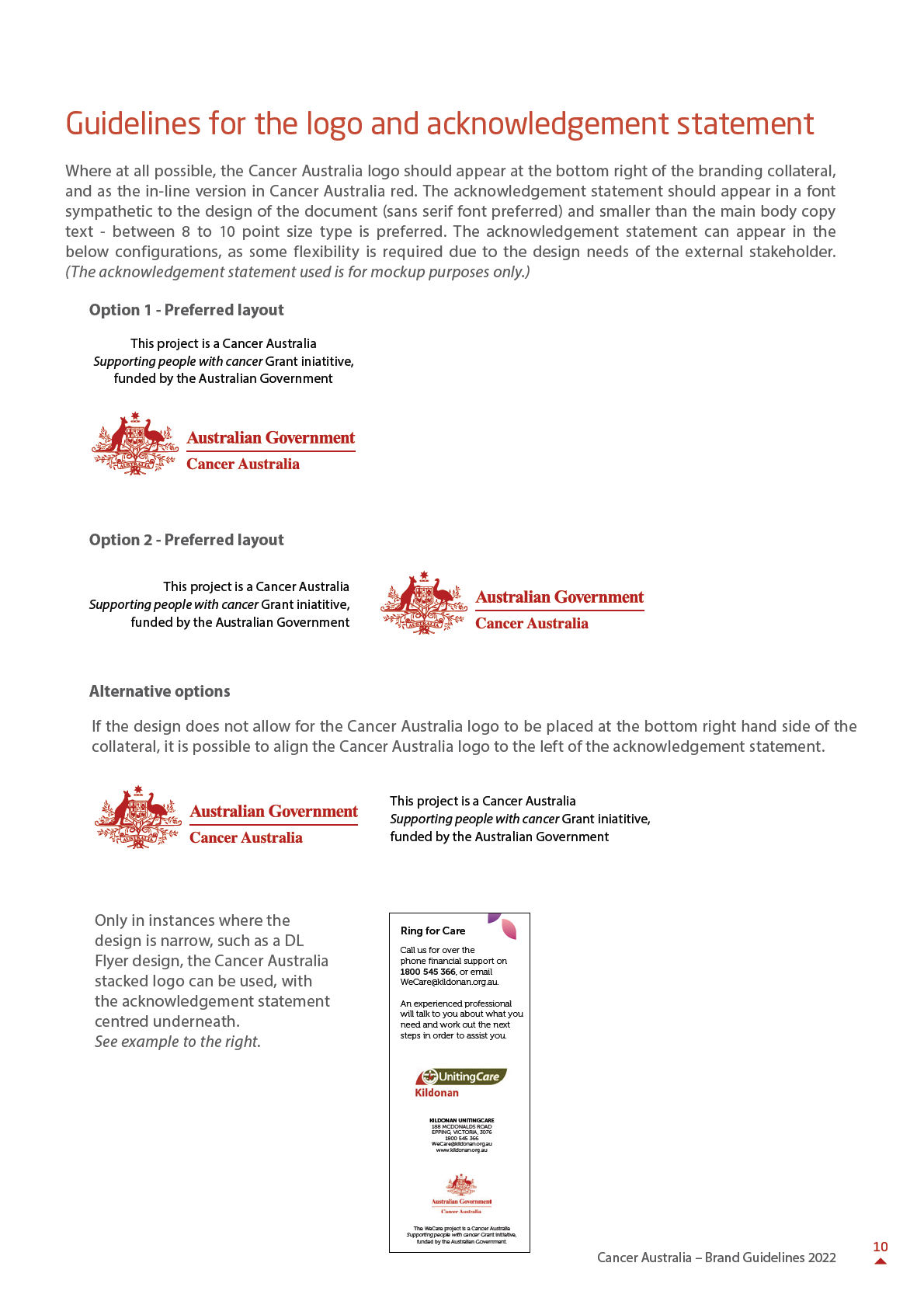
Guidelines for the logo and
acknowledgement statement
10
3.0 Typography
11
3.1 Print production & design
11
3.2 In house documents
11
3.3 Font examples
12
4.0 Colour
13
4.1 Partner colours
13
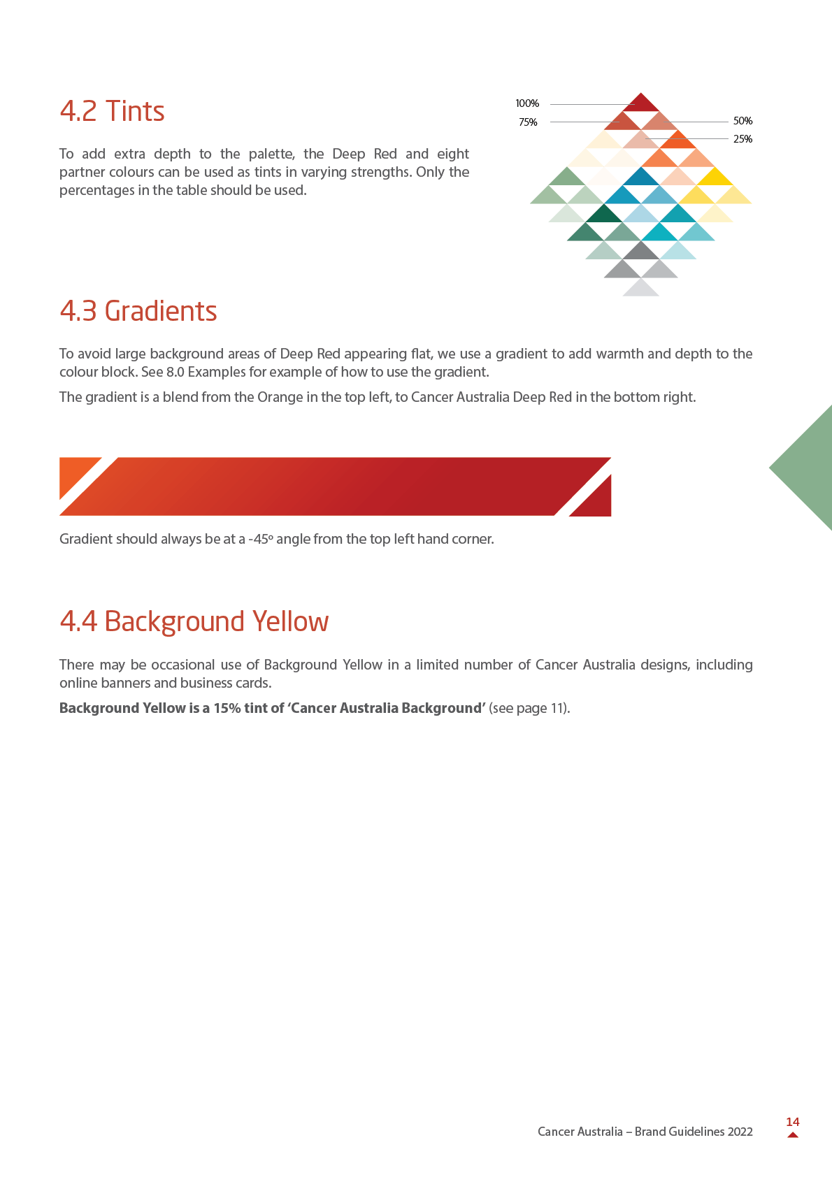
4.2 Tints
14
4.3 Gradients
14
4.4 Background Yellow
14
5.0 Shapes and textures
15
5.1 Tapestry Graphic Arrow
15
5.2 Using the Tapestry Graphic Arrow
16
5.3 Building Tapestry Graphic
illustrations
16
5.4 Tapestry Graphic Backgrounds
17
5.5 Misuse
18
6.0 Photography
19
6.1 Photography used with
Tapestry elements
19
6.2 Photography specification
and selection
20
6.3 Content, cropping
and composition
21
6.4 Some Do’s and Don’ts
22
7.0 Charts, graphs and tables
24
7.1 Charts and graphs
24
7.2 Tables
25
8.0 Examples and assets
26
1
Cancer Australia – Brand Guidelines 2022
1.0 Introduction
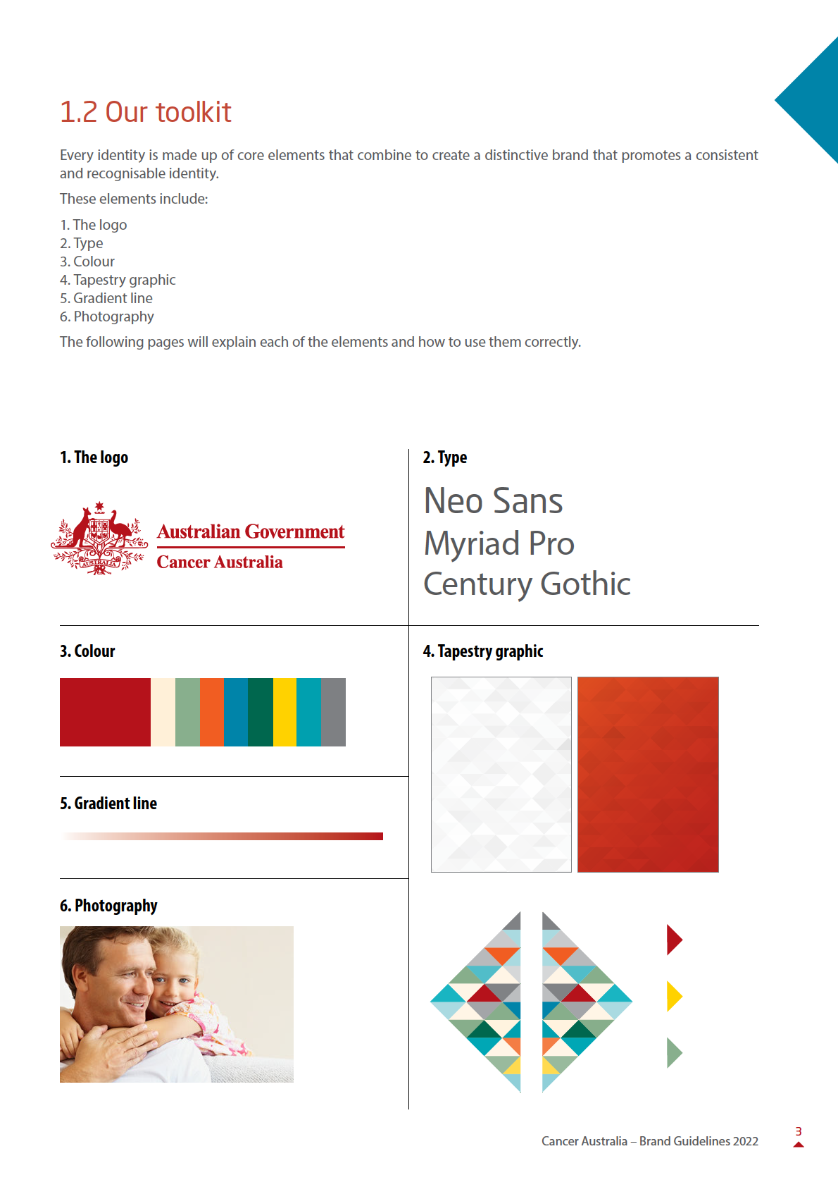
This document provides guidelines for use of the brand identity
for Cancer Australia.
The brand identity has been revised to effectively establish, position, support and promote the new Cancer
Australia as the Government’s national leadership agency in cancer control.
1.1 Cancer Australia
Our vision
Cancer Australia’s vision is to reduce the impact of cancer and improve the wel -being of those diagnosed with
cancer in Australia.
Our mission
Cancer Australia’s mission is to strengthen and provide advice on the Australian Government’s strategic focus on
cancer control and care.
Role and functions
Cancer Australia was established by the Australian Government in 2006 to benefit all Australians affected by cancer,
and their families and carers. Cancer Australia works to reduce the impact of cancer and improve the wel -being
of those diagnosed by ensuring that evidence informs cancer prevention, screening, diagnosis, treatment and
supportive care.
Cancer Australia provides national leadership in cancer control to improve patient outcomes, enhance health service
delivery and guide improvements across the continuum of cancer care. This is achieved through engagement with
key stakeholders in cancer control and the development of effective partnerships for the delivery of improved
cancer care.
Cancer Australia maintains an inclusive approach to engagement with people affected by cancer in order to ensure
that its work is informed by and responsive to their needs and those of the broader community. The agency also
focuses on populations who experience poorer health outcomes, including Aboriginal and Torres Strait Islander
peoples and people living in rural and remote Australia.
Cancer Australia is the:
• national leader in cancer control, a knowledge-hub and the principal source of evidence-based information for
health professionals and the community
• trusted voice of cancer information for consumers and health professionals
• go-to agency for cancer information
2
Cancer Australia – Brand Guidelines 2022


3.0 Typography
Typefaces have been selected to ensure consistency and address the technical requirements of different
applications.
3.1 Print production and design
3.1.1 - Neo Sans
Neo Sans is only to be used in the design/print production process. This font is selected for its openness and clear,
clinical lines.
3.1.2 - Myriad Pro
Myriad Pro is only to be used in the design/print production process.
3.2 In house documents
Templates and guidelines are provided for in house documents on the Cancer Australia intranet (The Loop).
3.2.1 Century Gothic
Century Gothic is used for body copy in internal corporate communications including letterheads, general
documents and report templates. In most printed Word document applications, body copy is set at 10pt. Colour
headings are used in documents in-house, see the Report Template on the Cancer Australia intranet (The Loop).
3.2.2 Calibri
Calibri is used in powerpoint presentations.
11
Cancer Australia – Brand Guidelines 2022
3.3 Font examples
3.3.1 Design/print production type styles
Document title
Neo Sans Regular 32pt
Heading level 1
Neo Sans Regular 24pt
Pullout Quote
Myriad Pro Light Italic 16pt
Heading level 2
Neo Sans Regular 20pt
Heading level 3
Neo Sans Regular 15pt
Heading level 4 / Chart or graph title
Myriad Pro Bold Condensed 13pt
Body copy
Myriad Pro Light 10.5pt
Notes
Myriad Pro Light 8pt
Note: if background page colour is red, reverse to white type headings 1, 2 and 3.
Please note: dot points appear as a red triangle, lining up with the middle of the body text. 4mm space between.
For example:
a physical examination
a blood test to check for anaemia
3.3.2 In-house type styles
Documents produced in-house should follow the guidelines below. Document formatting guidelines are available
to download on the Cancer Australia intranet (The Loop).
Heading 1 (Century Gothic 14pt bold, 6pt above, 18pt below, red or black)
Heading 2
(Century Gothic 12pt bold, 12pt above, 6pt below. Numbered list, hanging indent 1.25cm, red or
black)
Heading 3
(Century Gothic 11pt bold, 12pt above, 6pt below. Numbered list, hanging indent 1.25cm)
Heading 4
(Century Gothic 10pt bold, 12pt above, 6pt below)
Heading 5
(Century Gothic 10pt bold italics, 12pt above, 6pt below)
12
Cancer Australia – Brand Guidelines 2022
4.0 Colour
There are 10 main colours in the colour range.
The key colour is the Deep Red used by Cancer Australia in previous brand communications. The use of the colour
has been modified and is explained in section 4.3 Gradients within this chapter.
4.1 Partner colours
There are 10 colours which represent the range of cancers covered by Cancer Australia and the breadth of
stakeholder groups it works with.
Department and colour breakdown
CMYK 0. 100. 96. 28
CMYK 0. 5. 15. 0
CMYK 35. 0. 42. 23
RGB 181. 18. 27
RGB 255. 240. 216
RGB 135. 174. 139
Pantone 1807
Pantone 7506 15%
Pantone 7483 41%
Cancer Australia Deep Red
Cancer Australia Background
Lung Cancer
CMYK 0. 79. 100. 0
CMYK 100. 0. 9. 30
CMYK 75. 0. 60. 55
RGB 241. 93. 34
RGB 0. 132. 169
RGB 0. 103. 78
Pantone 179
Pantone 314
Pantone 555
CMYK 0. 16. 100. 0
CMYK 100. 0. 31. 7
CMYK 0. 0. 0. 60
RGB 255. 210. 0
RGB 0. 160. 175
RGB 128. 130. 133
Pantone 116
Pantone 320
Pantone 424
Gynaecological Cancer
NB: Breast cancer, although not specified within the
CMYK 0. 28. 7. 0
new brand palette, is unique in that it has always
RGB 248. 204. 213
Pantone 1895
been represented by the colour pink. When building
communication material for breast cancer the colour
breakdown to the right must be followed.
Breast cancer
13
Cancer Australia – Brand Guidelines 2022


Photography on solid backgrounds
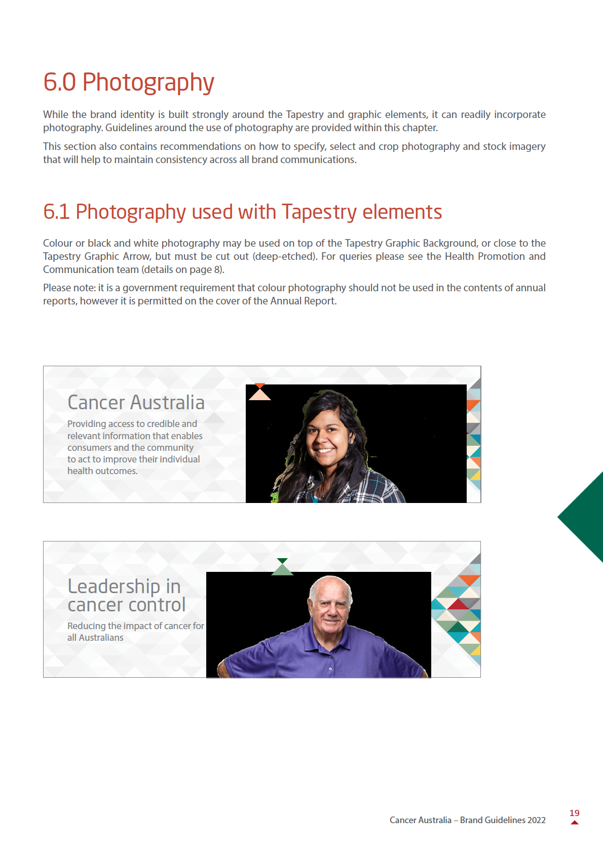
Colour or black and white deep-etched imagery may be used on a solid colour background. The background
colour used should be brand Background Yellow.
6.2 Photography specification and selection
The following guidelines are provided to help maintain a consistent look and feel across brand communications.
These recommendations should be applied whether specifying or briefing photography or selecting images from
an image library.
In general, the images we use in Cancer Australia communications should convey to any audience that Cancer
Australia:
• Celebrates diversity
Imagery should reflect Australia’s multiculturalism and range of demographics.
• Respects people’s dignity
Care should be taken that the tone reflects the sensitivity of cancer as a subject matter.
• Challenges stereotypes
Always try to use images that challenge stereotypical views of particular groups of people. For example, choose
images that show active consumer participation.
Consider careful y the type of publication the photo will appear in and its audience. Different types of photos
are more appropriate for different types of publications.
20
Cancer Australia – Brand Guidelines 2022


6.3 Content, cropping and composition
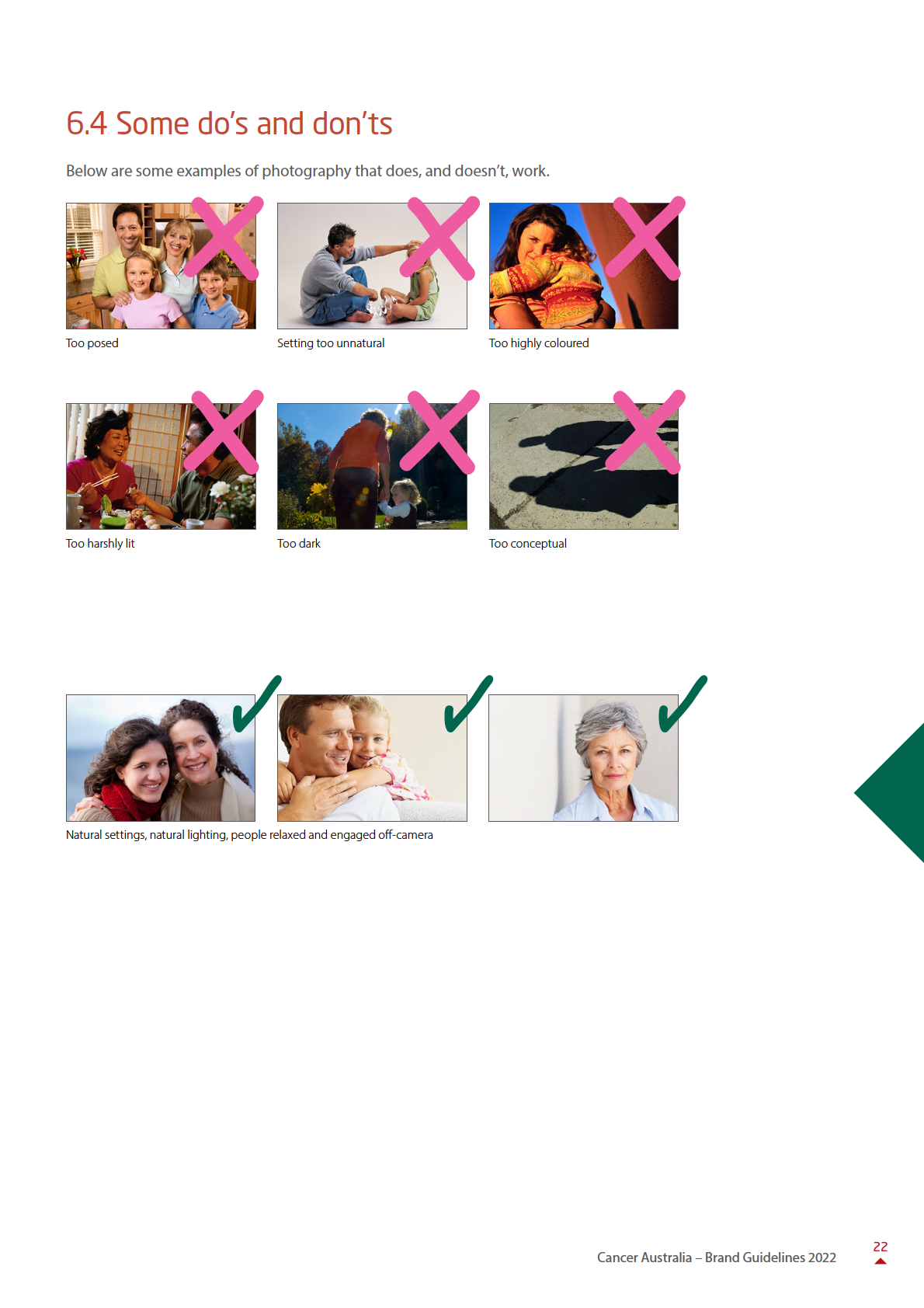
Photographic content should reflect real, everyday scenes wherever possible – real people in real environments
– that convey a sense of relaxed confidence that is inspirational to the viewer. Photography should follow the
guidelines below
• Relaxed not posed
Not too formal, ‘stiff’ or conceptual – people looking relaxed and positive
• Not enhanced
Not overly retouched or too heavily ‘affected’ (colour, contrast etc)
• Natural lighting
Imagery should be lit with natural light where possible
• Simple composition
Many of the recommendations discussed so far can be achieved with cropping. Removing unnecessary elements
or detail from an image can often help it communicate more quickly and powerful y.
Cropping into an image can also help to focus the viewer’s attention on important areas (i.e. people) and make
the photograph feel more intimate.
Original photograph
Closer crop
21
Cancer Australia – Brand Guidelines 2022


8.0 Examples and assets
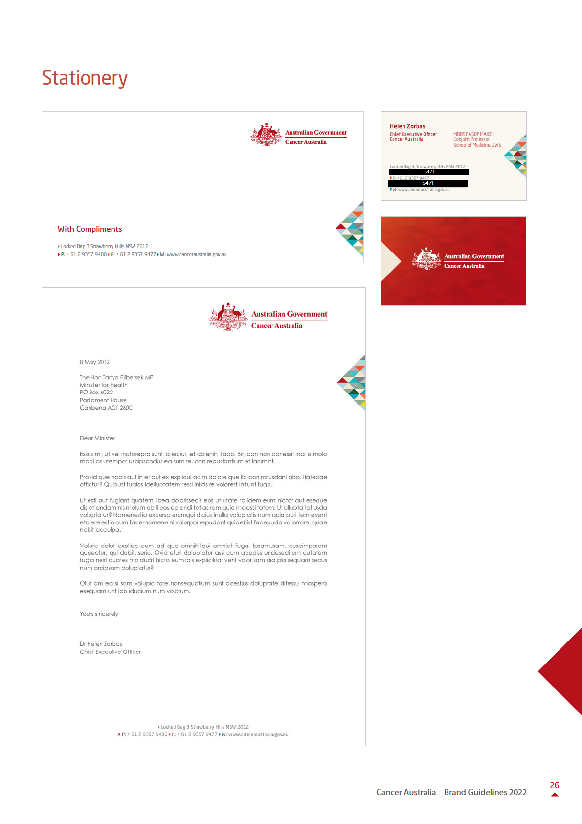
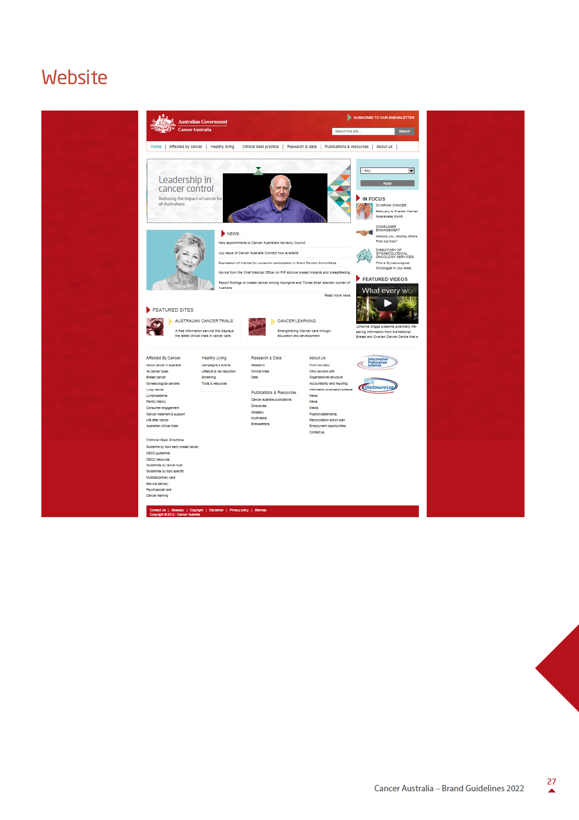
The applications on the following pages demonstrate how we bring all our branding elements together to create
on-brand communications. The applications shown are concepts and demonstrate the use of our look and feel in
our commonly used media.
These applications clearly cannot address every consideration you might encounter. They serve to demonstrate
the tone and style we wish to adopt, and should be thought of as a guide to help you create applications.
Banners
25
Cancer Australia – Brand Guidelines 2022
