Department of Health and Aged Care Style Sheet
LOGO
Our logo is the primary visual element that identifies us. It consists of the Coat of Arms, the ‘Australian
Government’ text, a horizontal dividing rule and the ‘Department of Health and Aged Care’ identifier.
POSITIONING
In most circumstances, the logo must have prominence
over and above other images and graphic elements.
The minimum width of the coat of arms is 20mm.
2) Inline negative version
To be used when the background colour is dark coloured.
by the
20mm
3) Strip positive version
CLEAR SPACE
To be used when the background colour is light coloured.
All versions of the Department of Health and
Aged Care logo have a clear space zone to retain
the integrity and clarity of the brandmark.
The zone, and area of ‘X’, based on the distance between
the top of the capital ‘A’ in ‘Australian Government’ and
the bottom of the horizontal line, defines the space
around the logo that should not be encroached upon.
4) Strip negative version
To be used when the background colour is dark coloured.
x
x
and Aged Care administratively.
Stacked configuration
x
x
x
FORMATS
This document has been released
For a package containing the department’s
1) Stacked positive version
logo in .eps, .png, .jpeg and .tiff formats please
To be used when the background colour is light coloured.
email
xxxxxxxxxx@xxxxxx.xxx.xx
Department of Health
CONFIGURATIONS
The Department of Health and Aged Care logo is
available in four configurations, inline, strip, stacked
and stacked strip with positive and negative versions.
Inline configuration
2) Stacked negative version
To be used when the background colour is dark coloured.
1) Inline positive version
To be used when the background colour is light coloured.
1
COLOUR
Colour plays an important role in the Department’s identity. The colours included in this section
are able to be used across various media.
Primary
281 UP
282 UP
7714 UP
7715 UP
R29 G67 B127
R21 G58 B110
R0 G138 B150
R0 G114 B126
#1d437f
#153a6e
#008a96
#00727d
the
Complementary
by
3005 UP
2935 UP
390 UP
632 UP
221 UP
179 UP
administratively.
R19 G144 B207
R0 G112 B186
R172 G192 B42
R0 G180 B208
R170 G23 B109
R232 G99 B53
released
#1390cf
#006fb9
#acbf29
#009eba
#aa176d
#e86234
Care
Complementary tints
been
has Aged
and
R128 G200 B234
R214 G223 B148
R138 G157 B183
R128 G185 B190
R213 G139 B182
R248 G208 B194
#80c8ea
#d6df94
#8a9db7
#80b9be
#d58bb6
#f8d0c2
document
Health
of
R179 G213 B216
R179 G222 B242
This
#b3d5d8
#b3def2
Neutral
Department
R109 G110 B113
R188 G190 B192
R209 G211 B212
R230 G230 B230
R241 G242 B242
#6d6e70
#bbbdc0
#d1d2d4
#e6e6e6
#f1f1f2
C58 M49 Y46 K15
K30
K20
K10
K5
Accent
Colors that are used for
199 UP
606 UP
emphasis in a color scheme.
These colors can often be
bold or vivid and are used
sparingly, to emphasize,
R238 G44 B60
R228 G211 B29
contrast or create rhythm.
#ee2c3b
#e4d31d
2
DESIGN SYSTEM
The design system for the department is not about the parts as they stand alone but how they fit together.
RIBBON
The Department of Health and Aged Care ‘Ribbon’ is a
graphic element within the design system that supports
the Department of Health and Aged Care identity.
APPLYING THE RIBBON
The ribbon is applied as an additional element to bind the visual
identity of a piece of work to the Department of Health and
the
Aged Care. It must be applied in a consistent manner so that it
remains in harmony with the other elements of the design.
by
Scale
Always scale the ribbon proportionately.
administratively.
Example A
released
Proportionate Scale
Care
Example B
been
Proportionate Scale
has Aged
Incorrect application
Stretched Vertically
and
Stretched Horizontal y
document
Health
of
Flipped Horizontally
This
Skewed
Department
HORIZONTAL STRIP
Skewed
Horizontal bars using the department’s primary colours can be used to house
the ribbon to create additional graphic elements. Strips are to be scaled
proportionately with a recommended minimum height of 3mm.
Example A
Ribbon housed within primary corporate colour 7714 UP with 3mm strip height.
Example B
Ribbon housed within primary corporate colour 281 UP with 3mm strip height.
3


 COVERS
the
by
administratively.
released
Care
been
has Aged
and
document
Health
of
This
Department
4


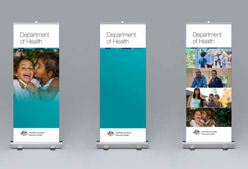
 BANNERS
Department
Department
Department
of Health
of Health
of Health
the
by
administratively.
released
Care
been
has Aged
and
document
Health
of
This
Department
5


 POWERPOINT
Title of
Presentation
Pul
P l
ul quot
e
quote or sub heading
www.health.gov.au
the
by
Image to the right
& content to the left
More content possibilities for you.
Very profound information pullout.
administratively.
Tequis magnam everunt re volupti ntiusament at et
omnimo totatin venimus anturis explaut alique quatem
qui utemquia dolo erum soluptas alite tet id qui
utempor esequis evelesc iaecabor re conseque qui
officab orruntota cus ium rempedi gendandus
veniscidus erum as ut utempor esequis evelesc
released
iaecabor re conseque qui officab orruntota cus ium
idebit, toremporias ea conet volo blantia plaborepel is
natqui of icil magnihi.
Care
been
has Aged
Charts
and
2015
2016
2017
2018
SCALABLE BUSINESS
Tequis magnam everunt re volupti
1000
ntiusament at et quatem qui utemquia dolo
ntiusament at et quatem.
800
Tequis magnam everunt re volupti
ntiusament at et omnimo totatin venimus
utemquia dolo erum soluptas alite tet id qui
600
utempor esequis evelesc iaecabor re.
400
document
Health
200
Caption Text
Tequis magnam everunt re volupti
of
ntiusament at et quatem qui
0JUL
AUG
SEPT
OCT
NOV
DEC
This
SCALABLE BUSINESS
Tequis magnam everunt re volupti ntiusament at et quatem qui utemquia dolo
ntiusament at et quatem qui erum soluptas alite.
Department
CHART A
CHART B
DESC. CHART A
50
25
Tequis magnam everunt
20
20
re volupti ntiusament at
37.5
17
et qua.
14
15
25
12
10
12.5
DESC. CHART B
5
Tequis magnam everunt
re volupti ntiusament at
0
0
2016
2017
2018
2017
2018
et qua.
6
TYPOGRAPHY
Typography plays an important role in communicating an overall tone and quality. Careful use of
typography reinforces the identity and ensures clarity and harmony in al communications.
PRIMARY TYPEFACE
Body copy is set in Helvetica Neue Light. The minimum
font size for body copy set in Helvetica is 10pt. Captions
The primary Department of Health and Aged
can be set in 8pt. Leading refers to the spacing between
Care typeface is Helvetica Neue.
lines of type and as a general guide should be set at
Uses include:
two to three points above the body copy type size.
• headings
OFFICE FONTS
• sub headings
• intro copy and;
Where Helvetica Neue is not available, such as in
the
Microsoft Word and PowerPoint documents, use
• body copy.
Arial, also a sans-serif typeface. Arial is packaged
by
These can be coloured with any of the
with Microsoft Windows and Mac OS X.
accessible colours (see Section 4 Colour).
administratively.
released
Care
HELVETICA NEUE
Bold
A B C D E F G H I J K L M
N
been
O P Q R S T U V W X Y Z
a b
Aged
c d e f g h i j k l m
has
n o p q r s t u v w x y z
and
Regular
A B C D E F G H I J K L M
N O P Q R S T U V W X Y Z
document
Health
a b c d e f g h i j k l m
of
n o p q r s t u v w x y z
This
Light
A B C D E F G H I J K L M
N O P Q R S T U V W X Y Z
a b c d e f g h i j k l m
Department
n o p q r s t u v w x y z
Figures
0 1 2 3 4 5 6 7 8 9 0
7
ARIAL
Regular
A B C D E F G H I J K L M
N O P Q R S T U V W X Y Z
a b c d e f g h i j k l m
n o p q r s t u v w x y z
Figures
0 1 2 3 4 5 6 7 8 9 0
Typography example
Heading Helvetica Neue Bold 12pt
the
Helvetica Neue 12pt bold heading
with Helvetica Neue body copy,
Body copy set in Helvetica Neue Light 10pt. The minimum recommended font
10pt size and 13pt leading.
by
size for body copy set in Helvetica is 10pt.
Leading refers to the spacing between lines of type and as a general guide
should be set at two to three points above the body copy type size. These
paragraphs are set with 13pt leading, three points above the 10pt body cop
administratively.y.
released
Care
been
has Aged
TYPOGRAPHY AND TEXT HIERARCHY
and
Typographic hierarchy presents lettering so
Headings
that the most important words are displayed
with the most impact so users can scan text for
Sub Heading Sentence Case
key information. Typographic hierarchy creates
contrast between elements. There are a variety of
Health
SUB HEADING ALL CAPS
document
ways you can create a sense of hierarchy. Here
are some of the most common techniques f
of or
Intro/breakout copy
Department of Health and Aged Care layouts.
Body copy bold
This
Body copy
Department
8


