RCH Brand Guidelines
RCH Brandmark
The Royal Children’s Hospital Brand Guidelines | Brandmark | Issued April 2024
1
RCH Brand Guidelines
RCH Brandmark
Contents
Brandmark: Overview
3
Brandmark: Colour versions
4
Brandmark: Single colour versions
5
Brandmark: Black versions
6
Brandmark: Reversed colour versions
7
Brandmark: Reversed white versions
8
Brandmark: Square tile versions
9
Brandmark: Horizontal tile versions
10
Brandmark: Minimum size rules for print and screen
11
Brandmark: Clear space rules
12
Brandmark: Background colours
13
Brandmark: Incorrect use
14
Brandmark: RCH icon
15
Brandmark: RCH department identification
16
Brandmark: RCH Co-branding overview
18
Brandmark: Co-branding - RCH as primary brand
19
Brandmark: Co-branding - RCH as secondary brand
20
Brandmark: Co-branding - RCH as equal partner brand
21
Brandmark: Co-branding - when to use Melbourne Children’s brand
22
The RCH brandmark is the
primary brand for The Royal
Children’s Hospital.
All departments, groups and
projects that belong to the RCH
must use the RCH brandmark.
This enables the RCH to speak
with one voice to our patients,
families, stakeholders and
community.
The Royal Children’s Hospital Brand Guidelines | Brandmark | Issued April 2024
2
RCH Brand Guidelines
RCH Brandmark
Brandmark
The Royal Children’s Hospital brandmark
is a registered trademark of The Royal
Children’s Hospital Melbourne and the
key component of our identity.
Every time the RCH logo us used, it
communicates the hospital’s responsibility
for, ownership of, or involvement in
a service, program or initiative.
It is derived from the parkland environment
of the physical hospital and the playful,
optimistic energy that is at the heart of
the hospital and its people. The vibrant
colours, strong figure and bursting shapes
are a celebration of the spirit of life.
The preferred version of the RCH logo
is the full colour master brandmark
shown on this page. Alternatively the
horizontal version can be used.
There are several versions of the RCH
brandmark available for use, depending
on the medium (print or screen),
background and application.
There are also tile versions for use on
background colours other than white.
Other versions include reversed and
single colour.
Please ensure you are using the most
appropriate version for your project.
By using the RCH brandmark and RCH
brand assets you agree to abide by these
guidelines.
Using the RCH brandmark
correctly is critical to the integrity
of the RCH brand.
It is important to ensure that the
RCH brandmark is presented
on each platform with clarity,
legibility and that it is placed in
a primary size and position before
all other brand components and
other content.
The Royal Children’s Hospital Brand Guidelines | Brandmark | Issued April 2024
3
RCH Brand Guidelines
RCH Brandmark
Brandmark
colour versions
The RCH brandmark has two full colour
versions; the master and the horizontal
orientation.
The master full colour version should be
used wherever possible.
The horizontal orientation is recommended
when space is limited by shape and
format, to allow for better legibility,
for example on a website header.
Please ensure you are using the most
appropriate version for your project.
Master brandmark version
NOTE:
The master and horizontal
orientations of the RCH logo
are also available as reversed,
single colour and tile versions.
Master brandmark - horizontal version
The Royal Children’s Hospital Brand Guidelines | Brandmark | Issued April 2024
4
RCH Brand Guidelines
RCH Brandmark
Brandmark
single colour versions
The RCH brandmark has two single
colour versions; the master and the
horizontal orientation. These versions are
shown in navy—the RCH primary colour.
The master single colour version should
be used wherever possible.
The horizontal orientation is recommended
when space is limited by shape and
format, to allow for better legibility.
Please ensure you are using the most
appropriate version for your project.
Master brandmark single colour version
NOTE:
Only use these single colour
versions if the full colour versions
cannot be used in the first
instance. For example, if there is
a limit to the number of colours
able to be used.
DID YOU KNOW?
Navy is the RCH corporate colour.
Master brandmark - horizontal single colour version
The Royal Children’s Hospital Brand Guidelines | Brandmark | Issued April 2024
5
RCH Brand Guidelines
RCH Brandmark
Brandmark
black versions
Black is not an RCH colour, but there
may be times when printing dictates
the use of black only. For this reason,
the RCH brandmark has black versions;
the master and horizontal orientation.
The master single colour version should
be used in the first instance.
Use the master horizontal version when
space is limited by shape and format,
to allow for better legibility.
Please ensure you are using the most
appropriate version for your project.
Master brandmark black version
NOTE:
Avoid using any black logos
unless necessary. For example,
when printing dictates the use
of black only.
Black is not an RCH colour.
Master brandmark horizontal black version
The Royal Children’s Hospital Brand Guidelines | Brandmark | Issued April 2024
6
RCH Brand Guidelines
RCH Brandmark
Brandmark
reversed colour versions
The RCH brandmark has two reversed
full colour versions; the master and the
horizontal orientation.
NOTE: Use these versions only on RCH
navy background.
The master full colour reversed version
should be used in the first instance.
The horizontal orientation full colour
reversed version is recommended when
space is limited by shape and format, to
allow for better legibility.
Please ensure you are using the most
appropriate version for your project.
Master brandmark full colour reversed version
NOTE:
These reversed full colour
versions should only be used on
a solid RCH navy background.
Master brandmark - full colour reversed horizontal version
The Royal Children’s Hospital Brand Guidelines | Brandmark | Issued April 2024
7
RCH Brand Guidelines
RCH Brandmark
Brandmark
reversed white versions
The RCH brandmark has two reversed
white versions; the master and the
horizontal orientation. Use these
versions only when unable to use full
colour versions and preferably on the
RCH navy background.
The master white reversed version
should be used in the first instance.
The horizontal orientation white reversed
version is recommended when space
is limited by shape and format, to allow
for better legibility.
Please ensure you are using the most
appropriate version for your project.
Master brandmark white reversed version
NOTE:
These reversed white versions
should be used on a solid RCH
navy background in the first
instance. They may also be used
on any RCH primary palette solid
colour (for example turquoise,
red, orange, green or pink).
It is important to achieve a high
level of contrast when placing
a reversed white version of the
RCH brandmark.
Master brandmark - white reversed horizontal version
The Royal Children’s Hospital Brand Guidelines | Brandmark | Issued April 2024
8
RCH Brand Guidelines
RCH Brandmark
Brandmark
square tile versions
The RCH brandmark has tile versions;
square and horizontal.
The master full colour logo on square
white tile or master full colour reversed
logo on square navy tile should be used
in the first instance.
The other versions; navy logo on white
tile and white logo on navy tile can be
used when colour is limited.
Please ensure you are using the most
appropriate version for your project.
Master full colour logo on white tile - square version
Master full colour reversed logo on navy tile - square version
Master navy logo on white tile, Master white logo on navy tile (below)- square versions
NOTE:
These square tiles can be used on
any RCH palette colour. And they
are ideal for use on photographic
backgrounds.
The Royal Children’s Hospital Brand Guidelines | Brandmark | Issued April 2024
9
RCH Brand Guidelines
RCH Brandmark
Brandmark
horizontal tile versions
The RCH brandmark has tile versions;
square and horizontal.
The master full colour logo on square
white tile or master full colour reversed
logo on square navy tile should be used
in the first instance.
The other versions; navy logo on white
tile and white logo on navy tile can be
used when colour is limited.
Please ensure you are using the most
appropriate version for your project.
Master full colour logo on white tile - horizontal orientation
Master full colour reversed logo on navy tile - horizontal orientation
Master single colour logo on white tile - horizontal orientation
NOTE:
These tiles can be used on any
RCH palette colour. And they are
ideal for use on photographic
backgrounds.
Master white reversed logo on navy tile - horizontal orientation
The Royal Children’s Hospital Brand Guidelines | Brandmark | Issued April 2024
10
RCH Brand Guidelines
RCH Brandmark
Minimum size rules
print and screen
Minimum size requirements ensure
Minimum widths for print:
the legibility, clarity and integrity of
the RCH brandmark when it appears
in print and on screens.
The minimum width of the master,
horizontal and tile versions are shown
on this page. However, these minimum
width requirements apply to all versions
of the RCH brandmark.
20mm
In print, the master version of the RCH
24mm
brandmark should never be smaller than
24mm wide. And the horizontal and tile
versions should never be smaller than
30mm in width.
30mm
25mm
On screen, the master version of the
RCH brandmark should never be smaller
than 125px wide. And the horizontal and
tile versions should never be smaller than
250px in width.
Please ensure you are using the most
appropriate version and adhere to
minimum size rules.
30mm
24mm
Print logos shown at actual size
Minimum widths for screen:
NOTES:
In print, the mono/single colour
versions (navy, dark grey and
black) have slightly smaller
minimum size requirements as
they have better legibility.
250px
On screens (websites, mobile
apps, PowerPoint), the horizontal
version of the RCH brandmark is
preferred due to better legibility
at smaller sizes.
Screen sizes vary and it is the
designer’s responsibility to ensure
125px
clarity and legibility depending
on the platform they are
designing for.
125px
Screen logos not shown at actual size
The Royal Children’s Hospital Brand Guidelines | Brandmark | Issued April 2024
11
RCH Brand Guidelines
RCH Brandmark
Clear space rules
To maintain the clarity of the RCH
Clear space for master, all horizontal and all tile versions:
brandmark and to maximise its visual
impact, clear space rules have been
defined and must be observed in all print
and screen applications.
X
Height
Clear space is the minimum area
surrounding the brandmark that must
remain free from any other graphic
element or text.
For the master, horizontal and tile
versions of the RCH brandmark, the
minimum clear space is determined by
the distance between the height of the
X
letter ‘T’ to the base of the letter ‘C’.
Height
This depth is then applied to all sides
of the brandmark.
X
Height
X
Height
X
Height
NOTES:
The specified clear space shown
here is a bare minimum only.
Wherever possible try to apply
more clear space than the
X
Height
minimum specified.
The Royal Children’s Hospital Brand Guidelines | Brandmark | Issued April 2024
12
RCH Brand Guidelines
RCH Brandmark
Background colours
Always use the full colour brandmark
version on a white background or the
reversed version on the navy background.
As a design option, a mono version
(navy or white) can be used on any RCH
brandmark colour. The designers
discretion should be used to ensure
legibility.
In all other instances use a tile version
of the RCH brandmark.
Avoid placement of the brandmark on
a black background unless printing is
restricted. Black is not an RCH colour.
White or RCH navy are the preferred background colours for the RCH brandmark
Mono/single colour versions (navy or white) of the RCH brandmark can be placed
on any brandmark colour (navy, turquoise, green, orange, red and yellow)
NOTES:
The full colour reversed version
of the RCH brandmark can only
appear on RCH Navy.
When the brandmark appears on
any colour from the RCH
brandmark palette it must be
either white or navy.
In all other instances, a tile version
should be used.
Mono/single colour versions (navy or white) of the RCH brandmark can also be placed
on RCH Gumleaf Green–a primary colour palette colour
The Royal Children’s Hospital Brand Guidelines | Brandmark | Issued April 2024
13


 RCH Brand Guidelines
RCH Brandmark
Incorrect use
There is only one way to correctly use
the RCH brandmark and that is to place
the file as supplied. It must not be
altered or modified in any way.
Some examples of incorrect use are
shown on this page. Please adhere to
brand guidelines.
DO NOT:
DO NOT stretch the brandmark,
DO NOT use the leaves as
• stretch the brandmark, place it on
put it on an angle or skew it
a graphic device or pattern
an angle or skew it
• change the typeface
• place it over a photo
• change the porportions of any part
of the brandmark
• use the leaves as a graphic device
or pattern
• impede the clear space surrounding
the brandmark
• change the colours
DO NOT change the typeface
DO NOT impede the clear space
surrounding the brandmark
• change the proportions
• sample elements to create another logo
• use as an illustration for any other
purpose
• add any words or names to create
another logo
• animate the logo in videos
DO NOT place it over a photograph or
DO NOT change the colours
NOTES:
background other than the specified
brand colours
It is imperative to not add any
graphic element to the RCH
brandmark. This includes names,
words, pictures, illustrations and
cartoons.
DO NOT add department names,
RCH
names of services, centres or
Gardening
Club
clubs. Please refer to RCH
Department Identification on
page 16 for more information.
DO NOT change the proportions
DO NOT add words or names
of any parts of the brandmark
to create another logo
The Royal Children’s Hospital Brand Guidelines | Brandmark | Issued April 2024
14
RCH Brand Guidelines
RCH Brandmark
RCH icon (Restricted use)
Use of the RCH icon (the symbol
without the wordmark or name of the
hospital) is restricted.
The RCH icon must not be used
in place of the RCH brandmark.
Its use is restricted to instances where
the full RCH brandmark appears first
and the RCH icon in a secondary position
and size.
One example of this may be an RCH
branded PowerPoint presentation for a
RCH event. In this instance, the full RCH
brandmark appears on the title slide and
the RCH icon appears on the inner slides.
The icon may be used at the discretion
of RCH Communications designers, but
RCH icon
needs permission when used by staff
and external suppliers.
NOTE:
Use of the RCH icon is restricted.
Never use the RCH icon in place
of the full RCH brandmark.
Minimum size and clear space
rules apply.
The RCH icon must not be
provided to external suppliers
There are four versions of the RCH icon;
The RCH icon in either navy or white
when they request use of the
full colour (as shown at top),
can be placed on any brandmark colour
RCH brandmark.
full colour reversed (allowed only on navy
background), white or navy.
The Royal Children’s Hospital Brand Guidelines | Brandmark | Issued April 2024
15

 RCH Brand Guidelines
RCH Brandmark
RCH department identif ication
The primary (and only) brand to be
shown by departments, centres, groups
and projects of The Royal Children’s
Hospital (RCH) is the RCH brandmark.
It is not acceptable for departments,
centres, groups and projects to develop
and promote their own logos. This
leads to confusion, both internally and
externally, as to how these groups are
connected to the RCH. It also presents
an inconsistent brand identity to the
community, stakeholders and wider
audiences.
Department, centre, group and project
names do not appear as part of the RCH
brandmark.
All communications and collateral from
the RCH should state which department
or centre it originates from unless it is
organisation-wide collateral. In most
cases, the name of the department or
centre will be recognised in bold text
alongside the contact details, on the
cover or title. It may appear in sentence
case or be capitalised.
It is important that the official list of
department names is referred to–to
ensure consistency across all channels
of communication, including signage.
Capitalisation, spelling and punctuation
must not be changed. The word ‘and’
should be spelled out and ampersands
(&) should not be used. Particles such as
‘the’ and ‘of’ should not be capitalised.
NOTE:
It is not acceptable for centres,
groups and projects of the RCH
to develop and promote their
own logos.
And it is unacceptable for any
Example of RCH department identification, correctly showing department name
centre, group and project of the
grouped with contact details on department letterhead.
RCH to promote themselves
For more examples, please refer to following page.
whilst excluding the RCH
brandmark from their materials.
The Royal Children’s Hospital Brand Guidelines | Brandmark | Issued April 2024
16


 RCH Brand Guidelines
RCH Brandmark
RCH department identification
The primary (and only) brand to be
shown by departments, centres, groups
and projects of The Royal Children’s
Hospital (RCH) is the RCH brandmark.
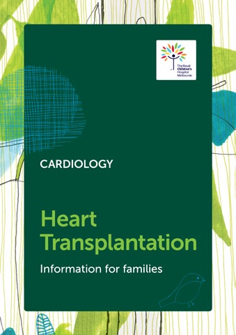
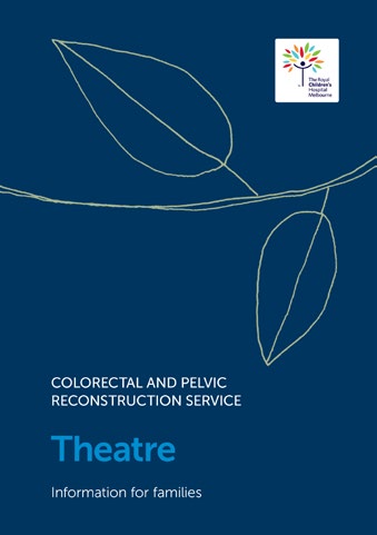
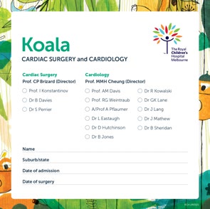
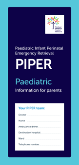
When their materials have a distinct look
and feel utilising other RCH brand assets
such as colour, pattern, illustration and
typography there is no need for any
department, service or program
to develop their own logos.
NOTE:
Each of of these RCH
departments, services or
programs correctly shows the
RCH logo as a primary brand,
with department identification
also clearly stated.
Various examples showing correct department identification
The Royal Children’s Hospital Brand Guidelines | Brandmark | Issued April 2024
17


 RCH Brand Guidelines
RCH Brandmark
Co-branding overview
There are many projects, events,
initiatives or services where
The Royal Children’s Hospital (RCH)
is involved or partners with others.
And it is important that the relationship
of the RCH to the project is accurately
presented.
If it isn’t, there could be confusion, and
potentially even legal ramifications, if the
RCH brand is incorrectly used.
These guidelines specify the RCH
approach to co-branding. They are
designed to protect the reputation of the
RCH and ensure an exemplary level of
professionalism when communicating to
various audiences.
RCH as primary brand
There are only three variations
for co-branding:
1. RCH as primary brand
(lead partner)
2. RCH as secondary partner
(secondary brand)
3. RCH as equal partner
(equal partner brand)
RCH as secondary brand
RCH as equal partner brand
The Royal Children’s Hospital Brand Guidelines | Brandmark | Issued April 2024
18
 RCH Brand Guidelines
RCH Brandmark
Co-branding:
RCH as primary brand
It is important that RCH branding is
correctly used to protect the reputation
of the RCH brand.
When the RCH as an organistaion is
communicating to its audiences,
RCH is the primary brand. This includes
communication from any RCH
department, centre, service or project.
The RCH brandmark must appear in
a primary position and size. Any
secondary brands (if required), must
appear in a seperate, smaller and less
prominent position than the RCH brand.
When RCH is the primary brand, the
materials must be produced in the RCH
brand style and comply with RCH brand
guidelines.
NOTE:
When the RCH as an organistaion
communicates with its audience,
the RCH must be the primary
brand.
When the RCH has governance
of a project or initiative, the RCH
must be the primary brand and
all other brands must appear in
a secondary size and position
to the RCH brand.
The Royal Children’s Hospital Brand Guidelines | Brandmark | Issued April 2024
19
 RCH Brand Guidelines
RCH Brandmark
Co-branding:
RCH as secondary brand
It is important that RCH branding is
correctly used to protect the reputation
of the RCH brand, even when the RCH
partners with other organisations.
When RCH is the secondary brand,
the materials must be produced in the
primary brand style and follow their
brand guidelines.
In this scenario, the RCH brandmark
must appear in a secondary position and
size to the primary brand and must be
seperate from it.
When using the RCH as a secondary
brand, our Brandmark and Co-branding
Guidelines must be followed to ensure
the RCH brandmark meets minimum
size, clearspace and background
requirements.
If the relationship of the RCH to the
project is not clear, there must be a
‘relationship statement’ included near
the RCH logo to clearly explain this.
NOTE:
When RCH is not the primary
brand, the RCH must appear in
a secondary size and position to
the primary brand.
The materials must be produced
in the primary brand style
(not in the RCH brand style).
An example of a relationship
statement:
The Centre for Community Child
Health is a department of The
Royal Children’s Hospital and
a research group of Murdoch
Children’s Research Instititute.
The Royal Children’s Hospital Brand Guidelines | Brandmark | Issued April 2024
20
 RCH Brand Guidelines
RCH Brandmark
Co-branding:
RCH as equal partner brand
It is important that RCH branding is
correctly used to protect the reputation
of the RCH brand, even when the RCH
partners with other organisations.
When the RCH is an equal partner brand,
the materials must be produced in the
style of the program or service.
In this scenario, the RCH brandmark
must appear in equal size and position
to the other brands.
When using the RCH as an equal partner
brand, our Brandmark and Co-branding
Guidelines must be followed to ensure
the RCH brandmark meets minimum
size, clearspace and background
requirements.
The relationship of the RCH to the
project must be clear. Ideally the equal
partner brands are grouped together
under a title, such as ‘Alliance members’
or ‘Project partners’.
The Royal Children’s Hospital Brand Guidelines | Brandmark | Issued April 2024
21
RCH Brand Guidelines
RCH Brandmark
Co-branding:
when to use Melbourne Children’s
The Melbourne Children’s brand is
restricted for use only for projects,
programs, events and initiatives
where they are equally managed and
represented by The Royal Children’s
Hospital, Murdoch Childrens Research
Institute and the University of
Melbourne.
Examples include Melbourne Children’s
Trial Centre (MCTC), Melbourne
Children’s Centre for Health Analytics,
and Grand Rounds.
NOTE:
For guidance on using Melbourne
Children’s please contact your
Communications team.
The Royal Children’s Hospital Brand Guidelines | Brandmark | Issued April 2024
22


