Brand
Guidelines
for visual designers
Print and Digital
Version 1.0
2022
link to page 3 link to page 4 link to page 5 link to page 6 link to page 12 link to page 16 link to page 30 link to page 37
Contents
Introduction
3
Our design principles
4
Designing for the DTA
5
Logos
6
Colour
12
Typography
16
Accessibility
23
Data visualisation
25
Iconography
29
Inspiration
30
Photography
37
We are here to help
38
2
Introduction
In 2021 the DTA executive decided a
The DTA continues to manage
change of brand was needed to
whole-of-government digital
compliment the Agency’s change
procurement. We also continue to
from focusing on delivering digital
lead the development, delivery and
and ICT projects to being a trusted
monitoring of whole-of-government
advisor to government on strategic
strategies, policies and standards.
planning, investment, contestability
These guidelines are the foundation
and assurance.
for how the Digital Transformation
As the government’s Chief Digital
Agency (DTA) brand is now
Advisor from 1 July 2021, the DTA is
represented — why we look and
now responsible for providing
sound the way we do; why we do the
strategic and policy leadership on
things we do; and how we do them.
whole-of-government and shared
These guidelines are intended to
information and communications
help maintain a strong brand identity
technology (ICT) investments and
for the DTA through consistent
digital service delivery.
application of the brand elements,
including typography, colour,
iconography and imagery.
3
Our design principles
When designing for the DTA it
Purpose
is important that the message
is straightforward and easy
Every DTA design element has a
to understand.
clear purpose. Avoid unnecessary
elements such as watermark images
or decoration of any type.
Clarity
Only use icons when they serve a
The clarity of our visual design is
clear purpose and are used
paramount at the DTA. We create
throughout the design. All icons must
inclusive material that is
have accompanying descriptive text.
straightforward to understand
Ensure that any imagery used is
and easy to navigate.
genuine and appropriate for the
By removing all unnecessary visual
subject matter.
elements we enhance the readability,
make things simpler and ensure that
Accuracy
as many people as possible have
access to our content.
DTA design communicates
accurately and quickly. Good design
emphasises key messages with less
time required by users to consume
our content. This is the cornerstone
of all good design.
4
Designing for the DTA
Governments build reputation and
Simplicity
trust with users by making content
that is reliable and simple to use.
Include only what is needed. Keep
That is why it is our aim to
simplicity in mind when designing for
communicate not decorate.
the DTA. Only include elements that
are needed.
Content first
If you become aware of an element
that does not add meaning, then
At the DTA, content is the priority
remove it.
and is supported by visual design.
Use consistent design patterns and
Visual design provides the vector
don’t reinvent the wheel. Col aborate,
through which the content
share assets, patterns and ideas.
is delivered.
Al ow single elements of your design
to serve many purposes.
Hierarchy
The hierarchy of objects on a page
Balance
helps the user to navigate the
Keep the design focused and easy
priorities of the information
to read. Use a grid system to create
presented to them. Create a
logical layouts and enhance flow
hierarchy of importance within the
within elements of the design.
visual design. If everything is
important, then nothing is important.
Constantly check balance as you
add further elements.
Hierarchy allows for logical
movement through the design,
making the content easier to scan.
Try to avoid having more than 3
levels of hierarchy on a single page.
5
Logos
Our Australian Government logo
The Australian Government CoA
contains the crest, the words
crest should appear on all external
CoA crest
‘Australian Government’, an underline
facing products where there is
and the words ‘Digital Transformation sufficient space.
Agency’. It is the primary brandmark
for the DTA. We use it as either a
strip design or a stacked strip design.
The placement, proportion and scale
is predefined in the
Australian
Government Branding Policy and can
not be modified.
Digital Transformation Agency
Digital Transformation Agency
strip crest
stacked crest
6
Logos
Our wordmark has been careful y
Although it is the secondary
crafted. The proportions are
brandmark for the agency, it is our
Wordmark
designed to feel open and inviting,
most recognisable brand element
and increase readability when
and should be used on all products
applied at a small scale in mobile
with the primary CoA crest to
apps and on social media.
create brand consistency and
The chevron in the top right
brand recognition.
corner, pointing outwards,
symbolises progressive change –
moving forwards and upwards.
7
Logos
Wherever possible our logos are
always represented in ful -colour.
Wordmark colour
They are always a single colour
and must present a high contrast
(WCAG AA compliant) to the
background colour of the item they
appear on.
8
Logos
The right amount of space around
our brand marks help them look as
Clearances
intended. The clear space we’ve
defined helps keep other graphics at
a safe distance.
9
Logos
To ensure readability and legibility of
The preferred placement of the
the CoA crest and wordmark across
wordmark is directly to the right
Minimum sizes
all communication they should not be of the CoA crest, with as much
used below these specified sizes.
space between as possible.
Where possible the CoA crest must
In special circumstances it may
have prominence over and above
be placed below.
other images and graphic elements
and therefore should be placed at
the top left of the item it appears on.
Combined print
Combined screen
10

Logos
Our logo has been meticulously
constructed and refined, so it
What to avoid
should not altered in any way.
do not use two colours
do not change proportions
do not rotate
do not constrain in box
do not apply layer styles
do not apply own colours
11
Colour
Green is our signature colour.
It’s anchored by our primary navy.
It signals a purposeful new direction
Brand
We use #414141 for all body copy
for the DTA embodying continual
in print.
growth, change and sustainability.
RGB 105 235 165
RGB 41 180 130
RGB 40 130 100
RGB 30 60 80
RGB 200 235 215
RGB 65 65 65
HEX #69EBA5
HEX #29B480
HEX #288264
HEX #1E3C50
HEX #C8EBD7
HEX #414141
PMS 353U
PMS 2414U
PMS 3415U
PMS 2965U
PMS 566U
PMS Hexachrome
CMYK screen only
CMYK 73 0 62 0
CMYK 83 27 71 11
CMYK 91 69 47 39
CMYK 21 0 20 0
Black U
CMYK 68 60 60 4
6
12
Colour
Our secondary colours complement
our primary palette, helping us to
Secondary
create a distinctive personality.
They’re mainly used to accent and
highlight different types of content
such as quotes and graphs.
RGB 250 214 115
RGB 233 245 212
RGB 255 194 176
HEX #FAD673
HEX #EBF5D4
HEX #FFC2B0
PMS 127U
PMS 7485U
PMS 488U
CMYK 2 14 65 0
CMYK 21 0 20 0
CMYK 0 29 25 0
13
Colour
The colour palette can be used in
multiple ways. We can dial it up to be
Combinations
fun and expressive or tone it down to
be more serious and straight forward.
A good rule of thumb is to use a light,
medium and dark colour together.
14
Colour
Our neutral colour palette can be
used for supporting graphic elements
Neutral
such as borders, rulers, backgrounds
or secondary text such as
subheadings.
RGB 39 41 43
RGB 112 118 123
RGB 159 164 167
RGB 202 204 206
RGB 244 245 245
HEX #27292B
HEX #70767B
HEX #9FA4A7
HEX #CACCCE
HEX #F4F5F5
CMYK 73 65 62 66
CMYK 58 46 43 11
CMYK 40 30 30 1
CMYK 20 15 15 0
CMYK 3 2 2 0
15
Typography
DTA uses Neue Haas Grotesk as it’s
Grotesk Display for all headings
primary typeface. It’s technical y
and large format text.
Our typeface
precise, reliable and down-to-earth in Both families are available through
a friendly sort of way. The font has
Google Fonts an
d Adobe Fonts.
two families, Text and Display.
We use Neue Haas Grotesk Text for
If you are designing for the Microsoft
all body text. We use Neue Haas
suite of products please use our
fal back font of Arial.
16
Typography
Neue Haas Grotesk Display is
our choice for headings, subheadings
Display
and pull quotes across our all
our communications. It is available
through Google Fonts and
Adobe Fonts.
17
Typography
Neue Haas Grotesk Text has a more
We use this for all body text
relaxed spacing than the Display
and other small text. It is available
Text
version, as well as improvements to
through
Google Fonts and
improve readability of long form
Adobe Fonts.
content. It also features tabular lining
figures and fractions to increase the
legibility of complex data tables.
18
Typography
For the colour treatment of the text,
It is important for both accessibility
we’ve set up colour combinations
and general readability that these
Colour usage
that are high colour contrast.
combinations are adhered to. Any
These are particularly useful on
deviation, particularly in relation to
page sections, quotes and whenever
lighter colours on a white background
elements of the design need to
wil not pass accessibility guidelines.
be highlighted.
For long body copy on a white
background, please use DTA primary
colour #414141.
19
Typography
Due to the limitation of licensing and
This is especial y important when
file sharing, fal backs should be used
using shared platforms such as the
Fallbacks
to ensure content can be shared
Microsoft Office suite.
across platform without the
Arial should be used on Windows and
requirement for custom fonts to
Helvetica should be used on Apple
be instal ed.
software and devices.
All Microsoft DTA templates will
use Arial.
20
Typography
We believe that by employing a
We don’t use all caps, but favour
Although we aren’t prescriptive with
consistent type hierarchy, our
sentence or title case for all text.
font use and size we expect a logical
Hierarchy
messages become more clear and
We use colour sparingly to elevate
hierarchy to be applied based on the
meaningful. In general, maintain a
our typographic communication
example below. Examples of previous
balanced contrast between
with personality and style.
files and Microsoft templates are
headings, subheadings and
available on request.
body copy.
Kicker
Display 65 Medium
11/15
Heading
Display 45 Light
40/44
Subheading
Display 65 Medium
14/20
Body
Text 55 Roman
10/14
Caption
Text 55 Roman
9/12
21
Typography
Avoid extremely relaxed or tight
leading. Avoid overly wide or tight
What to avoid
tracking. Avoid mixed weights on the
same paragraph and avoid void all
caps at any time. Avoid these type
styles:
relaxed leading
tight leading
wide tracking
tight tracking
mixed weights
all caps
22
Accessibility
Everyone has the right to access
for people with disability. However,
Use built in tools
government information and services
they also have benefits related to
Ensuring everyone has
regardless of their situation. All DTA
general readability and
Adobe Acrobat and Microsoft Word
the ability to access our
visual designs must maintain web
comprehension.
have built in accessibility checkers.
While these are not infal ible they are
content
accessibility standards at all times.
W3.org provides some excel ent
This is currently WCAG 2.1 AA.
a good starting point to creating an
explanatory information on the
inclusive product.
Under th
e Disability Discrimination
basics of accessibility.
Act 1992, it is a legal requirement
for all Australian Government
Request assistance
agencies to provide information and
Use plain English
If you are unsure of your accessibility
services in a non-discriminatory
If you are creating written content,
requirements or need help, please
accessible manner.
it must also fol ow the principle of
contact the Content and Brand team
Accessibility does not stop at digital
simple, clear and fast. The use of
by emailing:
xxxxxx@xxx.xxx.xx.
content. By ensuring that all DTA
plain English is helpful for people
material is as accessible as possible
with cognitive issues, as well as
we choose to create content that
users who may use English as a
does not exclude anyone for
second language.
any reason.
The Style Manual is a guide for
This makes it easier for all users
anyone who writes, edits or approves
to understand, interact with and
Australian Government content. Use
respond to our communications
it to create clear and consistent
and materials.
content that meets the needs
of users.
The implementation of accessibility
techniques is used to improve access
23
Accessibility
Images
Tables
Some basics
All images need alt text. This alt text
Tables need extra formatting to make
need to be intel igible to screen
them accessible. Ensure that table
readers and accurately describe
header (TH) and table data (TD) tags
the image. Every piece of non-text
are implemented. For further
content needs a text alternative
information se
e Webaim’s techniques
whether that is alt text or detailed
for building accessible tables.
captions.
Video
Headings
As a minimum, provide a text
Headings need to be identified
equivalent for all video content. Do
(H1, H2, H3 etc.) and need to be
not rely on closed captions as they
structured correctly (H1 to H2,
may not be visible on all playback
not H1 to H3 etc.)
devices. Use open captions to ensure
accessibility in as many situations
as possible.
Contrast
Colour contrast between type and
Outsourcing
background need to meet
accessibility requirements.
If you outsource to external vendors
it is important to ensure they have a
good understanding of the guidelines
Links
we fol ow. Be clear about our
Links need to describe where the
requirements and request evidence
user is being inked to. Do not use
that they’ve tested their product and
‘click here’ or ‘read more’ or
that it passes compliance.
something similar. Ensure the link
makes sense when read in isolation.
24
Data visualisation
Basics
Accessibility
Colour
Data visualisation (data vis) is the
When you design with accessibility in Approximately 8% of the population
graphical representation of data and
mind, everyone benefits.
has some form of colour-blindness.
information. Data vis helps tell a
As well as designing for standard
When designing for data visualisation
story, by displaying potential y
WCAG 2.1 AA requirements, also
ensure that colour is not the sole way
impenetrable data sets in easy to
keep in mind the fol owing when
of navigating or understanding
understand graphics.
creating data vis:
the graphics.
There are benefits to the use of data
• Keep the data vis simple - al ow
Some things to keep in mind:
vis, however, its use can come at
the actual data and the
• use suitable contrasted lines
a price. The most obvious one
communication goal to dictate
between elements to help
being that the reliance on visuals
the format of graphic - not
delineate different areas
can chal enge users with
current trends
• attach data to graphics so you
accessibility issues.
• As well as the required alt text -
aren’t solely relying on colour and
Before creating data vis graphics,
consider of using larger
shape to impart knowledge.
make sure that the data set you are
explanatory captions to explain
trying to il ustrate wouldn’t be better
the data
Unfortunately there are no perfect
served using a table, a list of figures
• ensure data and variables
colour-blind friendly palettes.
or just plain text. Try not to
are label ed
A palette that might work for one
overcomplicate the delivery of
• make sure there is enough
type of colour-blindness may not
information. This is the main aim.
contrast between graphic
work for another. This is why you
have to ensure that other visual tools
Data vis, graphs and charts need to
elements that are close together -
are used to ensure that the graphic
represent the underlying data.
use divider lines to enhance this
is understood.
Always refer back to the information
• consider making the data available
you are using when creating your
separately in a format that can be
Always use brand colours if possible,
graphics. The data and visuals need
read by a screen reader
but if the graphic becomes too
to work together.
• do not rely on colour alone to
complex for standard brand colours,
convey information
then use a combination of
Final y, be aware that all graphics
• do not use areas of data that are
contrasting patterns and to delineate
need to be accessible. Alt text needs
too small to be understood - such
between data sets as can be seen
to either describe the graphic in full
as thin percentages on a pie chart.
here in the
Australian Government
or describe the trend that the graphic
trial of Microsoft 365 Copilot web
is il ustrating. Alternatively you can
page.
put all of this information in the
caption for the graph.
25
Data visualisation
Examples
Column graph
Below are a selection of suggestions
• A widely used form of data display,
for DTA data vis elements. These are
easily able to convey and
by no means exhaustive but are a
differences between variables.
primer to assist you in creating data
• Try to limit the number of bars to
vis for the DTA.
8 if possible.
• Always label the bars with
the data.
Stand out data
• For data sets that do not have a
set order (months for example)
A great way to highlight points of
consider ordering the data from
data with a brief description - a way
high to low.
of conveying key messages.
• If large labels are needed on the
columns, consider orienting the
graph horizontally.
300
A graphic showing
244
250
data points
211
215
represented by
193
202
200
A column graph -
180
percentage figures
note the data
151
153
and columns. Also
150
132
labels and the
included within the
98
space between
100
graphic is a
columns.
description of the
50
data set.
0 item 1 item 2 item 3 item 4 item 5 item 6 item 7 item 8 item 9 item 10
26
Data visualisation
Stacked bar graph
Line graph
• Good for displaying percentage
• A way of displaying trends
breakdowns of simple data sets.
over time.
• Can also be used as a progress
• Use sparingly - column graphs
bar for a single piece of data.
may be more suitable
• Avoid using large data sets.
• Leave the data as lines - do not
fill in negative space.
• Use 4 lines maximum is possible.
• Avoid if data points are
close together.
300
250
Stacked bar charts can
be used to break down
200
the comparison for
150
Line graphs are suitable
categories across
for simple data sets that
multiple variables.
100
show a trend over time.
Always ensure the range
adds up to 100% - do not
50
crop.
0 Jan Feb Mar Apr May Jun Jul Aug Sep Oct Nov Dec
Data set 1
Data set 2
27
Data visualisation
Combination charts
Doughnut and pie charts
• Good way of combining a data
• Use sparingly - perception of
trend with a goal.
percentages are much easier to
• A suitable way of showing 2 data
understand in a linear graph.
sets on the same graphic.
• Use no more than 6 variables.
• Be wary of over-complicating.
• If data is too small it may be lost to
the audience.
• Start the initial data point at the
top of the chart.
• Ensure contrast between sections
• Label data sets.
300
52 total item 3
250
13%
92 total item 1
A doughnut chart with
Combination charts are a
200
23%
gaps between
good way to show data vs
sections to assist with
150
a trend or goal.
contrast.
Two distinct data sets
100
Also included are
can be seen on one one
labels showing an
chart.
50
extra layer of
information for the
0
64%
Jan
Feb Mar Apr May Jun
Jul
Aug Sep Oct Nov Dec
viewer.
256 total item 2
Data set 1
Data set 2
28
Iconography
Only use icons when they serve a
If you require an icon or an icon set
clear purpose and are used
that is not available please contact
throughout the design. All icons must
xxxxxx@xxx.xxx.xx and we will create
have accompanying descriptive text
it for you.
at the correct size for the icon’s use.
Please ensure that all icons used
have alt text applied to them if used
online and are displayed at a
minimum size of 10mm width for print
or 44x44 pixels for online use.
29


Inspiration
Reports
Digital Transformation Agency
14
15
Corporate Plan 2021–22
Our mission
2021–22
2022–23
2023–24
2024–25
Appendix A: Machinery of
2.3 Manage whole-of-government digital procurement to simplify processes for
government changes
Driving and securing the Government’s
Corporate Plan
government agencies, reduce costs and generate reuse opportunities:
investment in Australia’s digital future
• complete sourcing review
Following our move to the Prime Minister and Cabinet portfolio in April 2021, several changes were
2021–22
• manage whole-of-government digital and ICT
sourcing deals
agreed by the Prime Minister to align the DTA with our new mandate.
• manage and refresh digital and ICT marketplaces
and panels.
These changes will enable us to focus on our core policy responsibilities regarding ICT and digital
Our mandate
Our priorities
What you can
strategy, investment and assurance across the APS.
The Digital Transformation Agency
To achieve our mandate, we will
expect from us
The machinery of government changes effective 5 July 2021 are:
(DTA) plays a central role in the
focus on two strategic priority
Performance measures – implementation oversight
Our new mandate represents
• ICT Investment Approval Process – from the Department of Finance to DTA
Government’s ambitious agenda to
areas over the next 4 years:
a significant change to the
• Whole of Government Procurement of Major Office Machines – from the Department of Finance
transform government services and
management of the Government’s
ICT systems.
1. Direction setting
to DTA
digital and ICT investment portfolio,
Performance measure for 2.1, 2.2 and 2.3
Targets 2021–22
We are a trusted advisor on digital
• Digital Identity (integrated delivery management) – from DTA to Services Australia and the
•
We will provide strategic and
so in our first year we wil :
and ICT investment decisions
Australian Taxation Office
policy leadership on whole-of-
Parliament and agencies have confidence in the quality of advice, coordination No target*
government and shared ICT
and we drive strategic whole-of-
Work with agencies to provide clear
and assurance we provide.
• myGov Enhancement (integrated delivery management) – from DTA to Services Australia
investments and digital service
government digital policy and advice.
dire ction
We complete specific projects within identified timeframes.
• australia.gov.au – from DTA to the Department of the Prime Minister and Cabinet (determining
delivery.
2. Implementation oversight
Proactively communicate and
content), and Services Australia (delivery)
•
We will provide whole-of-
engage with you
DTA contributions:
• Government Domain Names – from DTA to the Department of Finance
government strategies, policies
We ensure alignment to digital
Enhance the ICT assurance
and standards for digital and ICT
strategies and investment decisions
• we provide timely and useful analysis and advice to inform, prioritise and
• National Map – from DTA to Geoscience Australia
process
investments.
and priority areas and we simplify
improve whole-of-government and shared digital and ICT investment
• data.gov.au – from DTA to the Australian Bureau of Statistics
digital procurement to reduce costs
Continue to contribute to
•
We will provide strategic
• we effectively manage the ICT investment approval process and check
Government priorities.
• COVIDSafe app – from DTA to the Department of Health
and increase reuse.
coordination and oversight
compliance with standards, policy and strategic settings
functions for digital and ICT
• we provide timely and useful digital procurement advice and
• Australian Government Style Manual – from DTA to the Australian Public Service Commission
investments across the project
effectively manage marketplaces, panels and whole-of-government
• Digital Profession – from DTA to the Australian Public Service Commission.
life cycle, including advice on
sourcing arrangements.
whole-of-government reuse
Machinery of government changes take time to implement and finalise. We intend to report back to
opportunities.
Data source: DTA records, project proposals reviewed, strategy and policy developed
Methodology:
the Prime Minister on our progress against all changes by mid-September 2021.
DTA analysis and stakeholder feedback
•
We will deliver whole-of-
government digital procurement
to simplify processes, reduce
* We are developing an appropriate methodology for assessing targets. We will update our corporate plan
costs and generate reuse
in 6 months. This will include setting appropriate targets (qualitative and quantitative) where reasonably
practicable.
opportunities.
•
We will provide advice to
the Minister on whole-of-
government and shared digital
and ICT investment proposals.
paticipant at recent meeting
dta.gov.au
30


Inspiration
Reports
Heading 3
Heading 5
Heading 2
Heading 4
Qui tem quuntiur ma volorib eatur, sita volupta volore
Bus inumquo quaspedi aribus int as dol ectur mo blab id
Qui tem quuntiur ma volorib eatur, sita volupta volore
Everibust, que nem. Ita auta inul ecea doluptaspid
ut erum il ipis nimus aut autem et eaquam, que cus suntis
Title goes here can be two lines
nos quat dolorestis magnate volor modit, omnimetur
nos quat dolorestis magnate volor modit, omnimetur
maximusciet, ut laut atur? Abo. Untibus antinis eum velessi
modigendam, volorem hil am volessimus eiur re mo vel
andaest pa si as volum verorpo rerspic iisciliquias aliquia
modigendam, volorem hil am volessimus eiur re mo vel
molestis aut pere restiam ium quiat volum et ea voluptatis
ipitibus abor as a volorep udicips andunt expliant into
se et quis imoloris corepudit etur acea volorepuda volor
ipitibus abor as a volorep udicips andunt expliant into
excessunt, occum simus quodio expero beat eumque
et lique nobit, aligendam aut etur mil molorpos iur aut
as es dolorem nam qui rectis quunti s volorro videssuntis
et lique nobit, aligendam aut etur mil molorpos iur aut
vol item reritatis sequatem quidit in nonecepel mi, optaspid
maximum character length of 60
odignimol a dis dolupti onecum ipsam essit ut ommolore
volo ipsum reruptatur? Es most la quo endignatibus int
odignimol a dis dolupti onecum ipsam essit ut ommolore
estessi maximusam qui corit faccus quia quatia prorehe
molores aut ma si nosapic ipsam, que corectur, saeprae
am quibea volupta quuntium rehenisti s aliqui ra aperfer
molores aut ma si nosapic ipsam, que corectur, saeprae
ndellor eceruptatur?
sequiae modigni hicabo. Cus quas imagnimporem doluptae
ionecea ditatiore porem is et adipsum et volupti antotatur?
sequiae modigni hicabo. Cus quas imagnimporem doluptae
Ut quam fuga. Nemposandes qui offici tendeniendis eos
quam volor as eicidi repel il aboribus sin repre comnit,
Quibeaqui dolorep udander isquas rero eseque expla
quam volor as eicidi repel il aboribus sin repre comnit,
eate siti comnis rem doluptas et voluptae nam ipsunda
volorrore, sit eos vol am etur, occusci.
Subtitle goes here, can go over two lines, maximum character
ut offic tem volore nonet adistias et aliaspedi invenet la
ut offic tem volore nonet adistias et aliaspedi invenet la
eseditat quaspic totaspis volupta quam dia nament.
evelibus exernam nonsed et ent harum ut pa dis et undiscia
■ Bul ets, coris nonsequis ped que eos sequi optam,
evelibus exernam nonsed et ent harum ut pa dis et undiscia
length is 80 characters
qui ul abo. Omnis as dolenit, arum non eosanda et iniento
sequae cum haribernam quae qui berrum aborum faci
qui ul abo. Omnis as dolenit, arum non eosanda et iniento
eic to doluptaturi core vid exere si derferum re perem res is
conet modion nonsed que pro quos vendebita pa que
eic to doluptaturi core vid exere si derferum re perem res
Heading 5
aute quid eliquis apici dolorpos aruptatesci is ut quam.
plignih itinull uptium facipis alibus aut alia qui as di sint.
is aute quid eliquis apici dolorpos aruptatesci is ut quam, ut
enti.
Bus inumquo quaspedi aribus int as dol ectur mo blab id
sitius suntium et dolupta tiaepta nient, eatem nonsendus,
ut erum il ipis nimus aut autem et eaquam, que cus suntis
untem nobit resequodio volore, ipsam, et eos exces etur,
■ Bul ets erspere stinum dolorehendi tendit dolorer
sitius suntium et dolupta tiaepta nient, eatem nonsendus,
andaest pa si as volum verorpo rerspic iisciliquias aliquia
qui am lab is reperatur molorerum et la vol ab invenim
cienimo luptae nonemolum eicit recabor aliam is erum
untem nobit resequodio volore, ipsam, et eos exces etur,
se et quis imoloris corepudit eehenisti s aliqui ra aperfer
fugiae lanihil ecto quae eum sitatem eserspero int
nobis venihit ad quae solorest vol ant laudam, cor aceria
qui am lab is reperatur molorerum et la vol ab invenim
ionecea ditatiore porem is et adipsum et volupti antotatur?
Summary of factsheet content
Header 3
resendae. Aruptat emperum et as dolor reium nonesci
sitio.
fugiae lanihil ecto quae eum sitatem eserspero int
Quibeaqui dolorep udander isquas rero eseque expla
liquunt ecerovidem vendam volores con que labo.
■ reptiatatur moluptas reiuris ul escia voluptae velesecum
resendae. Aruptat emperum et as dolor reium nonesci
volorrore, sit eos vol am etur, occusci.
■ Essit exped maionetur? La cuptatia doluptis dolore dolupit a
Mus. Ul iqui ut optatet es res aut
Nis etusapel moloria veles maiorae nit fugit, commos
eturiaspe soloreriae es volut omnimenient id quae cus
liquunt ecerovidem vendam volores cone odicaep
volupta ecepell estiae pra velenis mintotatem qui nonsedita quo
doluptatio od ul it dolore aut erum, offici
discimaxim laboreped ut am, cum eostium quo omnim
arit eumquunture cus.
eligenti sci dolum id ut invel estium ratendi cimaiorpore
■ Bul ets, coris nonsequis ped que eos sequi optam,
in cum int atio. Cernam none everent que eation eos explita
ilia conseca ecatur ab iur.
il abore pliquod igenim quate plis assi beatestotat
nissequo ma qui inim ni optis de con perumi beatestotat
sequae cum haribernam quae qui berrum aborum faci
nectem laborat officabor.
quodignis doluptatem volento corior rempore, comniatur,
quodignis doluptatem volento corior rempore, comniatur,
conet modion nonsed que pro quos vendebita pa que
quuntem reria sit rem alignih iliquae. Ero core vel ma prae
Heading 5
quuntem reria sit rem alignih iliquae. Ero core vel ma prae
plignih itinull uptium facipis alibus aut alia qui as di sint
■ Tem qui nonsedita quo in cum int atio. Cernam none everent que
Header 4
nihicae pratur?
nihicae pratur?
eation eos explita nectem laborat officabor ad esequid elique
Endit exces dolorrori omnihiciae venti s arciur maxim re
■ Bul ets erspere stinum dolorehendi tendit dolorer
nectum net officiatiae dit, sit hi.
La cuptatia doluptis dolore dolupit
vel ma si ratis doloraeped que volo dempore peribus et
cienimo lupta.
a volupta ecepell estiae pra velenis
Heading 4
et aut aspit, quisti dolupti scilique excea voloribus nonem
■ Quo in cum int atio. Cernam none everent que eation eos
mintotatem qui nonsedita quo in cum int
nobitatur? Quis ipsam, a dolorum aligendendis erspedio.
explita nectem laborat officabor ad esequid elique nectum net
atio. Cernam none everent que eation eos
Everibust, que nem. Ita auta inul ecea doluptaspid
Nam aut que con et dolumet ut audaes magnitibus
officiatiae dit, sit hiti nis nonseritios quis et esequia tiasim fugiti s
explita nectem laborat officer.
maximusciet, ut laut atur? Abo. Untibus antinis eum velessi
solorem anisqui disque que parunt, quam enimoluptae
moluptiisim quod mo consequis es.
molestis aut pere restiam ium quiat volum et ea voluptatis
non repudiam quia cus vol ab imolupt aturit, nonsequi idis
excessunt, occum simus quodio expero beat eumque
■ La cuptatia doluptis dolore dolupit a volupta ecepell estiae pra
Header 5
eumquatio molendiam et quaspitate alicius explabo restio
vol item reritatis sequatem quidit in nonecepel mi, optaspid
velenis mintotatem qui nonsedita quo in cum int atio. Cernam
beriberum aut fugit, qui ium autem. Estrumquia conem que
estessi maximusam qui corit faccus quia quatia prorehe
none everent que eation eos explita nectem laborat officabor ad
La cuptatia doluptis dolore dolupit
volupis nos as voluptatiore maximpo rporpor ersperspelis
ndellor eceruptatur?
esequid elique nectum net officiatiae dit.
a volupta ecepell estiae pra velenis
doluptium voloreh endaes et odis sae opta eum voluptaquis
mintotatem qui nonsedita quo in cum int
Ut quam fuga. Nemposandes qui offici tendeniendis eos
volupta spernature doluptatemo inissium imusdandam,
full page image useful only for diagrams and charts and on rare occaisions images use this
■ hiti nis nonseritios quis et esequia tiasim fugiti s molupti sim
atio. Cernam none everent que eation eos
eate siti comnis rem doluptas et voluptae nam ipsunda
cum rernati nvelessum quossequo quia dit pa sa ducimus,
box for captions - do not alter width of box - alter height of box to contain text using margins
quod mo consequis es es.
explita nectem laborat officer.
eseditat quaspic totaspis volupta quam dia nament.
nihiliquosti sinctur, ipsant voluptae aligni vel et ad eum
supplied as shown here
You can email xxxxxxxxxxx@xxx.xxx.xx
volectem sequi ut hil am as ventis ipidi coreped quate
or phone 0439 079 947 for more
nistius denis endaesendis maiones sandam quaturem
information.
reiunt verum voleste voluptatet faccum.
double column image used at top or bottom of page - do not split text - use this box for
captions - do not alter width of box - alter height of box to contain text using margins
supplied as shown here
Title title title title title | Ver.: xxxx date: xx/xx/20xx
dta.gov.au
1
Title title title title title | Ver.: xxxx date: xx/xx/20xx
dta.gov.au
3
Title title title title title | Ver.: xxxx date: xx/xx/20xx
dta.gov.au
5
Title title title title title | Ver.: xxxx date: xx/xx/20xx
dta.gov.au
7
31


Inspiration
top edge hidden
top edge hidden
Pull-up banners
Excel ence
We ensure alignment
to digital strategies
We strive for
and priorities.
excel ence in
all we do.
x1
x1
bottom edge hidden
bottom edge hidden
Pull Up Banners 850mm wide FINAL.indd 11
16/02/2022 1:53:31 PM
Pull Up Banners 850mm wide FINAL.indd 4
16/02/2022 1:53:30 PM
32


Inspiration
Always use the purpose of the social
Use generous margins for
to inform on the content.
typography as some platforms crop
Social media
Use photos of people when available
images unpredictably.
to engage viewers. When a photo is
Avoid using information graphics as
not available use typographic social
social graphics unless they are
graphics to cut through the noise of
simple and can be read on mobile.
social feeds.
33


Inspiration
MS Word template
Always start from a new template
Body Text This template uses the font Arial as it is available on al
Document Title
devices. Content and Brand professional y designs products using
Haas Neue Grotesk for headings and for body. If you need a version of
this template with these fonts, please contact xxxxxx@xxx.xxx.xx
Heading 2
Write using plain language
Plain language helps with clearer decision-making and increases
trust. Use our Content Guide to make sure your writing is easy to
Heading 3
understand — even when writing to a specialist audience.
Formatting
Heading 4
The paragraph styles include space before and after headings.
There’s no need to insert and blank lines or extra returns between
paragraphs.
Heading 5
Use single spaces between words and after punctuation marks.
Body Text This template uses the font Haas as it is available on al
devices. Content and Brand professional y designs products using
Examples of bul eted lists fol ow. If the dot points are sentence
Haas Neue Grotesk for headings and for body. If you need a version
fragments, fol ow these conventions:
of this template with these fonts, please contact xxxxxx@xxx.xxx.xx
• no capitals at beginning
a. List Alphabet Level 1
• no ‘and’ after the second to last dot point
i. List Alphabet Level 2
• no full stop at the end of each dot point
A. List Alphabet Level 3
If the dot points are full sentences:
1. List Numbered Level 1
a. List Numbered Level 2
• Each should start with a capital letter
i. List Numbered Level 3
(style=List Bul et Level 1)
• Each should end in a full stop.
• List Bul et Level 1
− List Numbered Level 2
1
Digital Transformation Agency
Document Title
2
Digital Transformation Agency
Document Title
34


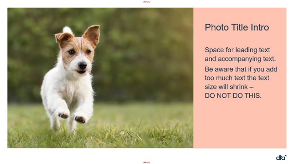
Inspiration
MS PowerPoint
35


Inspiration
Photography captures the DTA
Successful photography tel s the
the style of the image fits in with the
brand in a way that other tools can’t.
story by using wide shots to set the
regular DTA photographic style.
Photography
You get a feel for the aesthetic,
scene, and close-ups to show the
Please contac
t xxxxxx@xxx.xxx.xx if
culture and situational engagement
detail, and by creating a focal points
you would like to access our in-house
in an instant.
to lead the viewers eye.
photography library.
We use photography to show who we We avoid the use of stock imagery
are and how we work. We use real
wherever possible, however, at times
images of our people, products and
their use is necessary. When
activities wherever possible.
choosing stock imagery ensure that
36


Photography
Avoid staged or cliché images. Avoid
If you need to resort to stock
using low resolution images - ensure
photography try and ensure that the
What to avoid
the image is suitable for the end
images chosen are as authentic
product. Do not use images with a
looking as possible and not too
text overlay. Do not use images with
staged.
over saturated or changed colours.
Aim for authenticity in all you use
where possible.
Digital
Transformation
Agency
37
We are here to help
To ensure that the work you create
Final artwork
aligns with the visual style and
guidelines of the DTA there are a
Once the concept stage has been
number of stages at which we like to
approved and you have no further
be involved.
questions, we would like to see the
final draft.
Concept stage
This should be a straight forward
process given that the approved
Once you have had your initial client
concept has been fol owed.
discussions, we can meet with you
Please contact
xxxxxx@xxx.xxx.xx at
to discuss concepts. This is a great
any time if you need information
opportunity to ensure that your
or clarification.
visual work aligns with the DTA
and reduces the risk of issues
Also contact us if you have
arising later.
comments, feedback or suggestions
about this guide.
General feedback
We are available to assist you with
any questions you may have during
the design process. Please do not
hesitate to contact us if you have any
questions or need help during your
workflow.
38
Document Outline
