

OFFICIAL
Climate Change
Authority
Style Guide
DECEMBER 2024
OFFICIAL

OFFICIAL
CLASSIFICATION
Contents
Style Guide .............................................................................................................................................. 1
Climate Change Authority ....................................................................................................................... 1
Background ......................................................................................................................................... 3
Climate Change Authority Style Elements .............................................................................................. 4
Heading 1 ................................................................................................................................................ 4
Heading 2 ............................................................................................................................................ 5
Heading 3 ........................................................................................................................................ 5
Grammar, Punctuation and Conventions ............................................................................................ 7
Writing and Designing Content ......................................................................................................... 10
Accessible and Inclusive Content ..................................................................................................... 11
Web content accessibility guidelines version 2.0 (WCAG2.0) compliance ................................... 13
How to use Alt-text ........................................................................................................................ 13
Referencing ....................................................................................................................................... 14
Glossaries ....................................................................................................................................... 14$
Data Visualisation ............................................................................................................................. 15
Version Control
Document owner:
GM Strategy
Due date for 12-monthly review:
September 2025
Version
Author
Date
Changes
1.0
N/A
September
Initial version referenced in head document
2024
OFFICIAL

OFFICIAL
CLASSIFICATION
Background
The Climate Change Authority Style Guide helps you write clear and concise reports and documents
as an assistant to the Commonwealth Style manual (https://www.stylemanual.gov.au). Please ensure
you are familiar with the Commonwealth Style manual first. The Authority’s Style Guide aims to only
provide supplementary information specific to the Authority’s work or where the Style manual is not
completely prescriptive (such as referencing).
The Style Guide should not contradict the Style Manual. The Style Manual and Style Guide together
should be your bible when producing reports, charts, spreadsheets and other documents and you
should be intimately familiar with their content.
The Style Guide does not address every possible issue you may encounter. Please consult the
Commonwealth Style manual in the first instance. The Style Guide is an evolving document. If you
have suggested changes or additions for the next iteration, please contact the style guide’s current
author.
Document templates
Governance, version control (including update timeline and person responsible)
Link to glossary spreadsheet per
Training available
Contacts
Green call out box
Minimum standards, accessibility, legal requirements.
Blue call out box
Examples and tips.
Version control:
Date updated
Person responsible
Version
May 2023
Rebecca Berryman
Draft
June 2023
Claudia Papandrea
Approved v1
July 2023
Claudia Papandrea
Update v1.1
August 2023
Claudia Papandrea
Update v1.2
September 2023
Claudia Papandrea
Update v1.3
October 2023
Claudia Papandrea
Update v1.4
OFFICIAL


OFFICIAL
CLASSIFICATION
Climate Change Authority Style Elements
Colours
The Authority’s colour palette has been developed containing seven colours. These are the only
colours (as well as black and white) that can be used on Climate Change Authority collateral. Full
colour images (photos) can also be used. Please note, to ensure compliance with WCAG, white text
is
ONLY to be used on colours from Mid Blue to Dark Grey and black text is
ONLY to be used on
colours Light Green to Mid Blue.
Contrast Ratio
Ensuring that a contrast ratio of at least 4.5:1 exists between text (and images of text) and
background behind the text. Use a colour contrast tool to calculate if you are meeting minimum
standards.
For example:
Background colour: #007BB7 (CCA Mid Blue)
Foreground colour: #fff (white)
OR #000 (black)
The contrast ratio is 4.52:1 and passes accessibility minimum.
Typography
External typeface: HELVETICA NEUE
The primary typeface used for Climate Change Authority is Helvetica Neue. It is available in a range
of weights including: Light, Light Italic, Regular, Italic, Bold and Bold Italic.
Report typeface: ARIAL
HEADER: Arial Bold and Arial Bold Italic.
BODY TEXT: Arial Regular and Arial Regular Italic.
Internal typeface: ARIAL/CALIBRI
HEADER: Arial Bold and Arial Bold Italic.
BODY TEXT: Calibri Regular, Calibri Italic, Calibri Bold and Calibri Bold Italic.
WEB: typefaces on the website should be consistent with the treatment for internal
documents.
Header typeface is Arial Bold and Bold Italic.
Body text typeface used for Climate Change Authority is Calibri Regular, Calibri Italic, Calibri
Bold and Calibri Bold Italic.
Heading 1
Heading 1 should be used consistently for the top-level headings within your document. Applying the
Heading 1 style using the Styles function will ensure all heading one text will be consistent throughout
and makes it easy to amend levels if the structure needs to change.
OFFICIAL

OFFICIAL
CLASSIFICATION
Please use the Normal style - Arial font apt
size 10 at 1.08 spacing.
Heading 2
A Heading 2 should always be a sub-heading to a heading 1.
You don’t need to format the text to create a heading look – use the Styles to apply
the pre-defined styles. This gives you consistency throughout.
Heading 3
A heading 3 will sit below a heading 2.
Lists
List Paragraph items can be bullets
With sub-bullet points
1. Or they can be numbered
Quote text – for when you need a pull-out quote style
to use.
Intense Quote – for shaded text and call-out boxes
Hyperlinks
www.climatechangeauthority.gov.au
Hyperlinks will automatically set the style when a URL or bookmark is put behind text. If your
document is designed for print use the full URL. For online documents use descriptive text. This helps
assistive technology users to differentiate each URL. Do not use “click here”, “available here” or
“available on the website”.
Call out box Heading
Use this box style to highlight or emphasise a
short amount of text without bullets.
A longer amount of text should not be boxed. For example, put case studies in body text
with heading hierarchy.
Images
When you use images in a word document, you need to ensure:
You add alt text for accessibility. Right click the image and select Format Picture. Fill in the alt
text description (mandatory) and title (optional). This allows assistive technology users to
understand the picture.
Images can have captions. Right click the image and select Insert Caption. Use this field to
include the image credit.
You can change the alignment position of the image. Click the image to display the
Picture Tools
Format ribbon, then choose
Position. Any image that does not have text wrapped around it should
be set
In-line with text. This makes it accessible.
OFFICIAL


OFFICIAL
CLASSIFICATION
Photo 1 Townsville skyline.
Credit: Posnov/Getty Images
Tables
Choose
Insert > Table. Click the table and choose one of the table styles under
Table tools >
Design > Layout.
For accessibility you must:
1.
Add alt text to the table. Select the table and right click to access
Table Properties. Fill in the
alt text description (mandatory) and
title (optional). This allows assistive technology users to
understand broadly what’s in the table and how to navigate it. You don’t have to repeat the table
contents.
2. Ensure your header row is defined and it is set to
repeat. Click in the header row. Under the
Table Tools ribbon choose
Layout > Repeat header row. This enables tables to extend
across pages and is required for accessibility.
Figure 1: Use style sheet ‘Figure Title’
Table Heading
text
text
Figure 2: Example style sheet ‘Figure Title’
Heading 6
Col 1
Col 2
Col 3
Total
Text
100%
100%
100%
100%
Text
100%
100%
100%
100%
Text
100%
100%
100%
100%
Text
100%
100%
100%
100%
OFFICIAL

OFFICIAL
CLASSIFICATION
Grammar, Punctuation and Conventions
For Australian Government style compliance refer to the grammar and punctuation section of the
Style Manual.
General rules to obey:
Keep the functions of words in mind to write clear content. Grammar and sentence structure
help people understand meaning.
A sentence is a group of words that makes sense on its own. Structure the parts of a
sentence so meaning is easy to understand.
Use punctuation correctly to help readability and comprehension. Don’t overuse punctuation
marks. The Authority follows the principles of minimal punctuation and capitalisation.
Spelling errors detract from readability. Follow one dictionary for consistency and use it to
check variable spellings.
Use shortened forms if they help the user understand quicker. Make sure everyone
understands them.
Styles for numbers and measurements supports accessibility and readability for users.
Italic type contrasts with roman type. It draws people’s attention to convey meaning. Use italic
type sparingly as it can affect readability.
Check official sources for correct names and terms. Use consistent capitalisation and
punctuation.
Use correct titles and capitalisation for academics, diplomats, judges, government officials,
royalty, and the members of the armed forces.
Refer to the Authority’s glossary for commonly used key terms, definitions, and abbreviations.
Punctuation and Capitalisation
Punctuation and capitalisation have rules for correct use. Use minimal punctuation and capitalisation
to make content more readable. Too much punctuation makes text crowded and difficult to read. If a
sentence has a lot of punctuation marks, it might be a sign that the sentence is too long or complex.
Try to rewrite into shorter, clearer sentences.
To use minimal punctuation:
Don’t add full stops to the ends of headings, page headers, footers or captions.
Don’t use a semicolon at the end of each item in a bullet list.
Unless each item is a full sentence or the last item in a list, don’t use a full stop for items in
bullet lists.
Don’t use full stops between letters in an acronym or initialism.
Don’t use a full stop at the end of most abbreviations.
Restrict the use of the Oxford comma1.
Use the percentage sign next to a numeral in text. Don’t use a space between the number
and the percentage sign.
1 If the last item combines two words or phrases with the word ‘and’, use a comma before that final item. This use
of the comma is known as the ‘Oxford comma’ or ‘serial comma’.https://www.stylemanual.gov.au/grammar-
punctuation-and-conventions/punctuation/commas. The Oxford comma can prevent ambiguity in complex
sentence lists. For example, use the Oxford comma before the last item if you’re using a defining phrase
applicable only to that final item. A defining phrase is essential to the meaning of the sentence. The following
examples show how the Oxford comma can affect meaning, using the defining phrase ‘for stockfeed’.
OFFICIAL

OFFICIAL
CLASSIFICATION
Minimal punctuation helps all users to understand content.
Follow conventions for using capitals for titles, honours and forms of address. Use capitals when an
official title precedes the name of the office holder. This includes titles for executives specified in
legislation.
Follow the rules of capitalisation for government terms. Click here to use the correct term and follow
the rules for capitalising government terms. People find it easier to understand content that has a
consistent style. Below are examples of common uses.
Government
refer to the national government of Australia as the ‘Australian Government’. Use an initial
capital for both words only when they occur together.
use an initial capital for the word ‘government’ if it is part of a formal name. Use lower case
everywhere else.
Example – Australian Government
The Australian Government coordinates emergency management with the states.
Australian Government Department of Climate Change, Energy, Environment and Water
The advertised grants are funded by the Australian Government. The government recently extended
the closing date for applications.
Example – general
the Victorian Government
the Australian and New Zealand governments
the governments of South Australia and Tasmania
Road maintenance is a local government responsibility
Departments and agencies
Use initial capital letters only for the formal names of government departments and agencies. Check
the names of departments and agencies in the government online directory.
Don’t use capital letters for generic mentions. For example, use:
‘the agency’ instead of ‘the Agency’
‘the authority’ instead of ‘the Authority’
‘the commission’ instead of ‘the Commission’
‘the department’ instead of ‘the Department’.
Write this:
The
Department of Finance owns the policy. The
department has been working on it for months.
The
Australian Communications and Media Authority has responsibility. The
authority was
recently tasked with the report.
Not this:
The Department of Finance owns the policy. The
Department has been working on it for months.
The Australian Communications and Media Authority has responsibility. The
Authority was recently
tasked with the report.
Referring to the Climate Change Authority
OFFICIAL

OFFICIAL
CLASSIFICATION
Our name must be written in full for the first reference in each section of a document and when being
listed as a source for a figure or table. Subsequently referred to as ‘the authority’ in public documents,
never CCA.
We only refer to the authority using personal pronouns, ‘we’ or ‘our’ in external communications
products.
Please do not write ‘Climate Change Authority (the Authority)’ except in legal documents.
Percentages
Use the percentage sign next to a numeral in text.
Don’t use a space between the number and the percentage sign.
‘Per cent’ and ‘percentage’ aren’t the same. The term ‘per cent’ is an adverb. The noun form
is ‘percentage’.
‘Per cent’ is written as 2 words in Australia. ‘Percent’ is not Australian spelling.
Avoid using percentages to describe changes. Tell people what the actual increase or
decrease is.
When you use many percentages in running text, put the figures in brackets (parentheses) or
use a list to simplify the text.
Examples - percentages
Use the percentage sign next to a numeral in text. Don’t use a space between the number and the
percentage sign.
Correct: 15%
Incorrect: 15 %
As for any number, avoid starting a sentence with the percentage. Reword the sentence if possible or
write the percentage out in words. You can use everyday words if a precise amount is not needed.
Write this:
Fifty-five per cent of the council’s revenue came from rates.
Rates accounted for 55% of revenue.
Not this:
55% of the council’s revenue came from rates.
Don’t use percentages to describe change.
Write this:
The application fee is now $70. This is a $20 increase from 1 January 2020.
Not this:
The application fee increased by 40% from $50 to $70 on 1 January 2020.
Be concise when writing about percentages.
Write this:
In 2019, population size increased in New South Wales (32%), Queensland (20%) and
Victoria (19%).
Not this:
In 2019, the largest sources of population growth were New South Wales, Queensland
and Victoria. New South Wales accounted for 32% of the population growth, Queensland
20%, and Victoria 19%.
OFFICIAL

OFFICIAL
CLASSIFICATION
Writing and Designing Content
Accessibility considerations
User needs:
For a better understanding of user needs and accessibility, refer to the overview on accessibility.
You must make all government content accessible to people with disability.
This is part of Australian law under the Disability Discrimination Act 1992.
All Authority style elements are built into the document templates. Refer to the Style Manual before
you draft content and contact the Outreach and Engagement Team for external documents.
Top tips for drafting content:
Only create content that meets a need. Find out about users and their needs through user
research.
Use plain language. Write short and simple sentences in active voice.
Write and design content that is easy for the user to find with a search engine.
Editing and proofreading help ensure consistency, so content meets user needs and
expectations.
Use protective marking for government information. Follow the Authority’s procedures to add
them.
Content Types
Use the format that helps meet the user’s need. This could be a form, blog, image, report, or another
format. Refer to the Style Manual for content types and ask Outreach and Engagement for advice on
the best way to reach your audience.
Structuring Content
Design content with a structure that helps the user navigate and understand. This is important when
drafting briefs for Members, Ministers, Executive, and the public.
Refer to the Style Manual for how to structure your document:
Types of structure
Headings
Links
Lists
Paragraphs
Tables
Text boxes and callouts
Accessibility considerations
User needs:
Fundamental requirement: use lists to make it easier for users to skim content and navigate pages.
Web Content Accessibility Guidelines success criterion: 1.3.1 Info and relationships – level A.
OFFICIAL

OFFICIAL
CLASSIFICATION
Lists
The Lists are series of items. All lists have a 'lead-in' (a phrase or sentence) or heading to introduce
the list.
Use lists to:
help users skim information
group related information
help users understand how items relate to each other
show an order of steps
arrange information by importance.
Lists can be ordered or numbered (the order is important) or unordered (the order is not critical).
A bullet list can be ordered or unordered.
A numbered list is always ordered.
Punctuate lists according to style
Unnecessary punctuation makes your list look cluttered.
o
Use minimal punctuation.
In a bullet or numbered list, don’t use:
o
semicolons (;) or commas (,) at the end of list items
o
‘and’ or ‘or’ after list items.
Punctuate lead-ins and headings consistently:
Phrase lead-ins always end in a colon (:).
Sentence lead-ins can end in a colon or a full stop. Choose one punctuation mark and use it
for all sentence lead-ins in your document. If in doubt, choose a colon; it is used more
commonly.
Refer to the Style Manual for more guidance.
Accessible and Inclusive Content
People can experience ongoing, temporary or situational barriers to access information they need.
Help them by designing accessible and inclusive content.
Accessibility is a mandatory standard for government agencies.
Make content accessible - accessibility is about inclusion.
Reading levels in Australia
‘Reading level’ is the level of education someone needs to be able to read text. It is one way to
measure literacy.
In Australia:
about 44% of adults read at literacy level 1 to 2 (a low level)
38% of adults read at level 3
about 15% read at level 4 to 5 (the highest level).
People at a reading level 1 read at a primary school equivalent level. They can understand short
sentences.
OFFICIAL

OFFICIAL
CLASSIFICATION
Regardless of literacy levels, all users want to be able to interact with government easily. Respect
their time by writing in plain language. Check that your content is a reading level 2 (Australian year 7
equivalent). This level also helps users with higher literacy.
Government services and products need to be available to everyone. This means creating inclusive
content.
Inclusive content recognises:
Australia’s diversity
the diversity of technology Australians use to engage online.
Use language that is culturally appropriate and respectful of the diversity of Australia’s peoples:
cultural and linguistic diversity
Aboriginal and Torres Strait Islander peoples
people with disability
gender and sexual diversity
age diversity
Inclusivity – it’s the law
Use respectful and inclusive language that talks to the person, not their difference. In Australia, it’s the
law.
Commonwealth laws include:
Racial Discrimination Act 1975
Australian Human Rights Commission Act 1986
Public Service Act 1999.
It is unlawful to discriminate against a person under the
Sex Discrimination Act 1984. This
discrimination relates to their:
sex
marital or relationship status
actual or potential pregnancy
sexual orientation
gender identity
intersex status.
You must make all government content accessible to people with disability.
Use respectful and inclusive language that talks to the person – not their difference.
Commonwealth laws include:
Disability Discrimination Act 1992
Australian Human Rights Commission Act 1986
Inclusive language can be found in the glossary.
OFFICIAL


OFFICIAL
CLASSIFICATION
Web content accessibility guidelines version 2.0 (WCAG2.0)
compliance
Under the
Disability Discrimination Act 1992, Australian Government agencies are required to ensure
information and services are provided in a non-discriminatory accessible manner.
WCAG 2.0 is a technical standard developed under the Web Accessibility Initiative of the World Wide
Web Consortium (W3C).
The WCAG 2.0 guidance includes the ensuring the following:
Give all users access to the same information
Add alt text to all images
Include captions for all images that are not decorative
Write alt text and captions to support the image’s purpose
Use consistent formatting and punctuation for captions and titles
Number titles in long documents
For web content that includes the use of alternative text (Alt-text).
Alternative text explains is descriptive text which conveys the meaning and context of a visual item in
a digital setting, such as on an app or web page.
People hear words objectively but understand them subjectively.
How to use Alt-text
Images and pictures
Make sure to convey the content and the purpose of an image in a concise and unambiguous
manner. The alt text shouldn’t be longer than a sentence or two—most of the time a few thoughtfully
selected words will do. Consider what is important about an image. For example, important context
might be the setting, the emotions on people's faces, the colours, or the relative sizes.
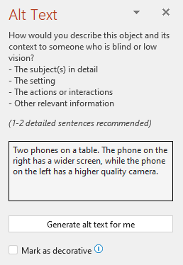
Do not repeat the surrounding textual content as alt text or use phrases referring to images, such as,
"a graphic of" or "an image of." In the example below, the alt text is referring to the image and does
not describe the content of the image sufficiently.
Example of Alt-text for images and pictures
OFFICIAL


OFFICIAL
CLASSIFICATION
Diagrams, flowcharts, and infographics
When dealing with objects that give detailed information, such as an infographic, use alt text to
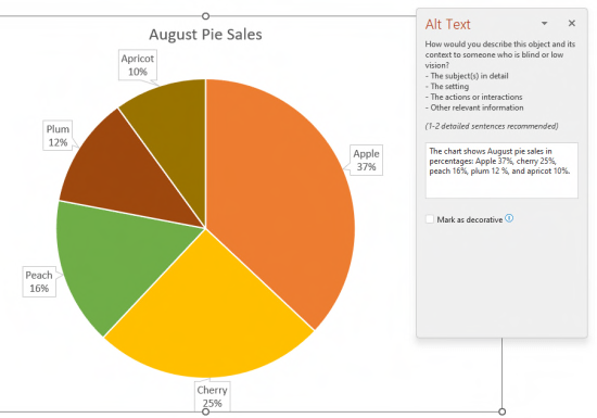
provide the information conveyed in the object. Describing a chart as
‘A bar chart showing sales over
time,' for example, would not be useful to a blind person.
Try to convey the insight; for example,
‘A bar chart showing sales over time. In July, sales for brand A
surpassed sales for brand B and kept increasing throughout the year.’ Alt text should also clearly
describe the beginning point, progress, and conclusion of flow charts.
Example of Alt-text for diagrams, flowcharts and infographics
Please see this section of the Commonwealth Style Guide for further information on use of Alt-text.
Referencing
Copyright requirements
You must properly attribute copyright material you cite or reference. This includes text, images, video
and sounds.
Include all the details required by open access licences (read how to attribute Creative Commons).
Read the government copyright rules in the
Australian Government intellectual property manual.
Please refer to the Authority’s Referencing Guide.
Glossaries
Key terms should be included in a glossary. The Authority’s glossary is available here.
The following guidelines should be used in drafting a glossary for a report or other publication:
Define words that may be unfamiliar to the reader:
o
If the term is technical or has a meaning different to common use it should be
included in the glossary, even if it is used only rarely and defined in the text. For
OFFICIAL

OFFICIAL
CLASSIFICATION
example, the Report 3 glossary defined ‘tax interaction effect’ even though it was
used only in one location in the report and clearly defined.
o
If the term is specific to climate policy, but simple and used rarely, then it should be
defined in the chapter but not included in the glossary. For example, the Report 3
glossary did not define ‘covered emissions’.
Definitions should only explain the meaning of the term. They should not include further discussion of
why a particular concept is important—this should be left to the chapter. Definitions should be simple
and stand-alone. The reader should understand the term from reading the definition, and as such, the
definition should not use jargon. If the definition includes technical terms that are themselves defined
elsewhere in the glossary, they should cross reference to the definition for the term.
Data Visualisation
Figures and infographics are a great way to present information in an easily digestible visual format.
There are some key questions to consider when creating an infographic such as:
What information are you trying to present e.g. a process, data report, comparison, timeline,
list, general information?
Who is your audience?
How do you think this information could be most easily conveyed?
Should all this information be in one infographic or multiple? i.e. are you overcomplicating it
by trying to put too much information in one?
Now that you have thought about the type of information and how you might want to present it, it’s
time to look for inspiration and existing templates.
CCA’s existing template
CCA’s existing reports including corporate documents
External reports from:
o
Government e.g. DCCEEW, DISR, ARENA, CSIRO, CEFC
o
Consultants e.g. EY
Google images with key search terms e.g. “timeline infographic”
Software to use:
Powerpoint
Power BI for plotting data
Excel if Power BI does not work
Photoshop (need to request access to switch our subscriptions around)
OFFICIAL


