CDPP
Branding
Style Guide
Contents
Introduction 1
CDPP Crest logo
2
Colour palette
6
Accessibility 7
Brand element
8
Typefaces 9
Branded material
12
Introduction
Maintaining a consistent visual identity and style underpins all professional communication
and the integrity of an organisations brand.
The CDPP Branding Style Guide provides you with practical advice and tips to ensure the
CDPP presents uniform communications where the logo, colour palette and style is applied
consistently.
This guide has been produced to improve and retain the integrity of CDPP’s brand and
maintain a common identity for all CDPP corporate material. The manual will allow you to
achieve professional results in the reproduction of artwork across a suite of materials.
The CDPP brand is simple, easily recognised and plays a key part in identifying CDPP with
all our stakeholders. It is important to clearly define the best ways in which the brand and
logo should be applied to ensure brand consistency—this guide aims to achieve that goal.
This guide is supported by a suite of resources including templates and examples are
provided in this guide for reference.
For more information or assistance consult the Communication team.
CDPP Branding Style Guide
1


CDPP Crest logo
The CDPP logo and Australian Government Crest must appear (consistently) across all
material, and the components of the Crest and Logo cannot be altered in any way.
Only original logo artwork can be used – never ‘scan’ a logo from printed material
or copy a logo from the CDPP website or intranet as this will result in a poor quality
reproduction.
If you require an official version of the CDPP logo, please contact the CDPP
Communication team.
Using the CDPP Crest
The CDPP Crest logo must appear on all CDPP materials and publications.
It should never be altered in any way, shape or form.
In some cases it may be appropriate for the CDPP Crest and another logo to appear in the
same design.
• In that situation, align both logos on the same horizontal grid with the text on the
same line, match the x-height as shown below.
• The CDPP logo is always placed on the left.
Application
The CDPP Crest in conjunction with the CDPP branding elements will be applied across a
range of materials including:
• Stationery
• Marketing material
• Advertising
• Internal communications
• Correspondence
• Digital
CDPP Branding Style Guide
2


Inline version (preferred)
Inline mono
Inline reversed
Stacked version
Stacked mono
Stacked reversed
CDPP Branding Style Guide
3


Minimum sizing and clearspace
To ensure the CDPP Crest logo maintains legibility and integrity, always preserve a
minimum clearspace between the logo and other elements. The proportions of the logo
should never be altered.
Minimum size
The minimum width of the Coat of Arms for print reproduction is 20mm.
It should never appear smaller than the minimum size shown here for screen and print.
Example below is shown to actual minimum size.
20mm
Minimum clearance
The clearspace around the crest ensures that other graphic elements and lettering do not
intrude on this space. Where possible use more clearspace than the minimum.
x
x
x = 5mm
x
x = 5mm
The marque above shows the defined clearspace around the crest.
CDPP Branding Style Guide
4


Logo on background colours
The CDPP Crest logo should only be used on very light or very dark solid blocks of colour.
Do not use the logo on top of a photograph or gradient unless it sits on a very light or very
dark area of the image. Use only either the mono or reverse versions of the logo.
If appearing on a block of colour it should adhere to the following guidelines. It should
always be clear and visible.
Correct use on white
Correct use on black
Correct use on grey
Correct use on navy
Correct use on teal
Correct use on light teal
Correct use on blue
Correct use on yellow
Correct use on orange
CDPP Branding Style Guide
5
Colour palette
Primary
CMYK 96 69 45 45
The primary colour is the first point of call when
using colours for CDPP publications. All CDPP
Navy
RGB 4 55 75
materials should use the primary colour navy.
Hex 04374B
Pop colours
The pop colours are the second point of call when using colours for CDPP publications.
These colours should be used as a pop colour function along with the primary navy colour.
If more than one pop colour is needed, up to 3 colours can be used together.
CMYK 81 26 36 8
CMYK 68 0 25 0
Teal
RGB 24 138 149
Light teal
RGB 49 191 199
Hex #188A95
Hex #31BFC7
CMYK 90 0 10 0
CMYK 0 20 96 0
Blue
RGB 0 178 221
Yellow
RGB 255 204 28
Hex #00B2DD
Hex #FFCC1C
CMYK 0 0 0 60
CMYK 0 75 98 0
Grey
RGB 128 130 133
Orange
RGB 242 101 36
Hex #808285
Hex #F26524
CDPP Branding Style Guide
6
Accessibility
The following examples define the accessibility standards with regard to colours:
Fail
AAA
AA
Fail
Fail
Fail
AA
AA
(18pt +)
(18pt +)
(18pt +)
AAA
AAA
AAA
AAA
Fail
AAA
AAA
AAA
(18pt +)
(18pt +)
(18pt +)
AAA
Fail
AA
AAA
AAA
AAA
AA
AAA
(18pt +)
(18pt +)
(18pt +)
(18pt +)
(18pt +)
AA
AA
Fail
Fail
Fail
Fail
Fail
Fail
(18pt +)
(18pt +)
AAA
Fail
Fail
Fail
Fail
Fail
Fail
Fail
(18pt +)
AAA
Fail
Fail
Fail
Fail
Fail
Fail
Fail
(18pt +)
Fail
AAA
Fail
Fail
Fail
Fail
Fail
Fail
AA
AA
Fail
Fail
Fail
Fail
Fail
Fail
(18pt +)
(18pt +)
AA
AA
Fail
Fail
Fail
Fail
Fail
Fail
(18pt +)
(18pt +)
CDPP Branding Style Guide
7


Brand element
CDPP star
The CDPP star forms part of the branding suite. This should be used
as often as possible across all branding materials. The star cannot be
distorted in any way and must stay in the ratio as provided.
The star can have any CDPP colour applied to it at any time as long as it
falls within the colour and accessibility guidelines.
Never apply effects or distort the CDPP star, examples below.
If you require this design element, please contact the CDPP Communication team.
CDPP Branding Style Guide
8
Typefaces
Museo Sans
Museo Sans is the primary typeface of the CDPP. It is a highly legible sans serif typeface very
well suited for any display and text use. It is primarily used as the body copy within large
reports and publications and also headings within these. This font is generally used by the
Communication team when producing corporate designs. i.e. Corporate Plan, Annual Report.
• Museo Sans 100 / 100 italic
• Museo Sans 300 / 300 italic
• Museo Sans 500 / 500 italic
• Museo Sans 700 / 700 italic
• Museo Sans 900
Calibri
Calibri is the in-house typeface of the CDPP. It is a versitaile family of typefaces that can be
used for producing reports and presentation off the desktop. i.e. PowerPoint, Word, Excel.
• Light
• Light italic
• Regular
• Italic
• Bold
• Bold italic
CDPP Branding Style Guide
9
Typefaces
Primary typeface – Museo Sans
Museo Sans 100
abcdefghijklmnopqrstuvwxyz
ABCDEFGHIJKLMNOPQRSTUVWXYZ
1234567890
Museo Sans 100 italic
abcdefghijklmnopqrstuvwxyz
ABCDEFGHIJKLMNOPQRSTUVWXYZ
1234567890
Museo Sans 300
abcdefghijklmnopqrstuvwxyz
ABCDEFGHIJKLMNOPQRSTUVWXYZ
1234567890
Museo Sans 300 italic
abcdefghijklmnopqrstuvwxyz
ABCDEFGHIJKLMNOPQRSTUVWXYZ
1234567890
Museo Sans 500
abcdefghijklmnopqrstuvwxyz
ABCDEFGHIJKLMNOPQRSTUVWXYZ
1234567890
Museo Sans 500 italic
abcdefghijklmnopqrstuvwxyz
ABCDEFGHIJKLMNOPQRSTUVWXYZ
1234567890
Museo Sans 700
abcdefghijklmnopqrstuvwxyz
ABCDEFGHIJKLMNOPQRSTUVWXYZ
1234567890
Museo Sans 700 italic
abcdefghijklmnopqrstuvwxyz
ABCDEFGHIJKLMNOPQRSTUVWXYZ
1234567890
Museo Sans 900
abcdefghijklmnopqrstuvwxyz
ABCDEFGHIJKLMNOPQRSTUVWXYZ
1234567890
CDPP Branding Style Guide
10
Typefaces
In-house typeface – Calibri
Calibri light
abcdefghijklmnopqrstuvwxyz
ABCDEFGHIJKLMNOPQRSTUVWXYZ
1234567890
Calibri light italic
abcdefghijklmnopqrstuvwxyz
ABCDEFGHIJKLMNOPQRSTUVWXYZ
1234567890
Calibri regular
abcdefghijklmnopqrstuvwxyz
ABCDEFGHIJKLMNOPQRSTUVWXYZ
1234567890
Calibri italic
abcdefghijklmnopqrstuvwxyz
ABCDEFGHIJKLMNOPQRSTUVWXYZ
1234567890
Calibri bold
abcdefghijklmnopqrstuvwxyz
ABCDEFGHIJKLMNOPQRSTUVWXYZ
1234567890
Calibri bold italic
abcdefghijklmnopqrstuvwxyz
ABCDEFGHIJKLMNOPQRSTUVWXYZ
1234567890
CDPP Branding Style Guide
11


Branded material
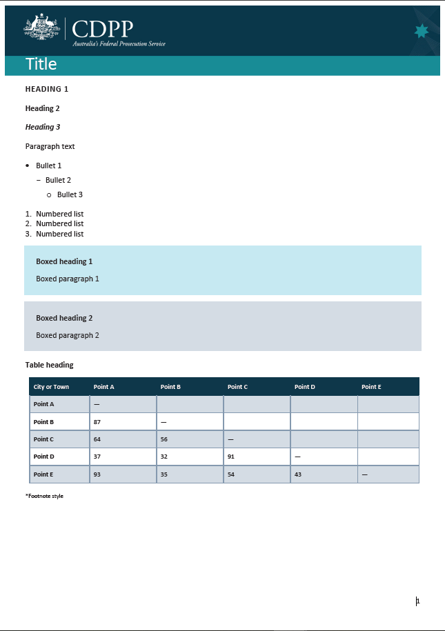
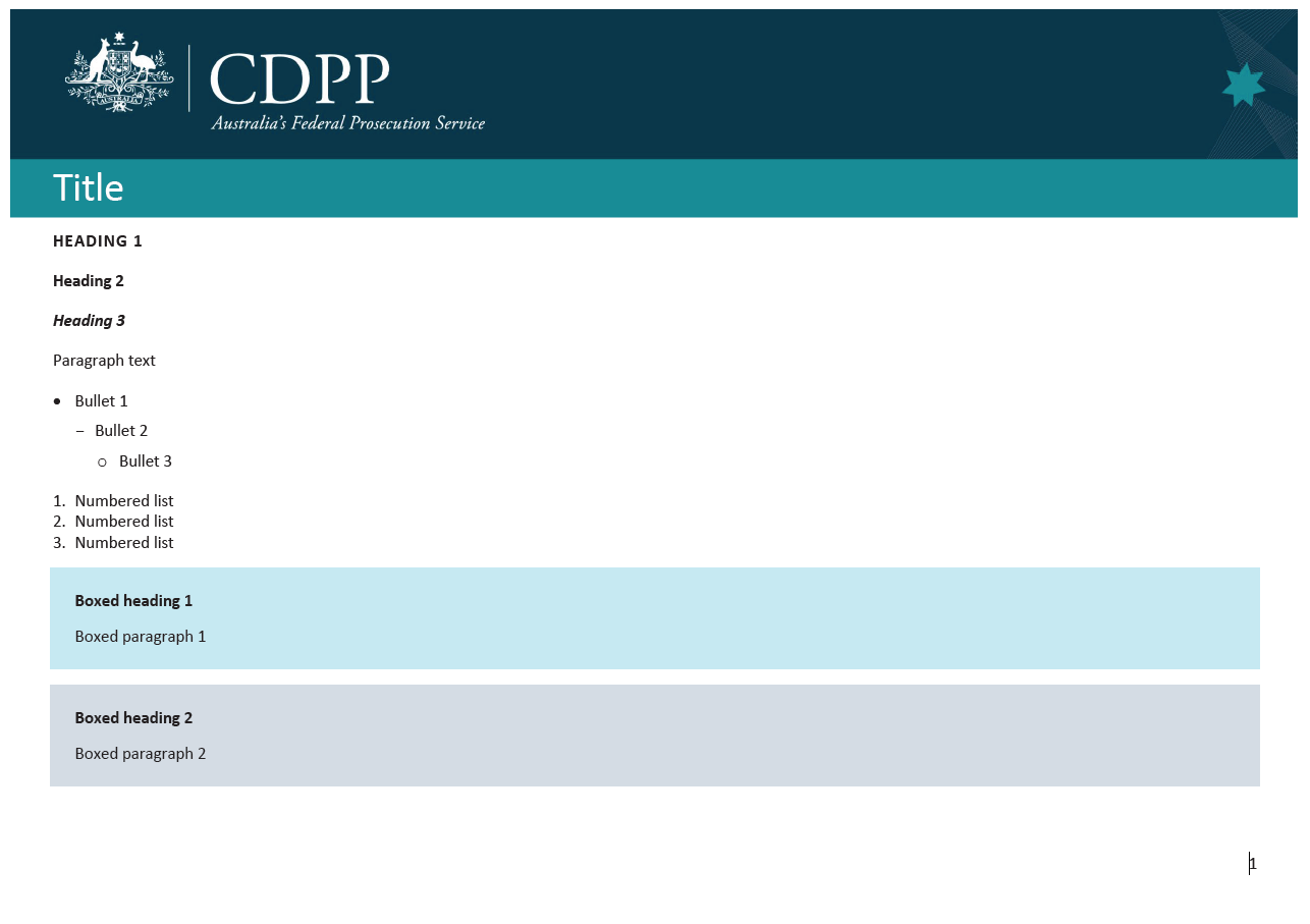
Report and document templates
The following Word templates are available in all corporate colours for download and
use on The Desk – Report and Document Templates.
Business areas are not allocated specific colours from the palette – all colours are available
for use.
Long template
Short template
Title
HEADING 1
Heading 2
Heading 3
Paragraph text
• Bullet 1
- Bullet 2
o Bullet 3
1. Numbered list
2. Numbered list
3. Numbered list
Boxed heading 1
Boxed paragraph 1
Boxed heading 2
Boxed paragraph 2
Table heading
City or Town
Point A
Point B
Point C
Point D
Point E
Point A
—
Title
Point B
87
—
Point C
64
56
—
Subtitle
Point D
37
32
91
—
Point E
93
35
54
43
—
*Footnote style
1
Landscape template
Title
HEADING 1
Heading 2
Heading 3
Paragraph text
• Bul et 1
- Bul et 2
o Bul et 3
1. Numbered list
2. Numbered list
3. Numbered list
Boxed heading 1
Boxed paragraph 1
Boxed heading 2
Boxed paragraph 2
1
CDPP Branding Style Guide
12


Fact sheet templates
The following fact sheet templates are available in all corporate colours for download and
use on The Desk – Fact Sheet Templates.
Fact sheet template
Landscape fact sheet template
CDPP Branding Style Guide
13


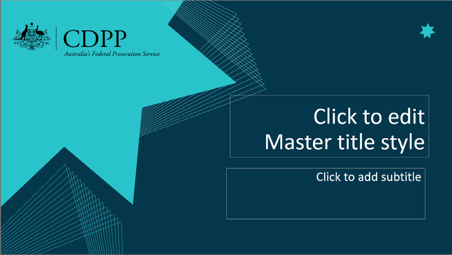
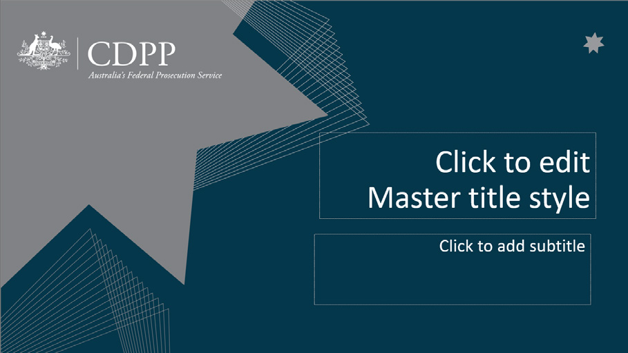
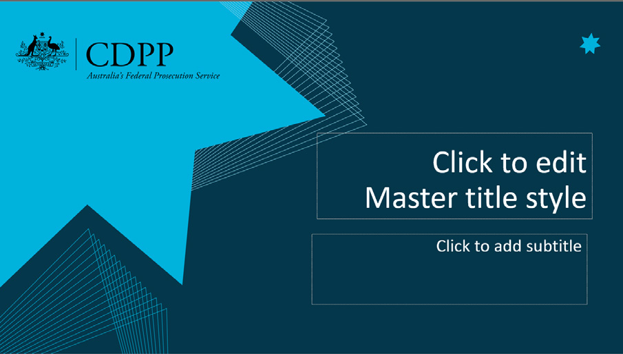
PowerPoint templates
The below PowerPoint templates are available in all corporate colours for download and
use on The Desk – PowerPoint Templates.
The Communication team can create custom branded templates.
CDPP Branding Style Guide
14


