Contents
Our brand
1
Importance of branding
1
Additional resources
1
Contact
1
APVMA brand products
2
Business
2
Col ateral
2
Corporate
2
Publications
2
Stationary
3
Logo 4
Appearance
4
Colour
4
Applying the logo
5
Use of the Australian Government logo by third parties
7
Corporate colours
8
Images
9
Graphical elements
10
Secondary branding
11
APVMA website
12
Web typography
12
Main navigation
14
Left-hand navigation
15
Breadcrumbs
15
Buttons
16
Pul -quotes
16
Tables
17
Homepage banners
18
Email signatures
19
Print typography
20
Franklin gothic
20
Arial 20
Templates and promotional material
22
Fact sheets
22
Other templates
22
ii
Display materials
23
Merchandise
23
List of figures
Figure 1: Examples of the correct and incorrect use of Australian Government logos
5
Figure 2: Australian Government logo isolation zone
6
Figure 3: Examples of how not to use the Australian Government logo
6
Figure 4: APVMA corporate colour palette
8
Figure 5: Example stock images
9
Figure 6: Example uses of the hexagon
10
Figure 7: The APVMA website homepage
12
Figure 8: APVMA website main navigation menu
14
Figure 9: APVMA website left-hand navigation menu
15
Figure 10: APVMA website breadcrumbs
15
Figure 11: Example buttons
16
Figure 12: ‘Time’ pull-quote
16
Figure 13: ‘Check’ pull-quote
16
Figure 14: ‘Fees’ pull-quote
16
Figure 15: ‘Alert’ pull-quote
16
Figure 16: ‘Info’ pull-quote
17
Figure 17: Example table
17
Figure 18: Example homepage banner
18
Figure 19: APVMA document and presentation templates
22
Figure 20: How to access the Styles pane in Microsoft Word
22
Figure 21: Pul -up banners
23
iii
Our brand
This document describes the branding and visual identity of the Australian Pesticides and Veterinary Medicines
Authority (APVMA). The guidance in this document must be followed when commissioning, designing or delivering
any form of communication.
Importance of branding
A strong brand strengthens the identity and visibility of Australian Government agencies. It helps to provide
certainty for members of the public that they are using or engaging with an Australian Government service or
website, and reduces complexity of Australian Government structure through a simple, memorable identity.
Additional resources
In addition to the APVMA Visual Style Guide, the following guidance should be fol owed when developing any form
of communication.
• Australian Government Style Manual
• Australian Government Branding – Guidelines on the use of the Australian Government logo by Australian
Government departments and agencies
• APVMA Website Governance Policy
Contact
Al forms of communication intended for an external audience must be submitted to the Communications Team for
review via xxxxxxxxxxxxxx@xxxxx.xxx.xx.
Communication intended for an internal audience should also be submitted to the Communications Team for
review.
Any enquiries about the APVMA’s Visual Style Guide, or how to apply the guidance in this document, should also
be directed to the Communications Team.
1
APVMA brand products
Visually cohesive and clearly written products provide consistent brand messaging that communicates our
purpose, services and work to our clients, stakeholders and the broader community.
Our brand products are categorised over 5 areas, providing an overview of the scope of product we produce as
well as assisting with the management of brand development.
Business
• Conferences/symposiums
• Corporate gifts
• Cross-branding guidelines
• Promotional items
• Training
Col ateral
• Colour palette
• Creative assets
• Logo
• Photography
• Signage
• Typography
Corporate
• Advertising
• Banners
• Diagrams
• Email signatures
• External website
• Instructional Material Library (IML)
• Intranet
• Online Services Portal
• PPLA portal
• Social media
Publications
• Annual Report
• Business publications, including Public Release Summaries and Trade Advice Notices
• Corporate Plan
2
• Digital marketing
• Email marketing
• Operational Plan
• PowerPoint template
Stationary
• Business cards
• Envelopes
• Letterhead
• With compliments
3
Logo
The Department of the Prime Minister and Cabinet publishes guidelines on the use of the Australian Government
logo by Australian Government departments and agencies. Please contact the Communications Team to request a
copy of the APVMA logo, and ensure the logo is used in accordance with the following requirements.
Appearance
The Australian Government logo consists of 4 elements:
• The Commonwealth Coat of Arms (Conventional Version 3A Solid)
• The words ‘Australian Government’ (Times New Roman Bold)
• An underline
• The department or agency name (also Times New Roman Bold)
There are several forms of the logo which may be used for different situations. It is left to the discretion of the
department or agency as to which should be used on any given occasion.
Inline logo
Stacked logo
The minimum width of the Commonwealth Coat of Arms on stationary and larger items must be 20 mm. However,
on items such as name badges and identity cards where it may not be possible to adhere to this, the Coat of Arms
may be altered in width, but must remain recognisable.
Colour
It is intended that the Australian Government logo be reproduced in one colour only, preferably black. However, to
add flexibility to this reproduction, guidelines for limited colour use have been developed.
The logo can be reversed – white on black – or can appear as a light colour on a dark colour, or as a dark colour
on a light colour. The logo must not appear in a pastel or light colour on a light background, or as a tint or stipple of
any colour, or as a dark colour on a dark background.
The choice of compliant colours is up to individual Australian Government bodies, but it is essential to ensure that
any use of colour does not compromise the integrity of the logo. Attention to contrast should also be considered
carefully, and the various elements of the logo must not be represented in more than one colour.
4
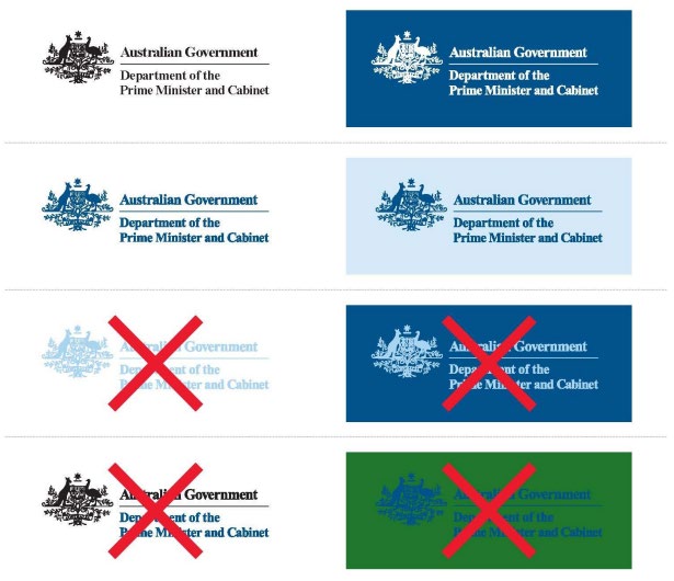
The use of a black and white logo on a particular product does not preclude the use of the logo in a different
compliant colour palette on other products.
Figure 1: Examples of the correct and incorrect use of Australian Government logos
Applying the logo
In most circumstances, the logo must have prominence over and above other images and graphic elements.
Where possible, the logo must be placed at the top of the item it appears on and other logos, text or images must
not be placed above or to the left of the logo.
An individual logo must appear only once in a document. It must not be used as a decorative or artistic element or
as a watermark, and must not be overprinted with text or images.
An isolation zone has been established to ensure the dignity of the logo is not jeopardised through crowding. The
location of this zone is indicated by the grey X’s in Figure 2. The width of the ‘X’ is the distance between the top of
the capital ‘A’ in ‘Australian Government’ and the bottom of the horizontal line beneath these words (as indicated
by the black Z’s below).
Please note, the isolation zone shown must be seen as a minimum and can be greater. It applies to every form of
the logo and in every application of the logo.
5
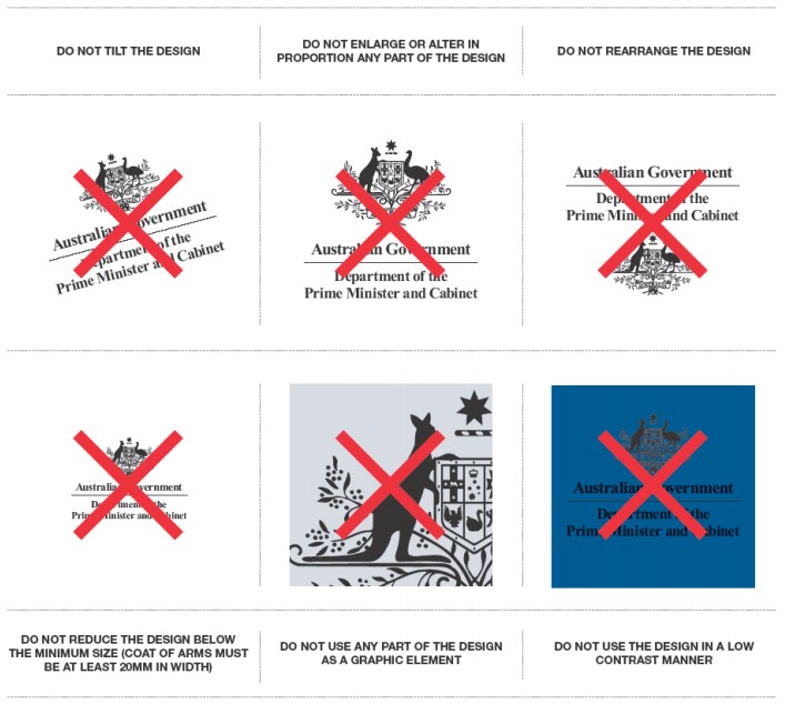
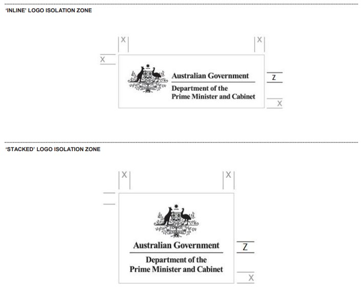
Figure 2: Australian Government logo isolation zone
Incorrect application
The examples in Figure 3 show how the Australian Government logo is not to be used. These examples apply to
every form and application of the logo.
Figure 3: Examples of how not to use the Australian Government logo
6
Use of the Australian Government logo by third parties
Departments and agencies are able to authorise third parties to use the Australian Government logo (in various
forms) where appropriate, for example to acknowledge Australian Government funding and support. This is at the
discretion of the department or agency.
Please contact the Communications Team if you receive a request from a third party to use the logo.
7
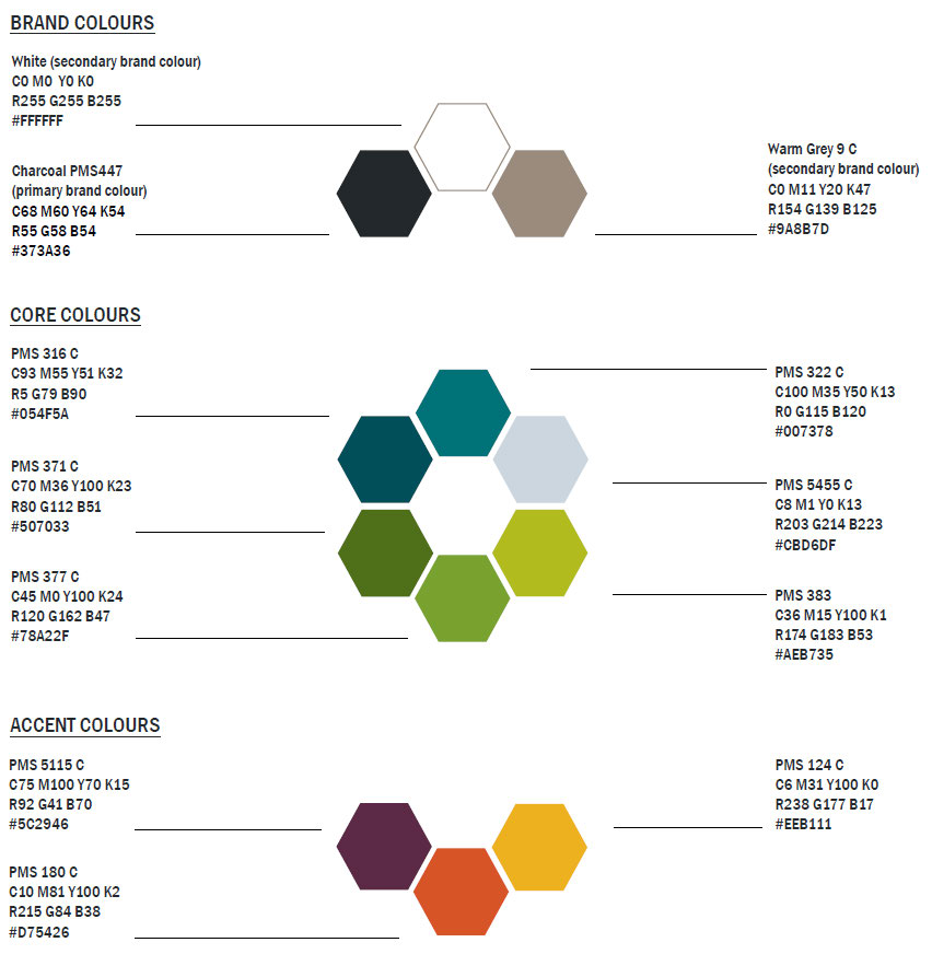
Corporate colours
A 3-part colour palette helps bring our brand to life:
• Brand – dominant product colour of charcoal, warm grey or white.
• Core – key colours, may form a significant usage. As a general guide, usage should be restrained to 3 core
colours per product.
• Accent – generally used sparingly as a highlight or contrast.
The APVMA’s corporate colour palette is pictured below in Figure 4.
Figure 4: APVMA corporate colour palette
8

Images
The use of quality imagery enriches our products and enhances our corporate brand. Images help to communicate
our messages quickly and succinctly, increasing readership and memory recall.
Our images are sourced from stock libraries or taken by an in-house photographer and are generally used in
corporate products such as the Annual Report and PowerPoint presentations.
When using images online, and in most publications, you must provide image captions, titles and alt text. More
information about these requirements is available in the Australian Government Style Manual.
Please contact the Communications Team if you require access to our image library or to arrange the purchase of
stock photography. You can also contact the Communications Team to have a photograph taken by our in-house
photographer.
Figure 5: Example stock images
9
Graphical elements
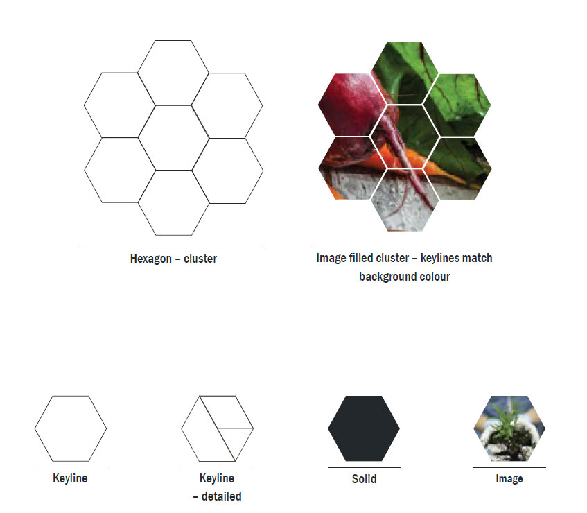
Hexagon formations provide a dynamic element to support the APVMA brand and can be configured in different
sizes and groupings.
Hexagons can be used across our brand in a variety of ways, noting that it is never used in a rotated format (with a
pointy end at the top).
Figure 6: Example uses of the hexagon
10
Secondary branding
The APVMA deploys a monolithic brand architecture. This means we have a single masterbrand with strong visual
components to strengthen the value and recognition of the APVMA brand.
Visual brand components, such as graphical elements (hexagon) and our colour palette have been designed to
allow flexibility of use and help keep our brand fresh.
With consistent service and product offerings, we do not engage in secondary branding that departs from our
approved style.
To ensure that strong brand consistency is maintained, advice on the use of graphical elements, as well as
approval of any public facing products should be sought from the Communications Team.
11
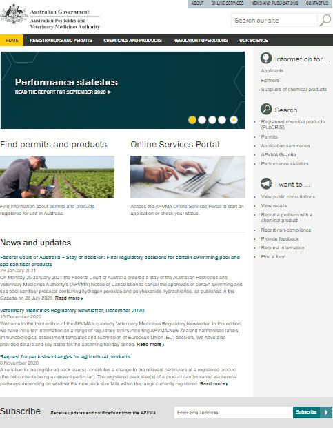
APVMA website
The APVMA’s external website, apvma.gov.au, is our primary communication tool with external stakeholders and
is managed by the Communications Team.
Secondary channels, such as social media or publications, should refer audiences to the APVMA website for
detailed and current information.
Figure 7: The APVMA website homepage
Web typography
Uniformity across products promotes a consistent and clear brand. Basic HTML styles are provided below as
guidance in the development of products.
12
Main navigation
• Size – 0.85 em
• Typeface – Franklin Gothic URW
• Static colour – #FFF
• Hover/active colour – #353735
H1
• Size – 3.5 em
• Typeface – Franklin Gothic URW
• Weight – 500
• Line-height – 1.05 em
• Colour – #00747A
• Margin-top – 14 px
H2
• Size – 2.4 em
• Typeface – Franklin Gothic URW
• Weight – 700
• Style – normal
• Line-height – 1.1 em
• Colour – #00747A
H3
• Size – 2 em
• Typeface – Franklin Gothic URW
• Weight – 700
• Style – normal
• Colour – #00747A
H4
• Size – 1.5 em
• Typeface – Franklin Gothic URW
• Weight – 700
• Style – normal
• Colour – #00747A
• Line-height – 1.3 em
• Margin-bottom – 14 px
13

H5
• Size – 1.25 em
• Typeface – Franklin Gothic URW
• Weight – 700
• Style – normal
• Colour – #353735
• Line-height – 1.3 em
• Margin-bottom – 14 px
P
• Size – 1.0 em
• Typeface – Arial
• Weight – 400
• Style – normal
• Line-height – 1.5 em
• Colour – #353735
Main navigation
Figure 8: APVMA website main navigation menu
Hover state
• Colour 1 – #B9C9D0 (background)
• Colour 2 – #353735 (text and underline)
• Size – 35 px (H) (max height, width is variable)
Static state
• Colour 1 – #353735 (background)
• Colour 2 – #FFF (text and underline)
• Size – 35 px (H) (max height, width is variable)
Hover/active state
• Colour 1 – #FFCB05 (background)
• Colour 2 – #353735 (text and underline)
• Size – 35 px (H) (max height, width is variable)
14

Left-hand navigation
Figure 9: APVMA website left-hand navigation menu
Static state:
• Colour 1 – #FFF (background)
• Colour 2 – #353735 (text and underline)
• Size – 40 px (max height, width is variable)
• Border – 1 px
• Colour – #DDD
Active state
• Colour 1 – #B9C9D0 (background)
Breadcrumbs
Figure 10: APVMA website breadcrumbs
Static state
• Text colour – #353735
• Hover colour – #00747A
• Text size – 0.8 em
Hover state
• Hover colour – #00747A
• Text size – 0.8 em
15


Buttons
Figure 11: Example buttons
Static state
• Colour 1 – #00747A (background)
• Colour 2 – #FFFFFF (text and underline)
• Size – 40 x 140 px (max height, width is variable)
Hover/active state
• Colour 1 – #FFCB05 (background)
• Colour 2 – #353735 (text & underline)
• Size – 40 x 140 px (max height, width is variable)
Pul -quotes
Prominence is given to important content on the website through the use of enlarged text and icons known as ‘pul -
quotes’ which assist users to quickly detect high-value informational or action items.
Pul -quote examples
Figure 12: ‘Time’ pull-quote
Figure 13: ‘Check’ pul -quote
Figure 14: ‘Fees’ pul -quote
Figure 15: ‘Alert’ pull-quote
16

Figure 16: ‘Info’ pul -quote
Tables
Web-based tables should conform to the following requirements:
• Table width should be set to 100% (rather than a fixed pixel width).
• If a cel requires a set width, percentages should be used rather than pixels.
• Correct HTML tags, such as <th> and <tr> should be applied to all table elements, with a <caption> tag
inserted after the <table> tag.
• Numbers should be right-aligned (excluding the first column).
• Sentence case should be used in header rows (e.g. only the first word is capitalised, except in the case of a
proper noun).
Zebra stripe shading is automatically applied to every second row to assist with the legibility of long tables.
Figure 17: Example table
17
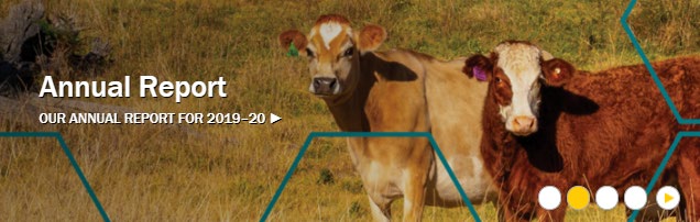
Homepage banners
Website homepage banners are used to promote key messages and/or updates to stakeholders.
Homepage banners follow a template design and are produced by the Communications Team.
Images selected for a homepage banner should have a well-defined area for text that does not interfere with the
main focus of the image. This area should be dark or able to be darkened to provide sufficient text colour contrast
to satisfy accessibility criteria.
Text should be succinct, consisting of one topic line and a second, descriptive call to action. Text should remain
clearly visible over the image and not encroach on radio buttons.
Figure 18: Example homepage banner
Homepage banner typography
• Text colour 1: white (#FFF)
• Text colour 2: charcoal (#353735)
• Typeface line 1: Franklin Gothic Medium (sentence case)
• Typeface line 2: Franklin Gothic Medium (all caps)
18
Email signatures
A corporate email signature has been developed to reinforce the APVMA brand and provide stakeholders with
essential contact information.
The corporate email signature template, which includes instructions on how to apply the signature, is available on
the Instructional Material Library.
When applying the corporate email signature:
• Do: use only the fonts, colours and layout as provided
• Do not: add any text below the signature block or amend sizes or positioning of elements
Please contact the Communications Team if you require assistance.
19
Print typography
Our corporate typefaces, Franklin Gothic and Arial, are standard sans serif fonts that are easy to read and
contribute to our clean corporate branding.
Franklin gothic
Franklin Gothic Book
ABCDEFGHIJKLMNOPQRSTUVWXYZ
abcdefghijklmnopqrstuvwxyz
0123456789
Franklin Gothic Medium
ABCDEFGHIJKLMNOPQRSTUVWXYZ
abcdefghijklmnopqrstuvwxyz
0123456789
Franklin Gothic Medium Condensed
ABCDEFGHIJKLMNOPQRSTUVWXYZ
abcdefghijklmnopqrstuvwxyz
0123456789
Franklin Gothic Demi
ABCDEFGHIJKLMNOPQRSTUVWXYZ
abcdefghijklmnopqrstuvwxyz
0123456789
Franklin Gothic Demi Condensed
ABCDEFGHIJKLMNOPQRSTUVWXYZ
abcdefghijklmnopqrstuvwxyz
0123456789
Arial
Arial Regular
ABCDEFGHIJKLMNOPQRSTUVWXYZ
20
abcdefghijklmnopqrstuvwxyz
0123456789
Arial Black
ABCDEFGHIJKLMNOPQRSTUVWXYZ
abcdefghijklmnopqrstuvwxyz
0123456789
Arial Narrow
ABCDEFGHIJKLMNOPQRSTUVWXYZ
abcdefghijklmnopqrstuvwxyz
0123456789
21
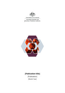
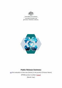
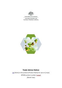
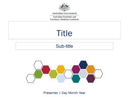
Templates and promotional material
A number of document and presentation templates are available to staff on the Instructional Material Library (IML).
These include:
• the publications template, a general-use template for external-facing corporate documents
• the Public Release Summary (PRS) template
• the Trade Advice Notice (TAN) template
• a PowerPoint presentation template, which can be used for both internal and external presentations.
Figure 19: APVMA document and presentation templates
In-built styles are available in the ‘Styles’ pane for the publications, PRS and TAN templates. The styles pane can
be accessed in Microsoft Word by clicking the arrow highlighted yellow in Figure 20. A work instruction on how to
use the style pane is available on the IML.
Figure 20: How to access the Styles pane in Microsoft Word
Style advice is also provided throughout the PowerPoint presentation template.
Al external-facing documents and presentations should be submitted to the Communications Team for review
prior to publishing or external distribution.
Fact sheets
Fact sheets are typically used for specific promotional or information purposes and provide a point-in-time
resource for conferences, industry events and other marketing purposes.
The Communications Team can create fact sheets upon request.
Other templates
Additional corporate templates, including the APVMA letterhead, are available on the IML. Please contact the
Communications Team if you are unable to find a suitable template.
22
Display materials
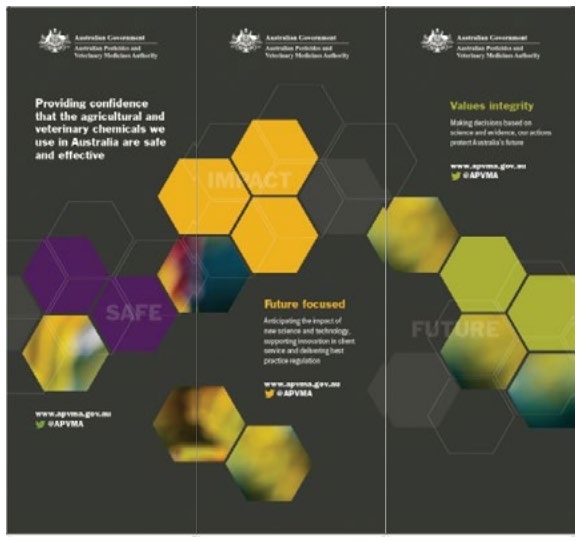
Easily transportable, pull-up banners are available for use at events and conferences. Please contact the
Communications Team if you wish to use the banners.
Figure 21: Pul -up banners
Merchandise
The Communications Team can assist with the design and quotes for promotional merchandise.
23